
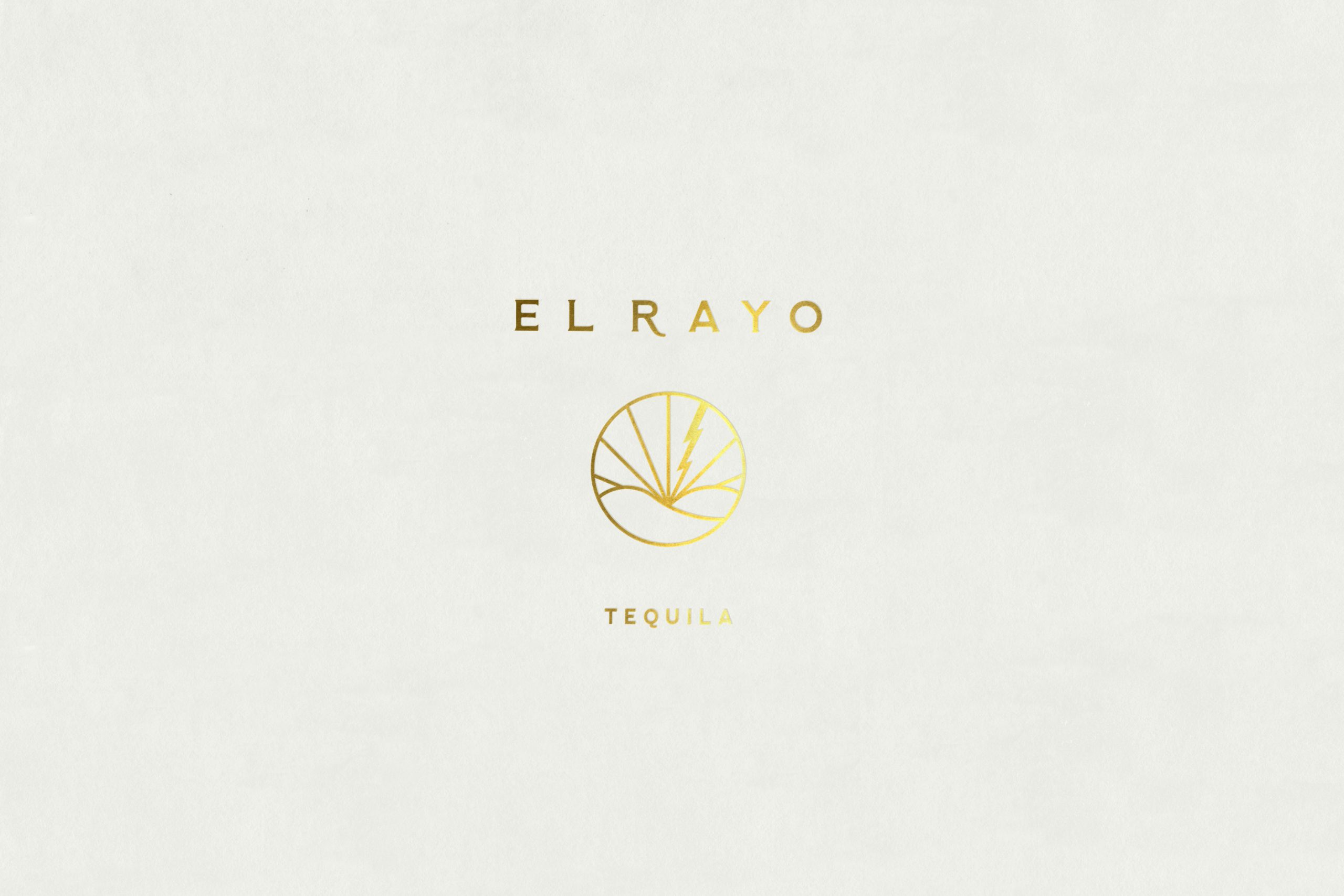
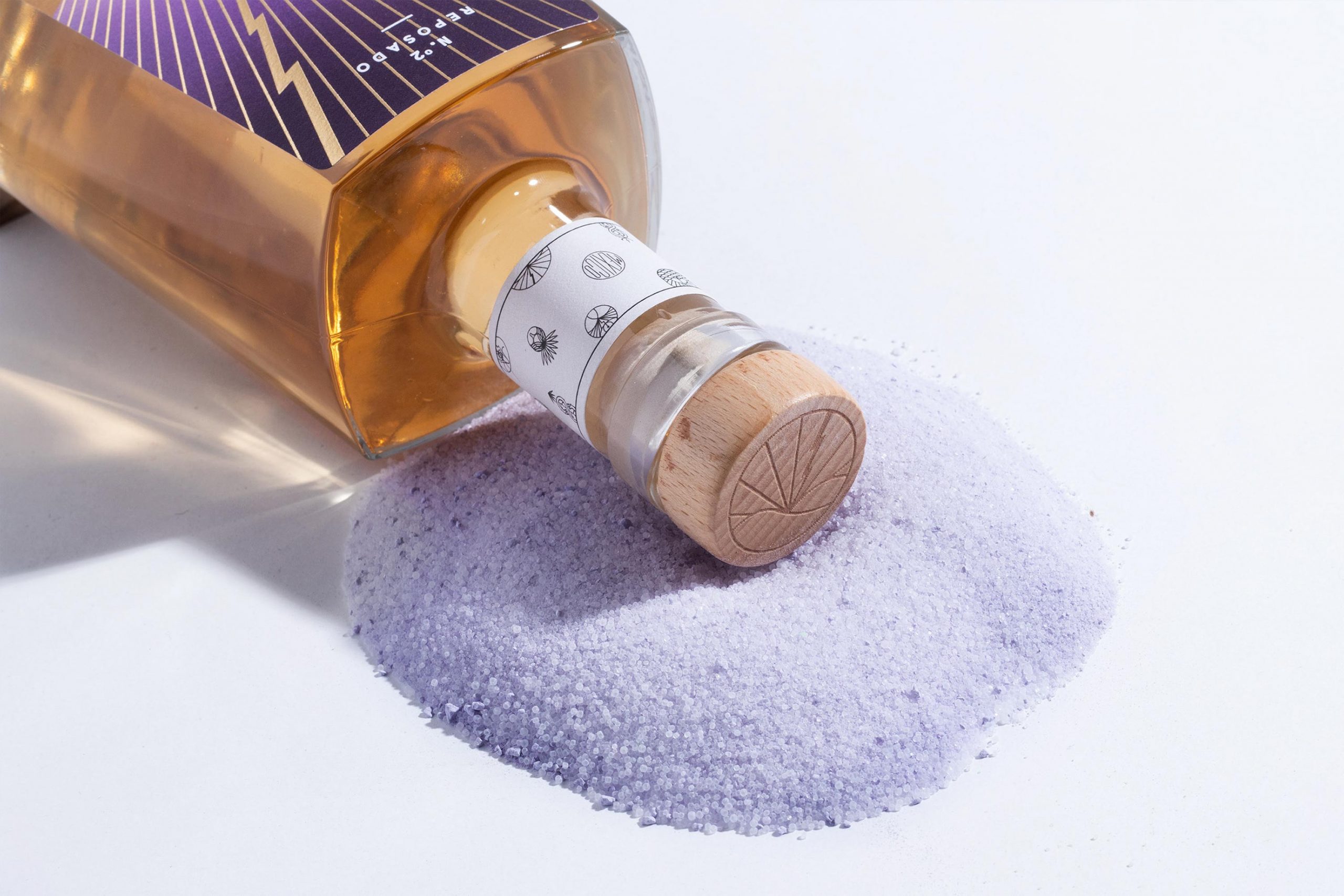
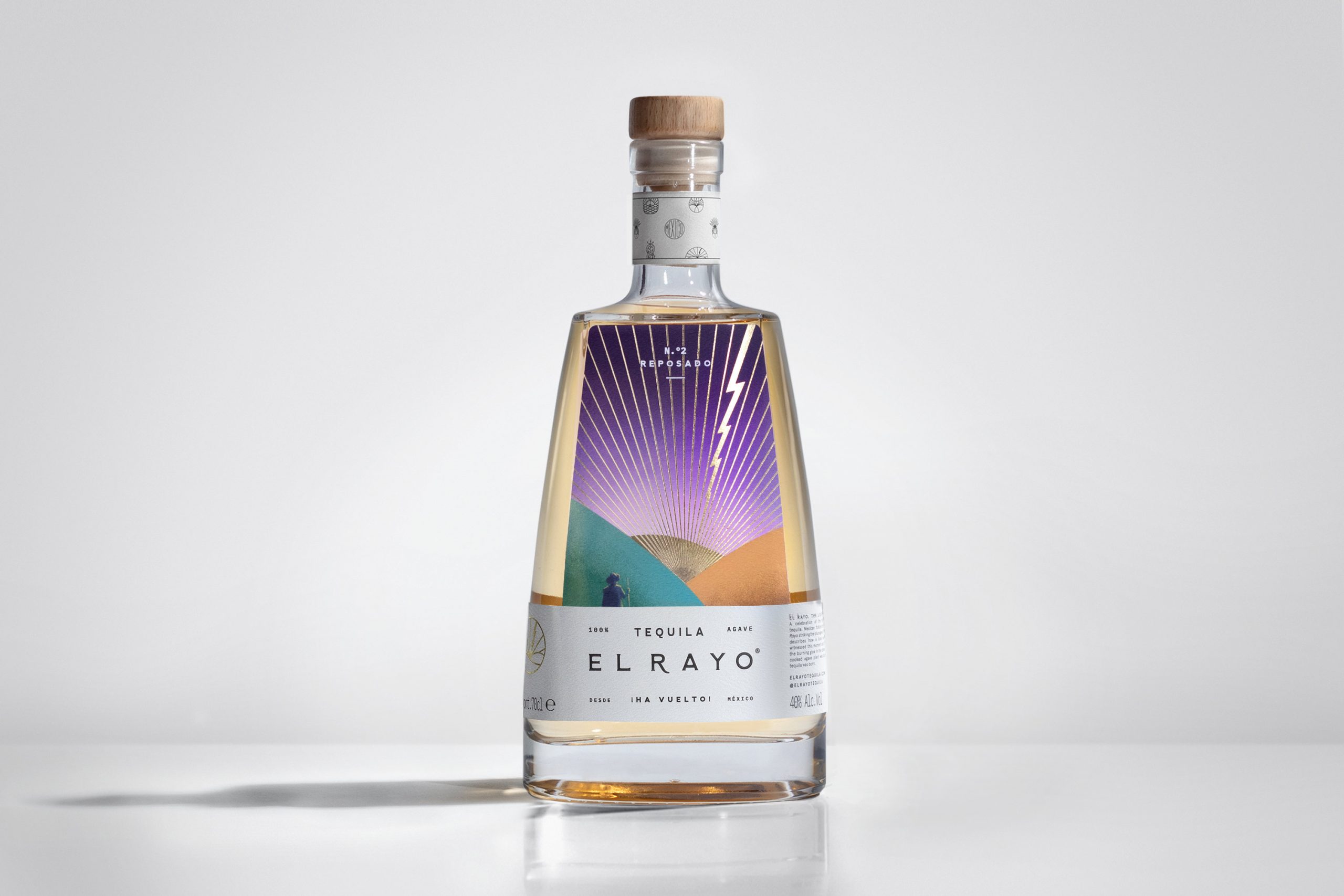
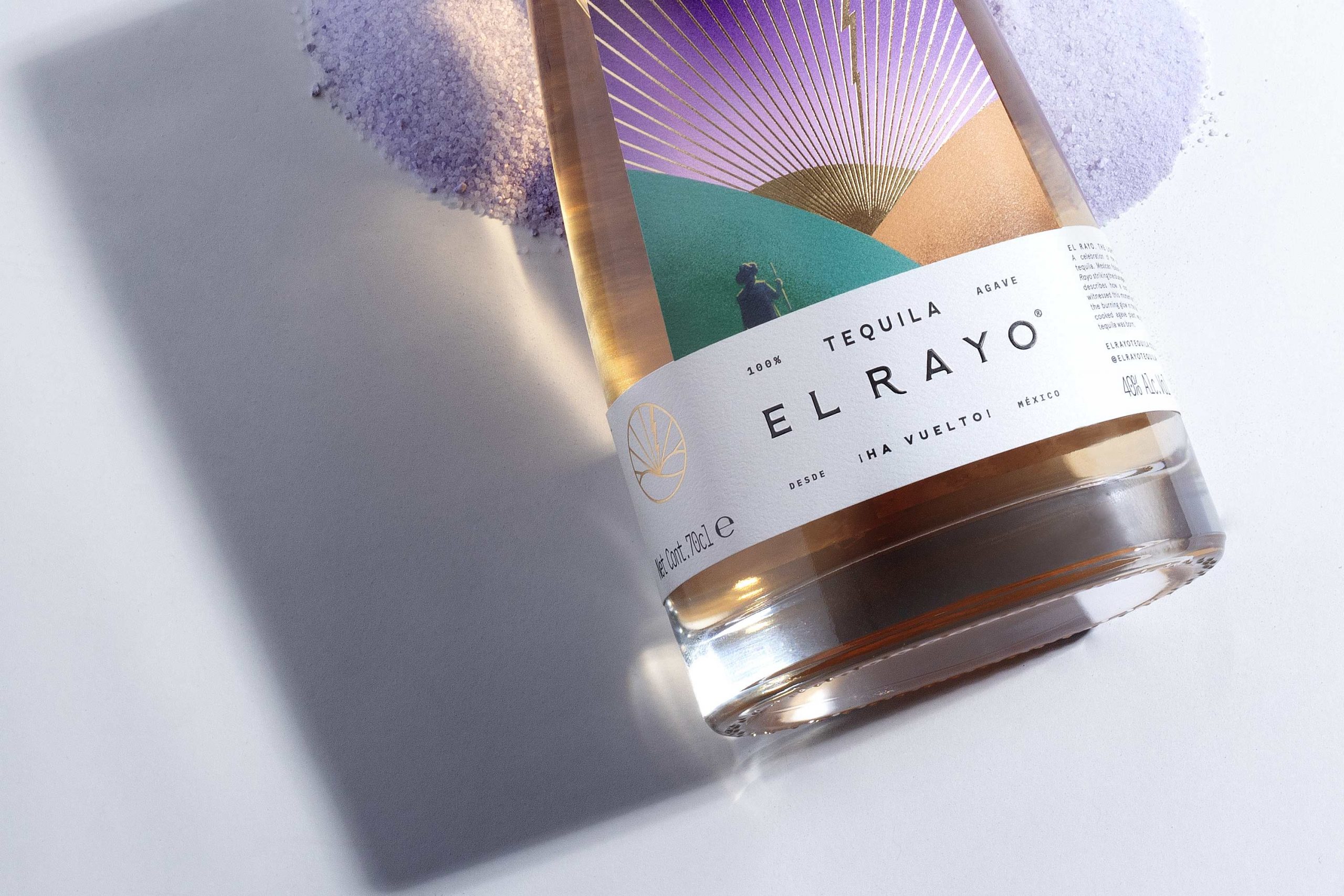
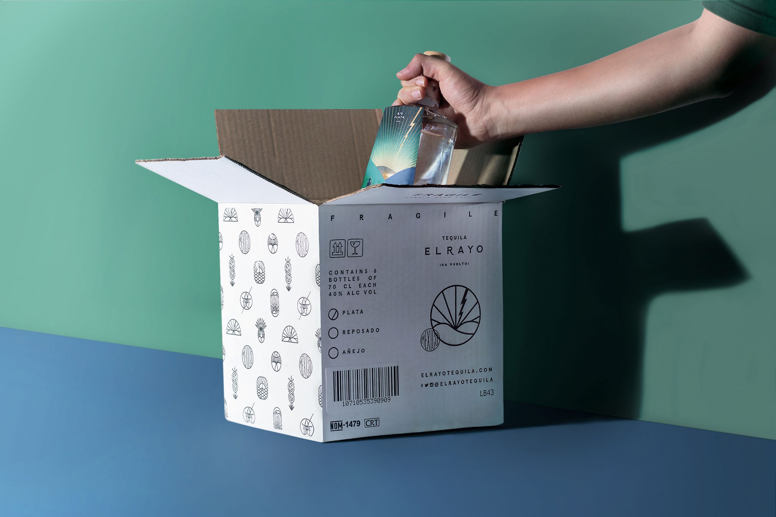
EL RAYO TEQUILA
MEZCAL
—
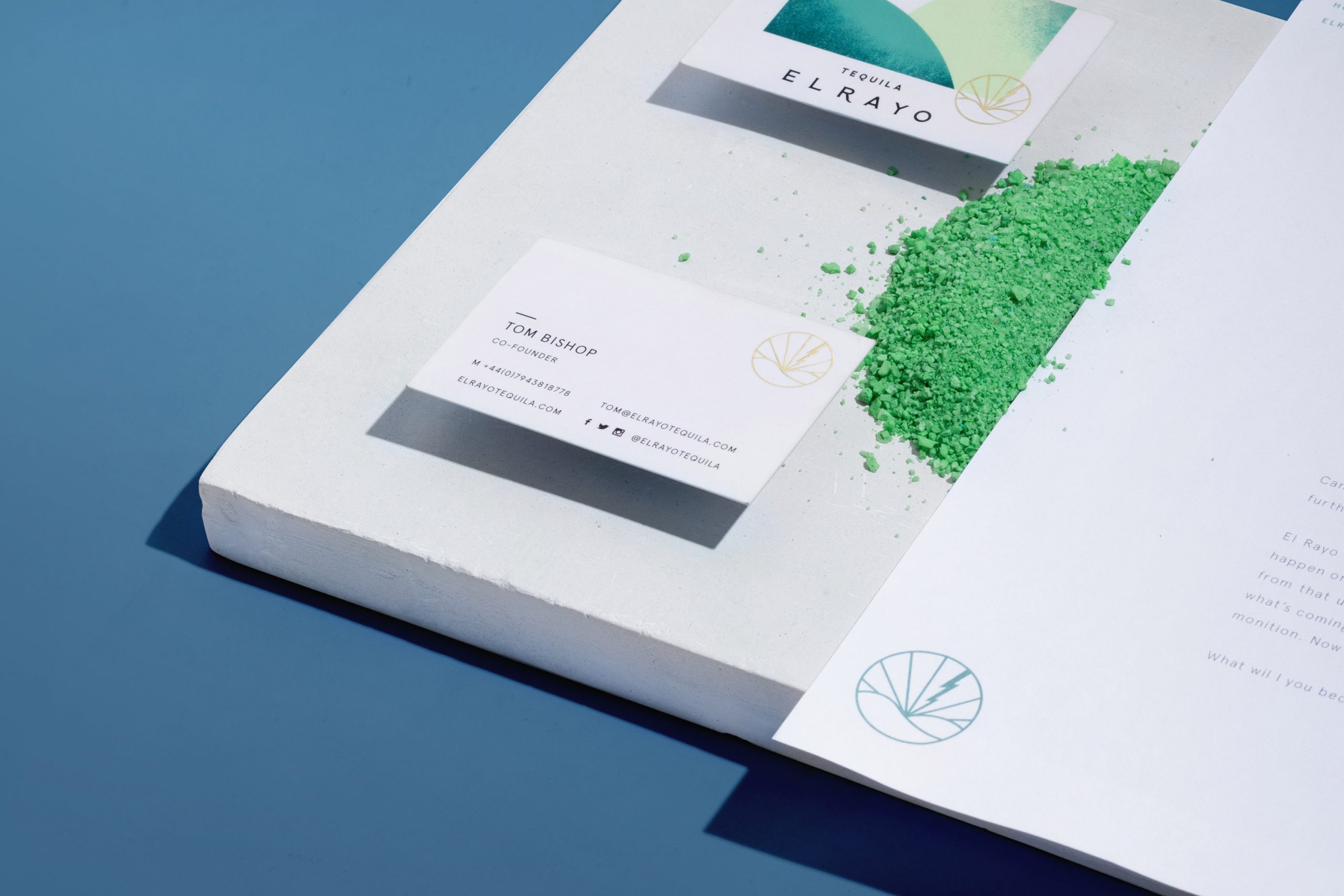
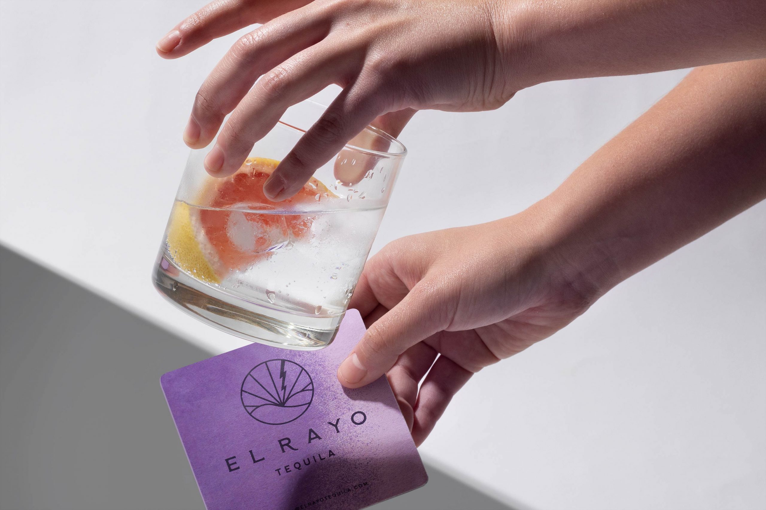
branding, packaging.
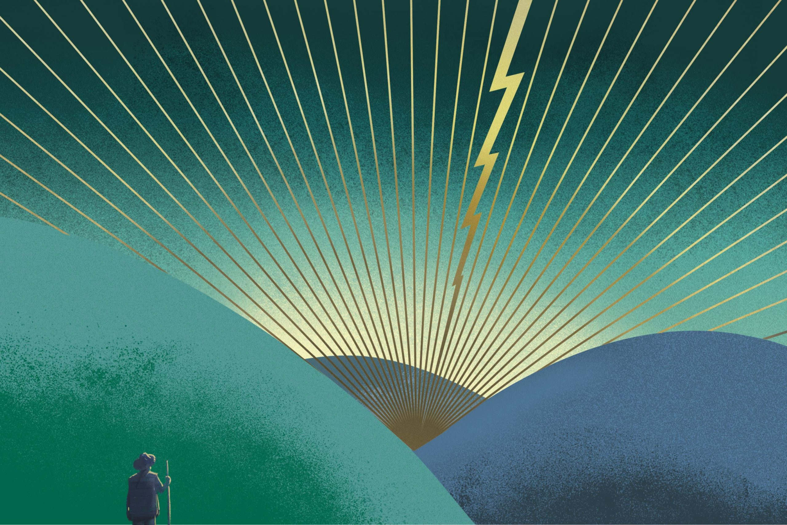
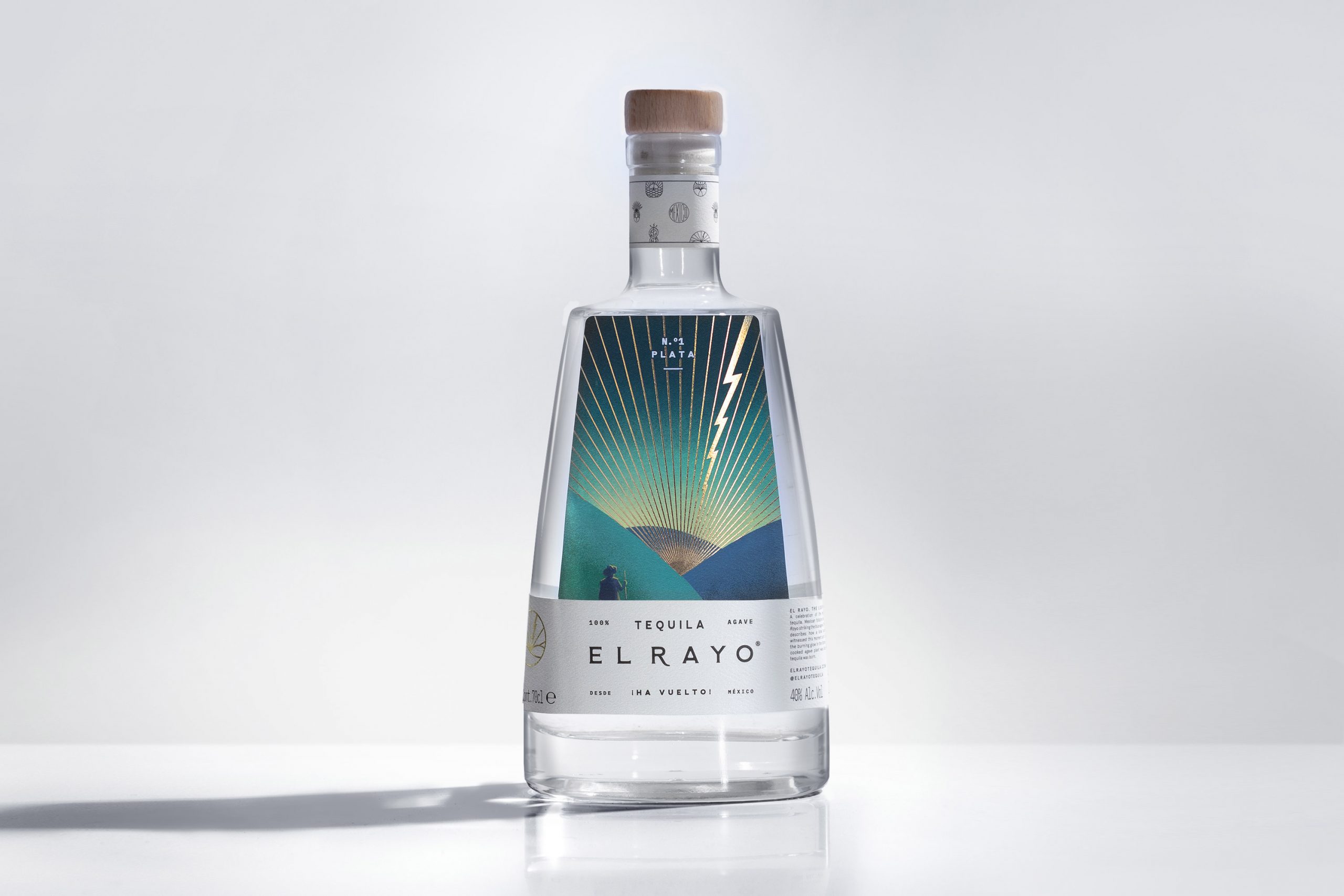
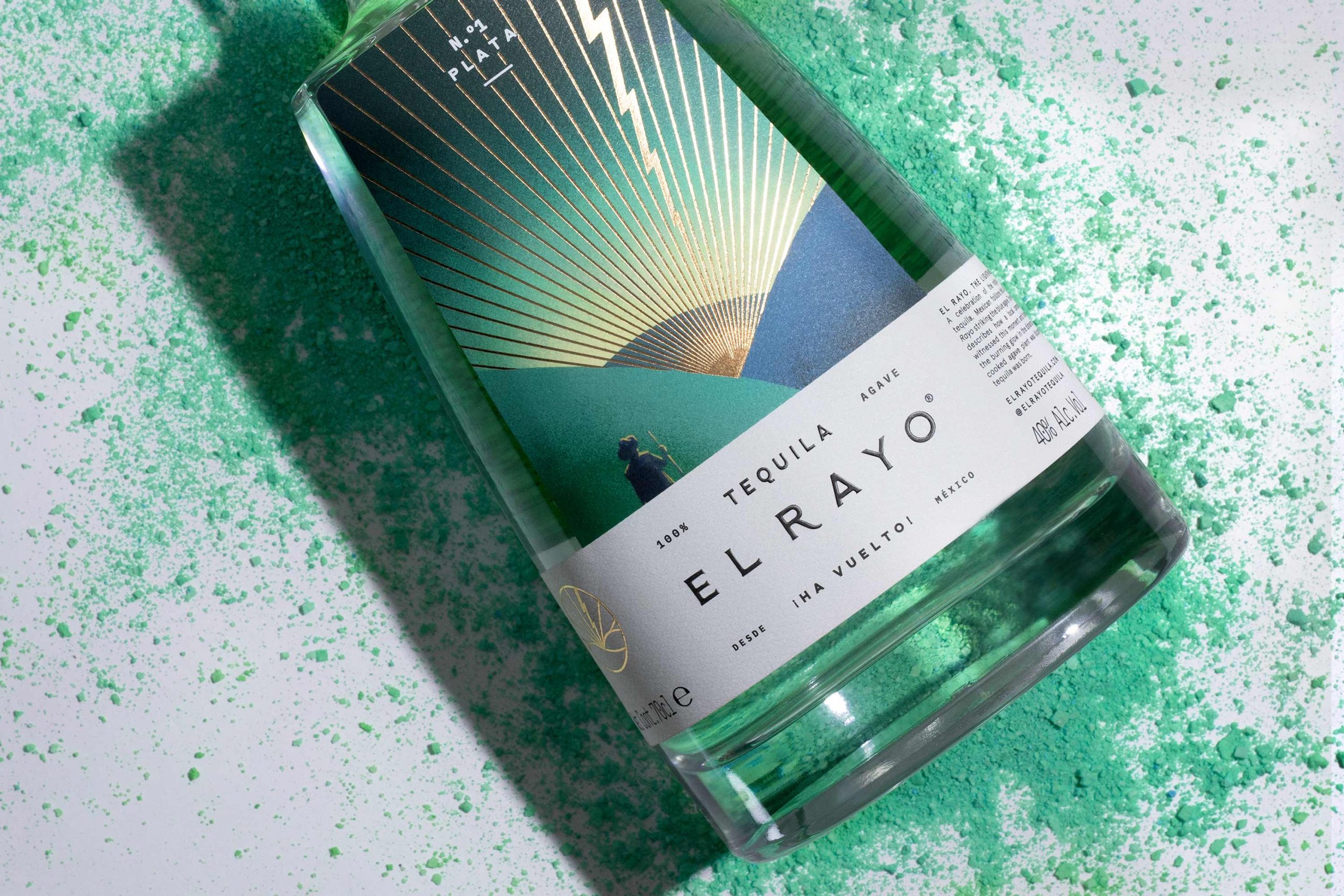
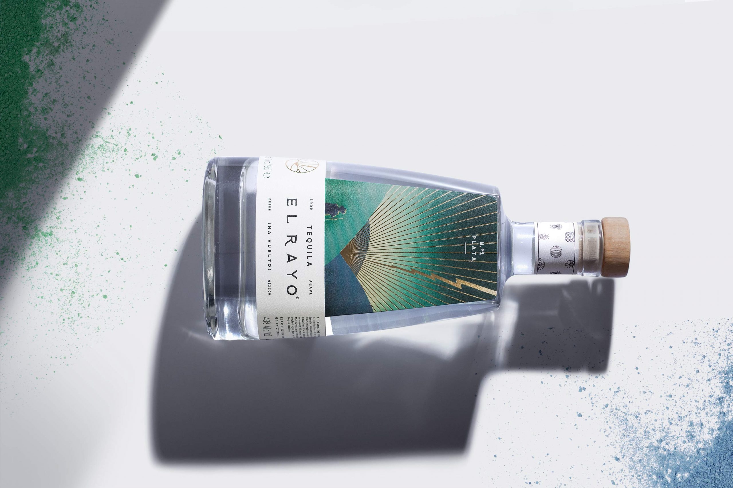
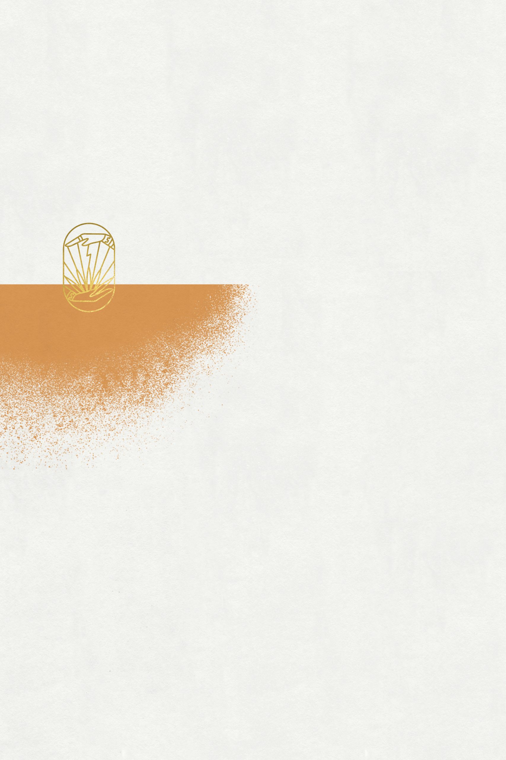
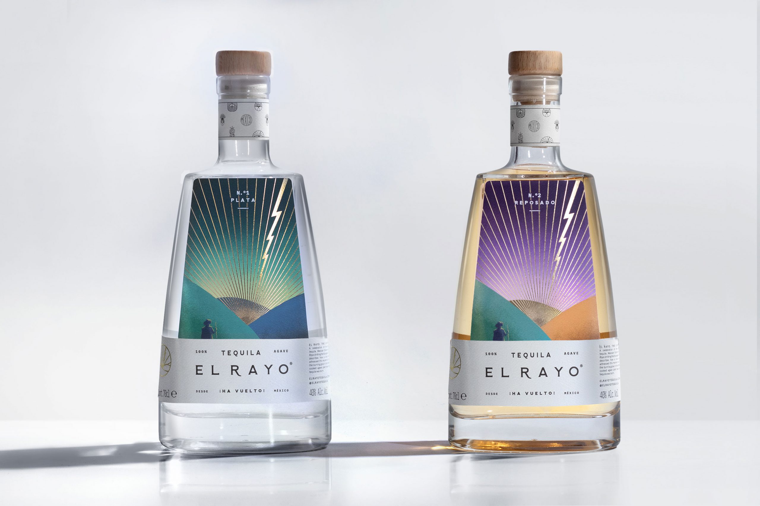
El Rayo (translated as thunderbolt) is a brand that aims to change tequila ́s perception in Europe. To dissolve the idea that the drink serves the sole purpose of inebriation. To promote the exuberance of the beverage ́s flavor from its origin to a globalized market. A twist in a classic product.
—
CREDITS
ART DIRECTION: MARIO HGNO BALLESTEROS
COPYWRITING: OLGA VILLEGAS, KAREN VIZCARRA
DESIGN: NUBIA FERNÁNDEZ, MARIO HGNO BALELSTEROS
PHOTOGRAHY: FREDY “EL GATO” MORFÍN
ABOUT
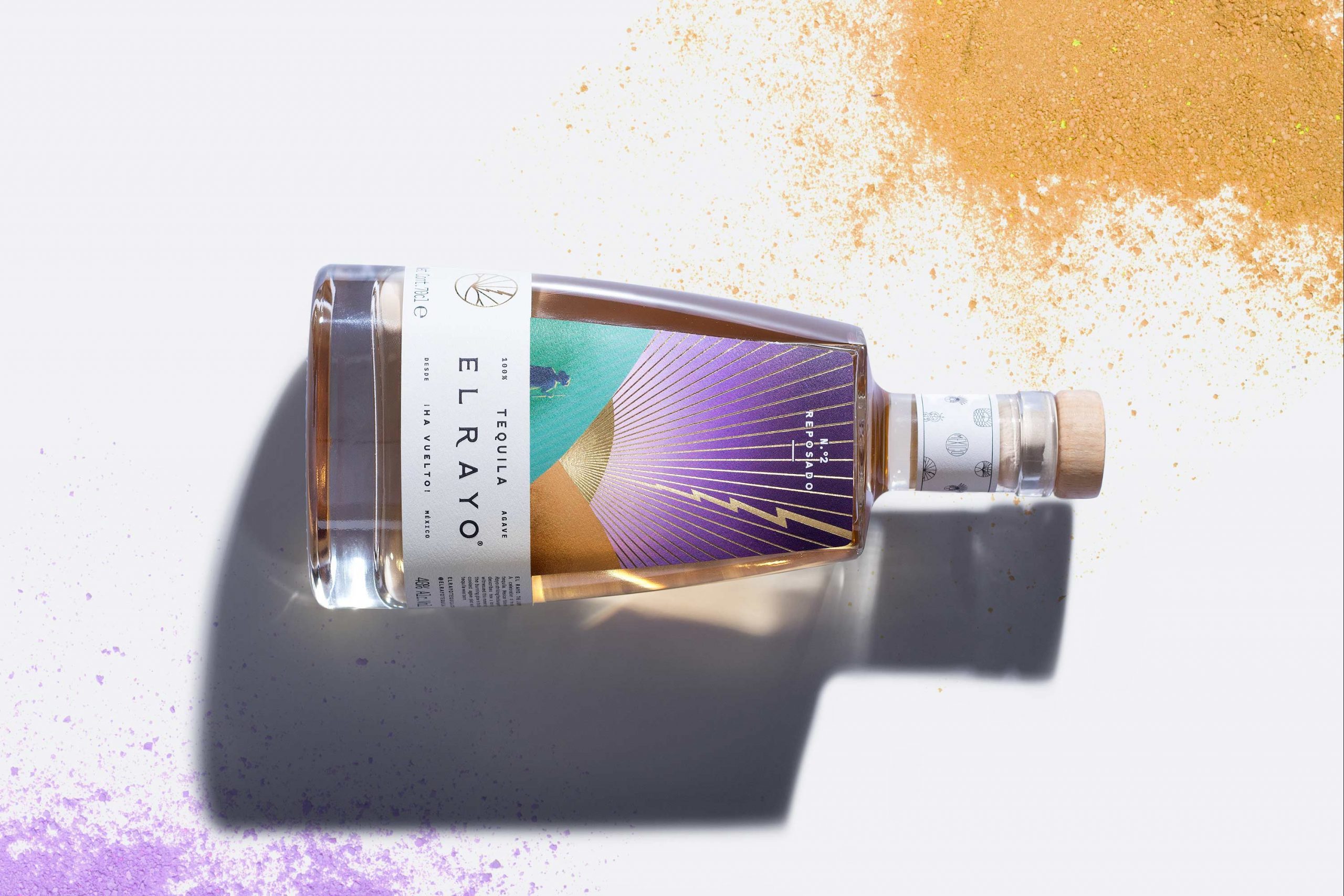
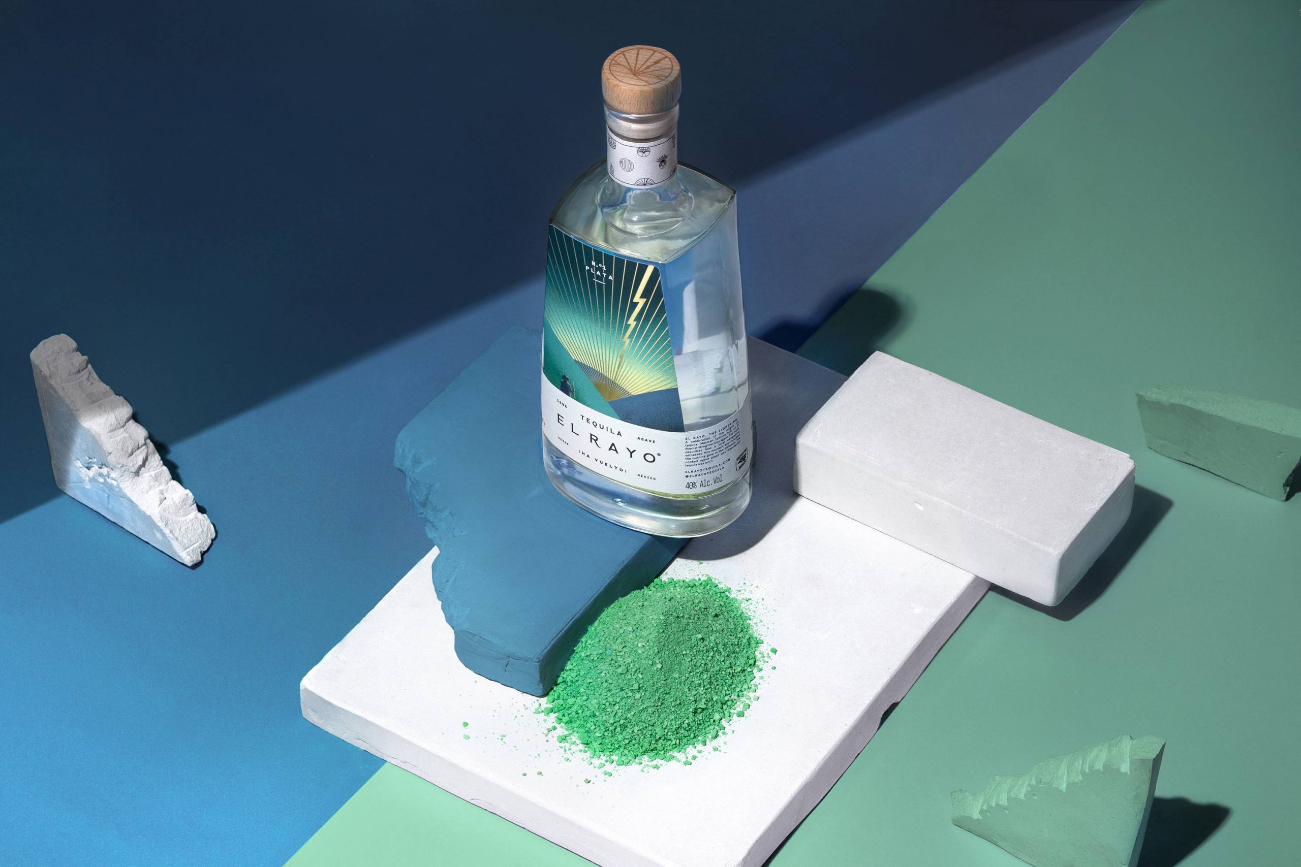
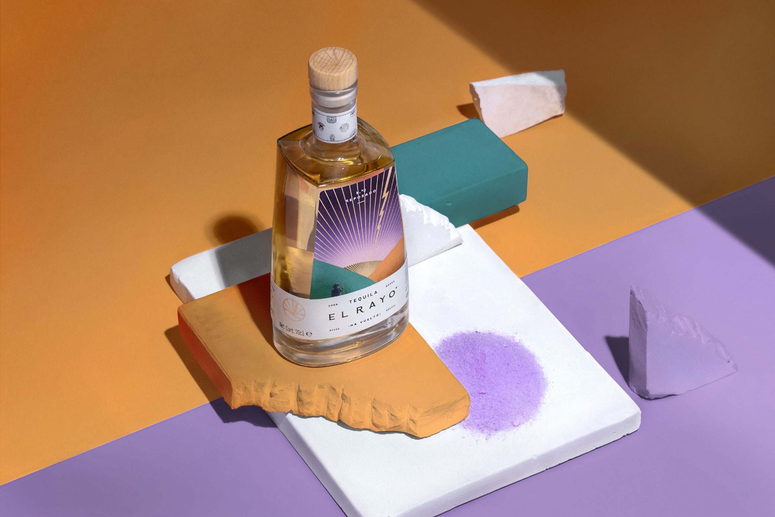
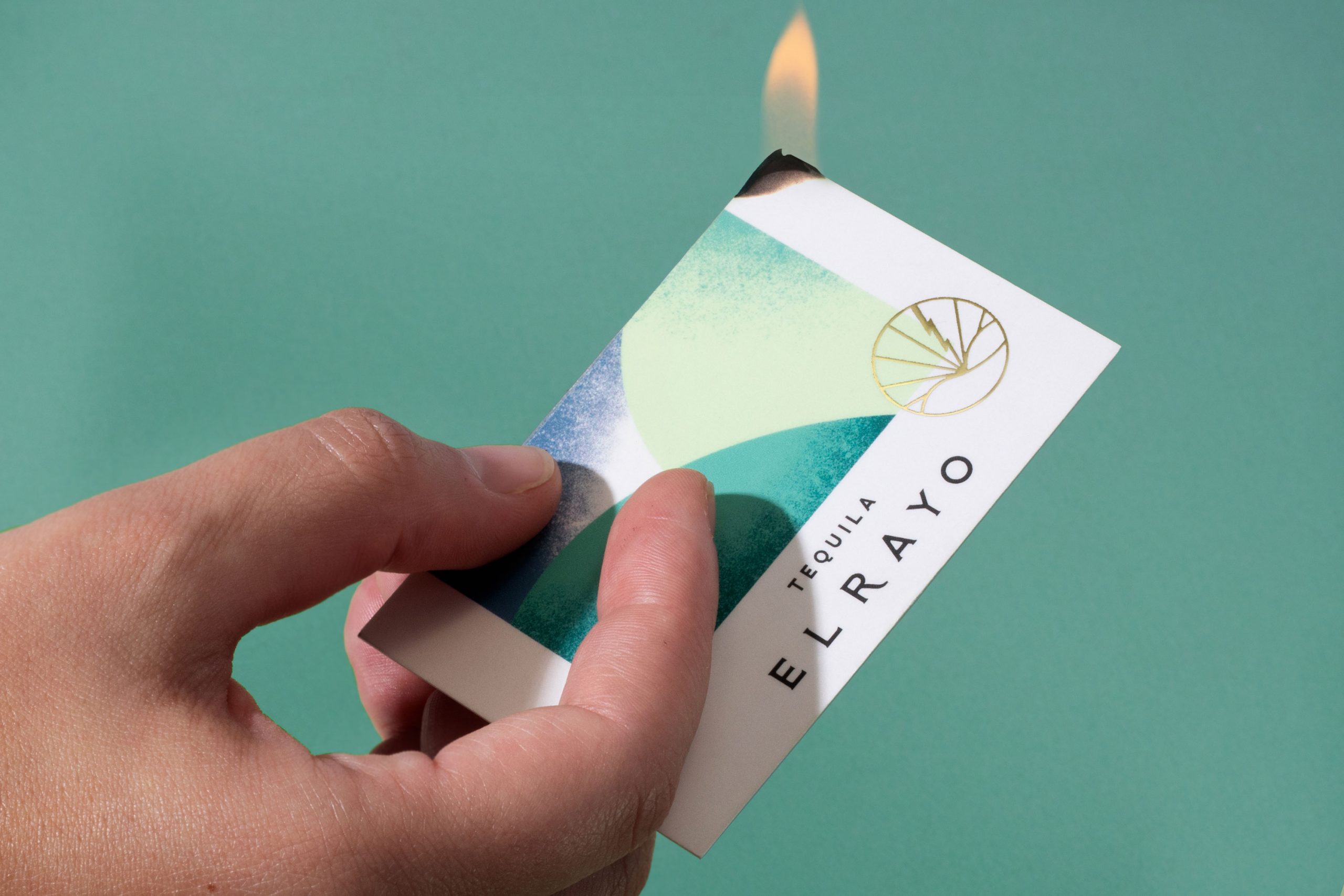
The base narrative is a fictional story about the ancient popular legend of the origin of tequila. In it a farmer crosses a field where he witnesses a lightning striking the core of an agave plant from where the drink, known today as tequila, flowed out of. We took the explorer archetype for the brand’s essence and it became the label ́s protagonist.
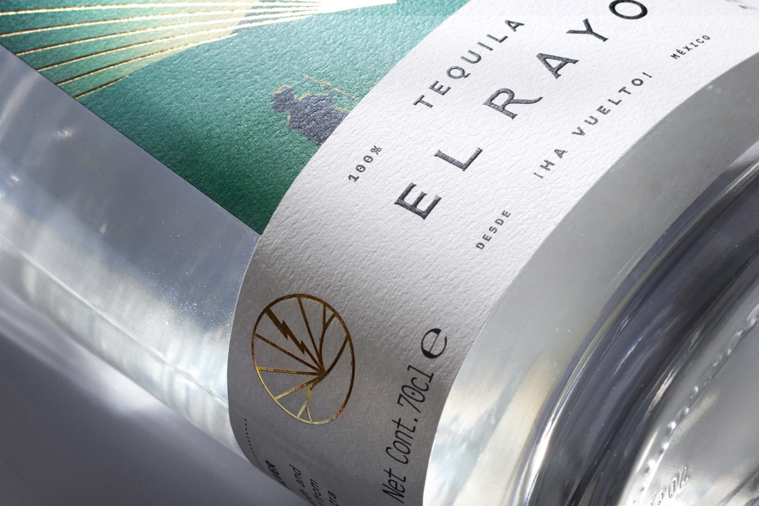
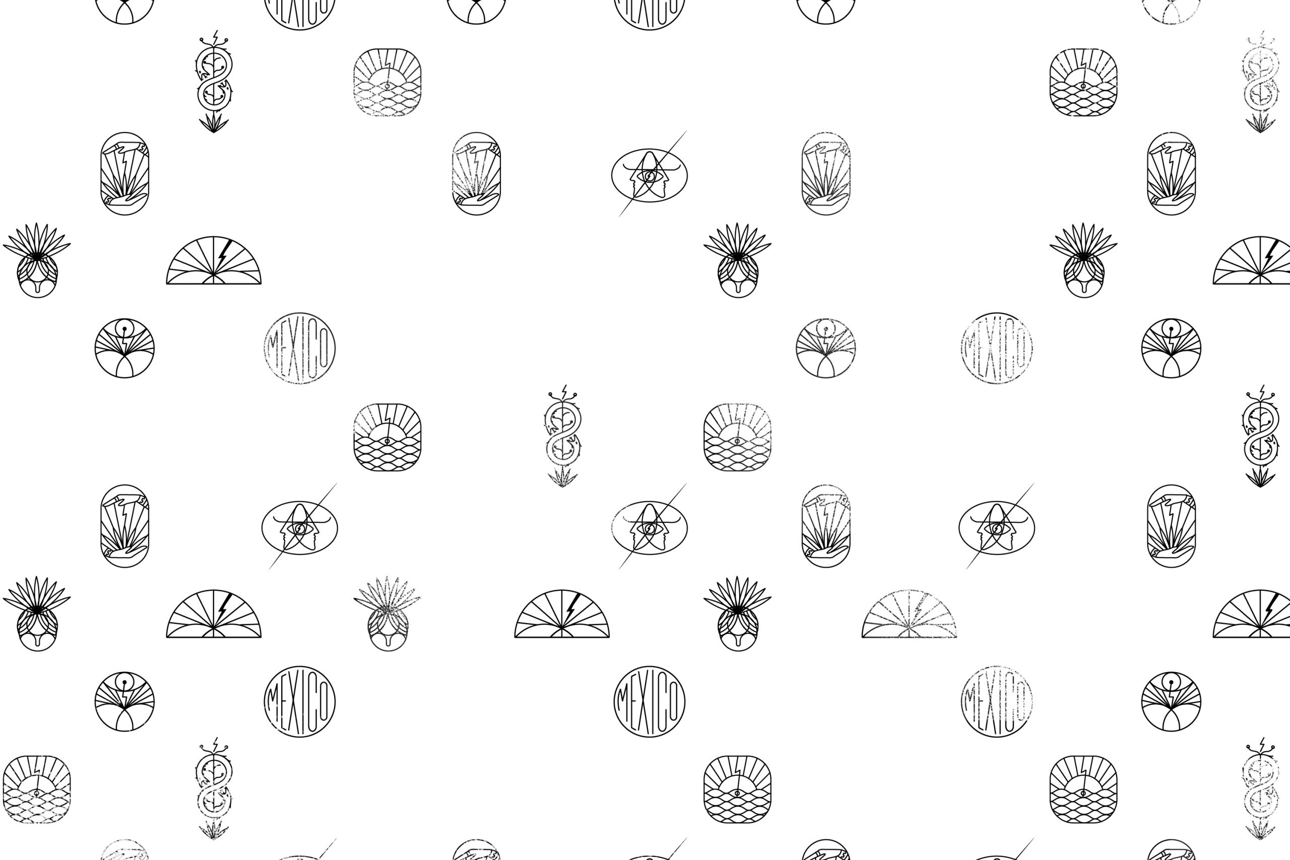
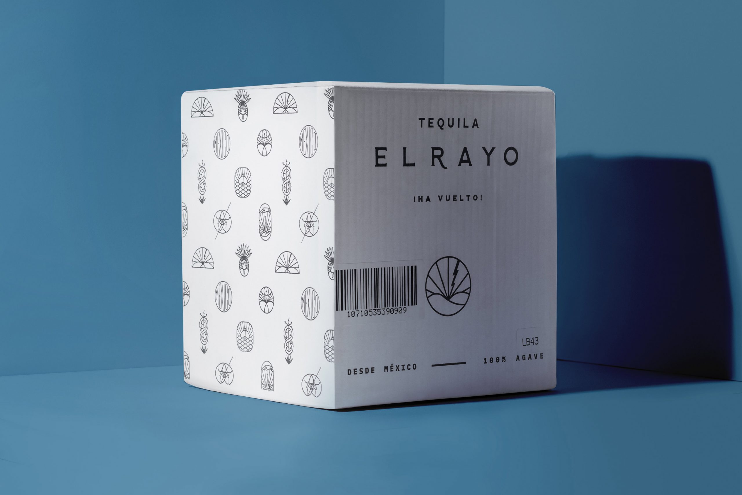
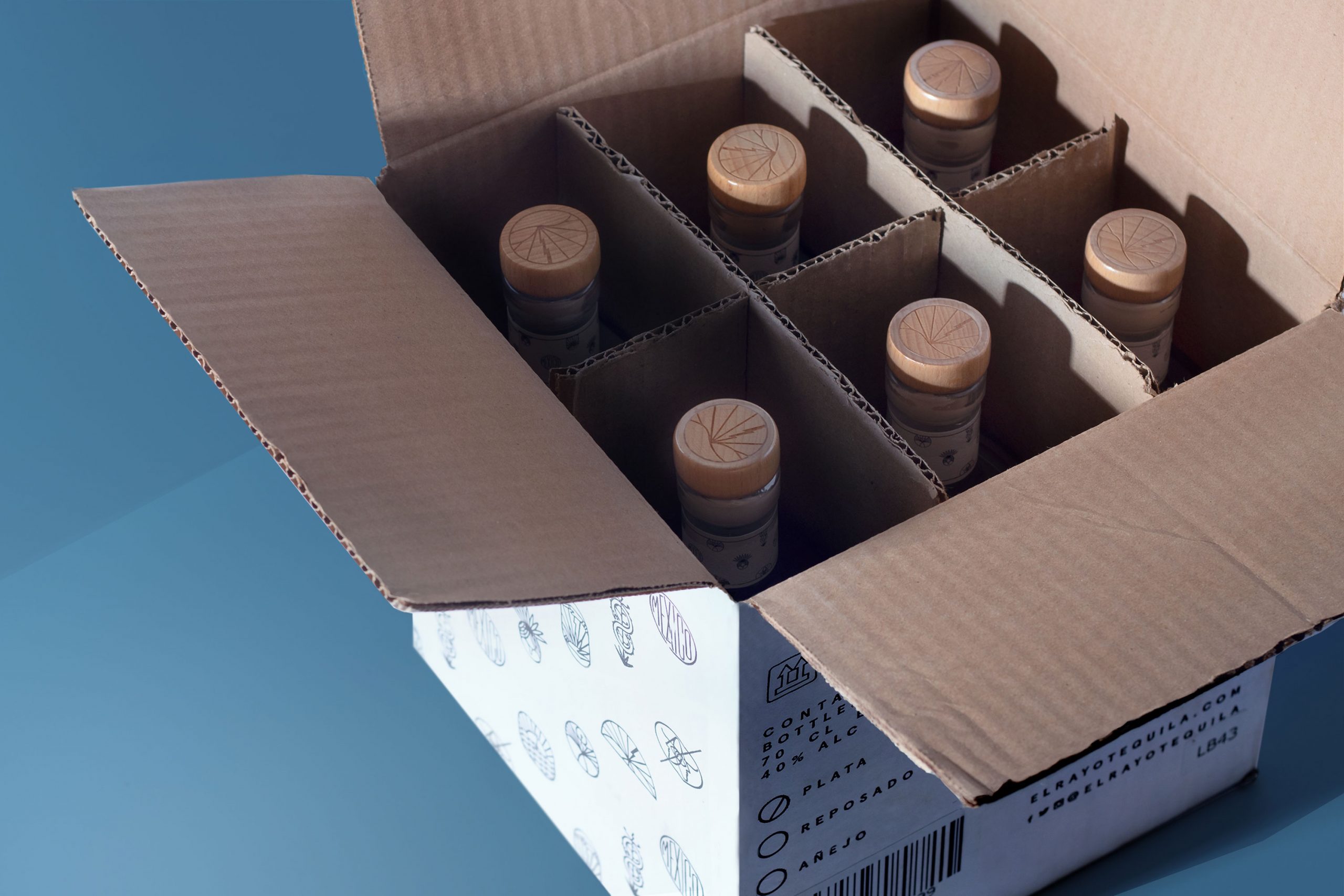
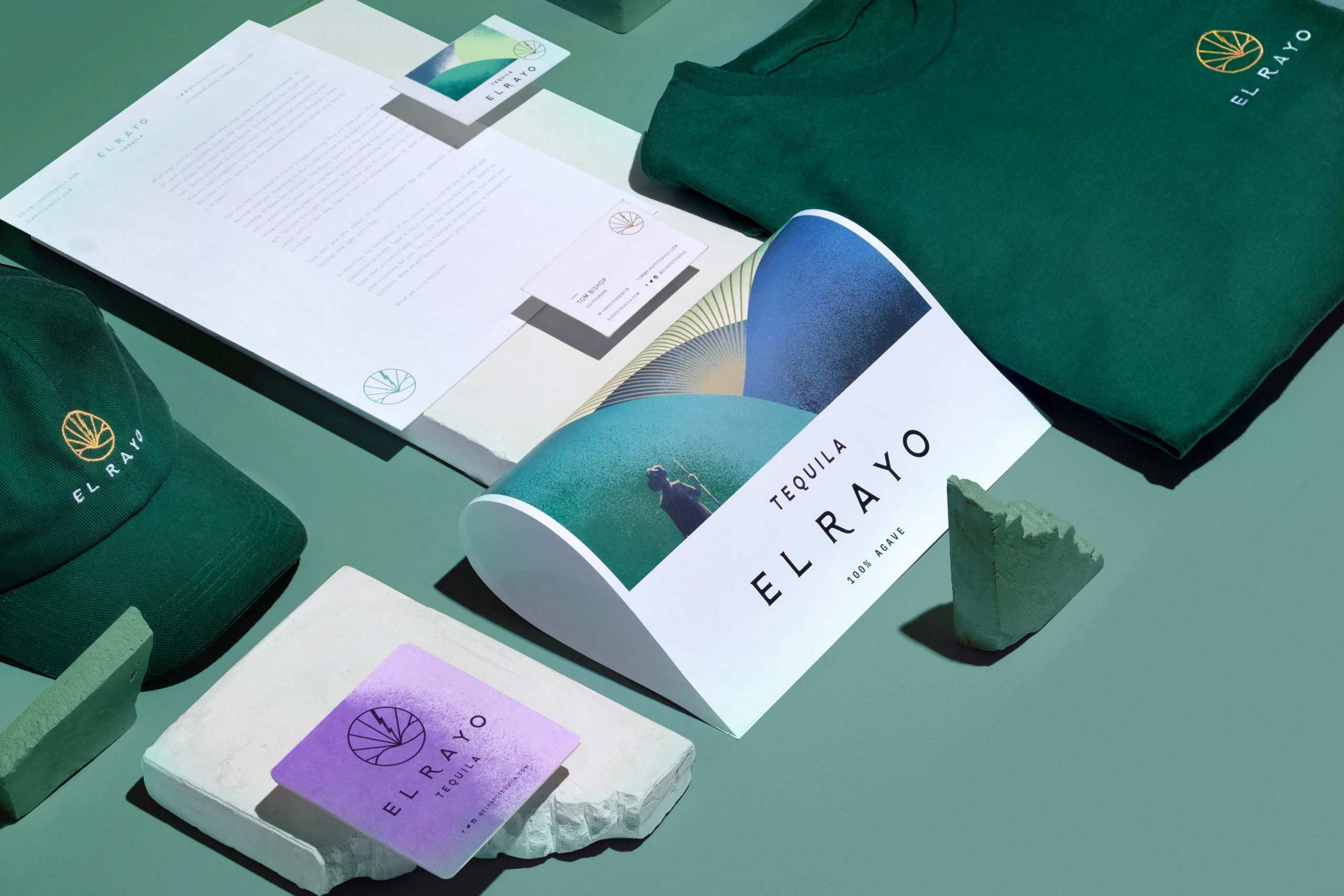
The identity was developed under a Mexican folk tale tone. Landscapes filled with Mexican fields walked by farmers that became the centerpiece of the brand ́s artwork. The big picture reminds us of the stories told in small towns, legends about enlightenment brought by the sky. Both the branding and packaging are filled with hints of pop art and a modern contemporary aesthetic, a substantial universe that was applied to the brand ́s collaterals.


SHARE THIS PROJECT