NĂHNYA
TEA PRODUCTS
—
NAMING, BRANDING, PACKAGING. 2017
NĂHNYA is a Mexican brand that involves tea, infusions and beauty products that are a blend of asian practices and hints of the mexican countryside.
—
CREDITS
ART DIRECTION: MARIO HGNO BALLESTEROS
COPYWRITING: OLGA VILLEGAS, KAREN VIZCARRA
DESIGN: LILIAN NAVARRO, MARIO HIGINIO BALLESTEROS
PHOTOGRAHY: MARIO HGNO, AMADEUS HERNÁNDEZ

NAMING
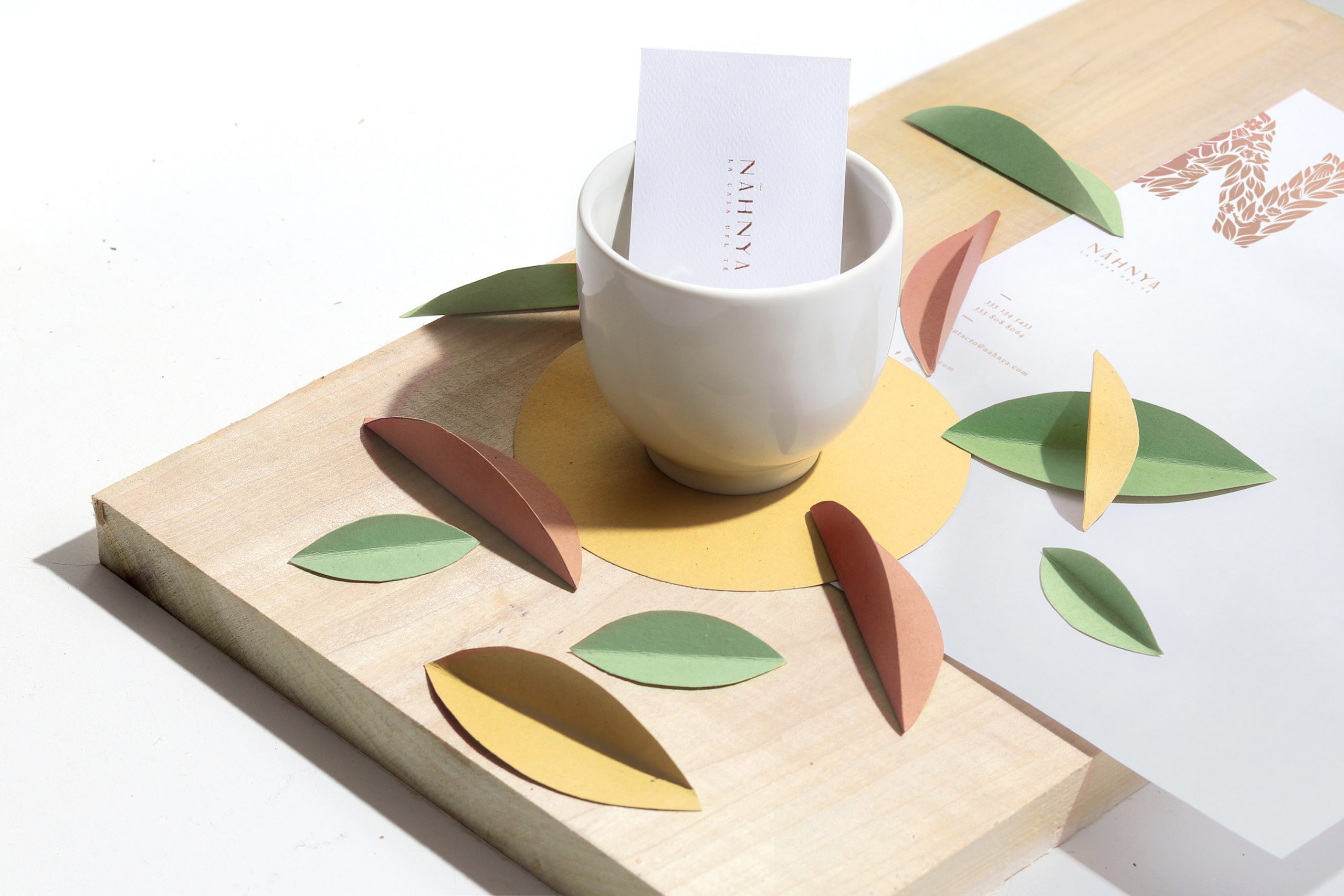
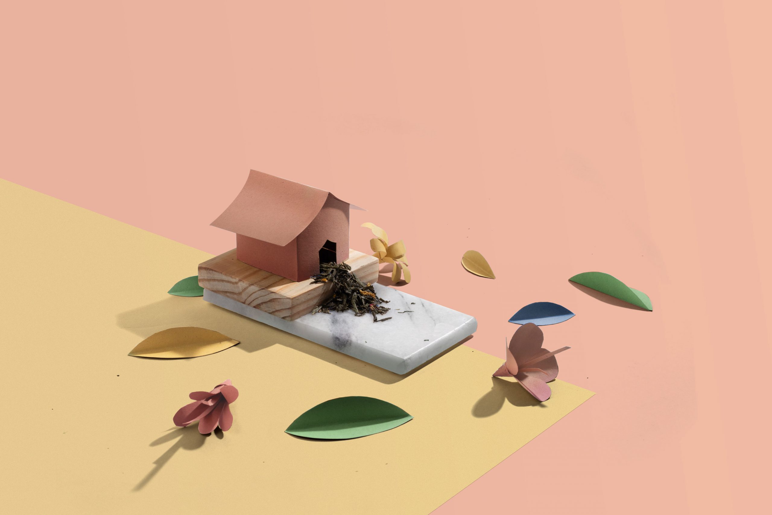
We developed the name following two concepts: nah- which means house in Mayan and nia which means ours in Esperanto. This feminine neologism with Pre-Columbian traits is an amulet that takes us back to our home.







BRAND SOLUTION
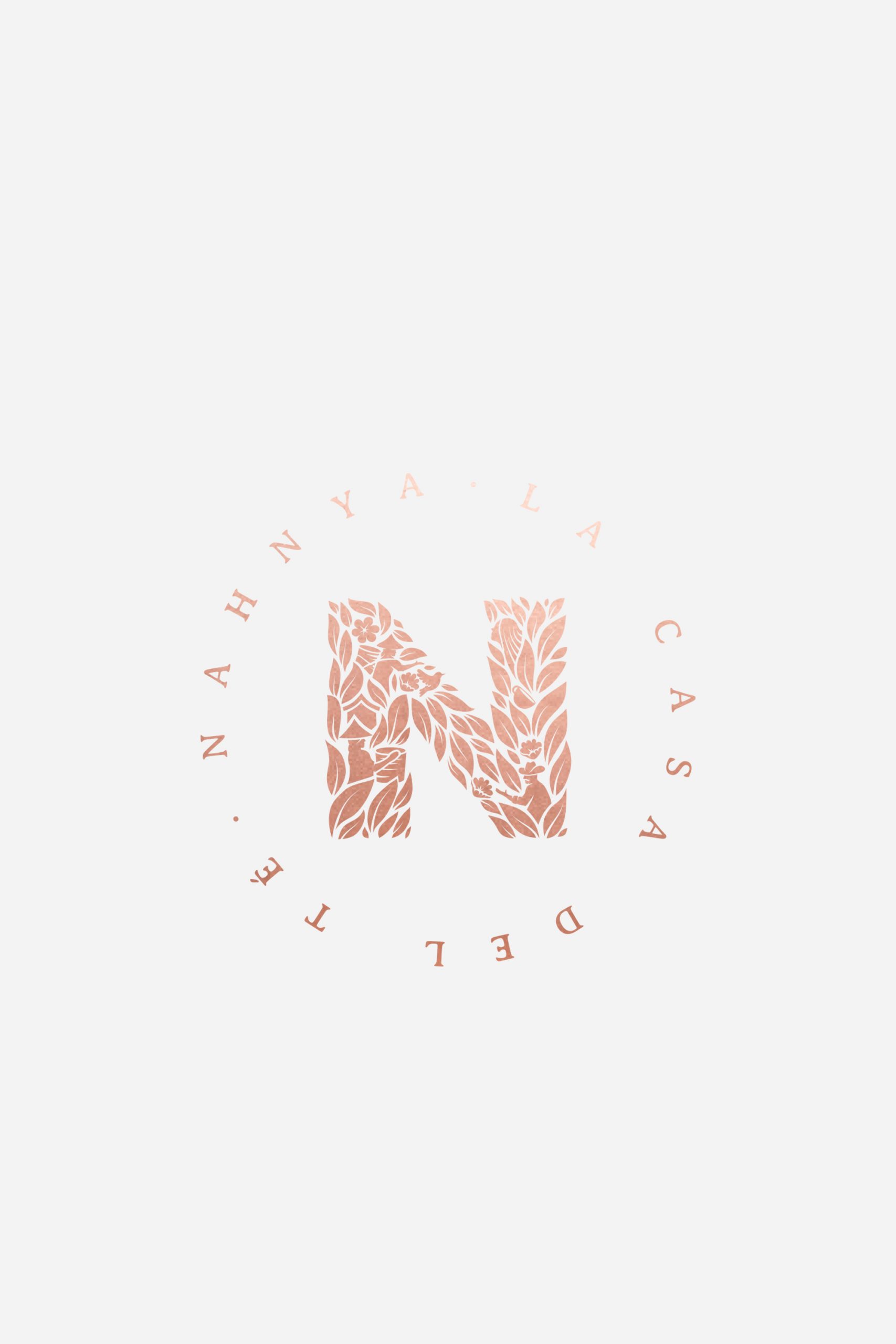
The graphic identity involves the connection of two worlds, two cultures through: camellia sinensis leaves (tea leaf), women who harvests leaves representing the asian cultural part of the product, a local farmer who represents the Mexican cultural part of the brand. The flowers are all of the possibilities that can be made with tea as a base. The brand appeals to nature who is bountiful and provides products for our selfcare.




BRAND UNIVERSE
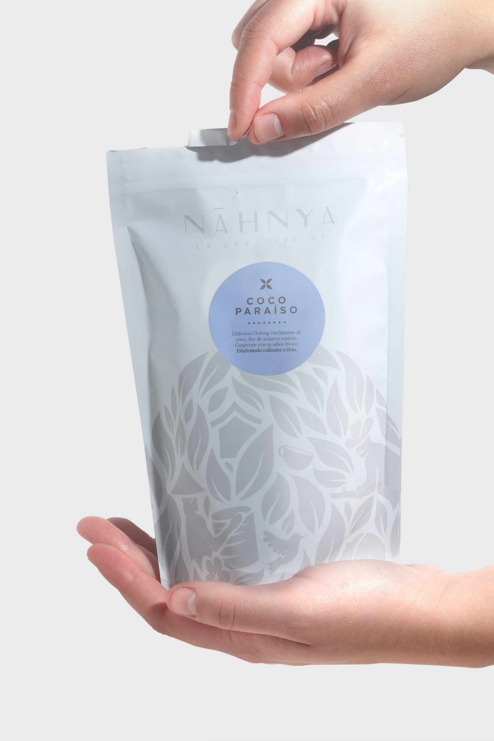
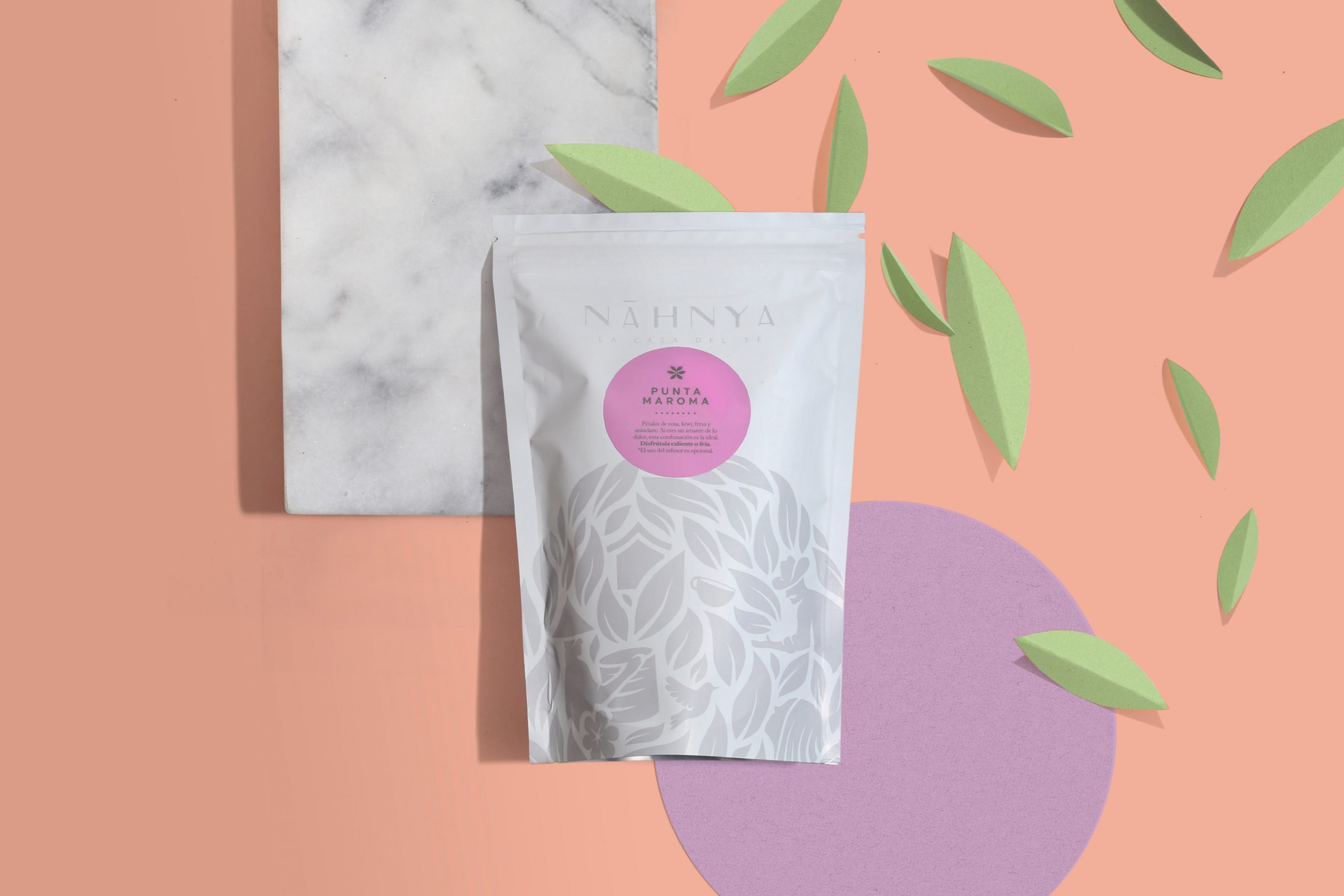
Besides working as a drinking-tea-brand, Nahnya® had to work as an on-going extension line of produces for wellness and beauty. Hence the need of creating a solid, easy identifiable system that could be flexible at the same time.


NARRATIVE EXTRACT
Tea reminds us of home. That safe and peaceful place that transcends the moment. Through small sips the spirit connects and with the last gulp the tea reveals itself and talks: it opens our conscience, it tells us that our inner home -our spirit-, connects with the outer home -our Earth-
SHARE THIS PROJECT