
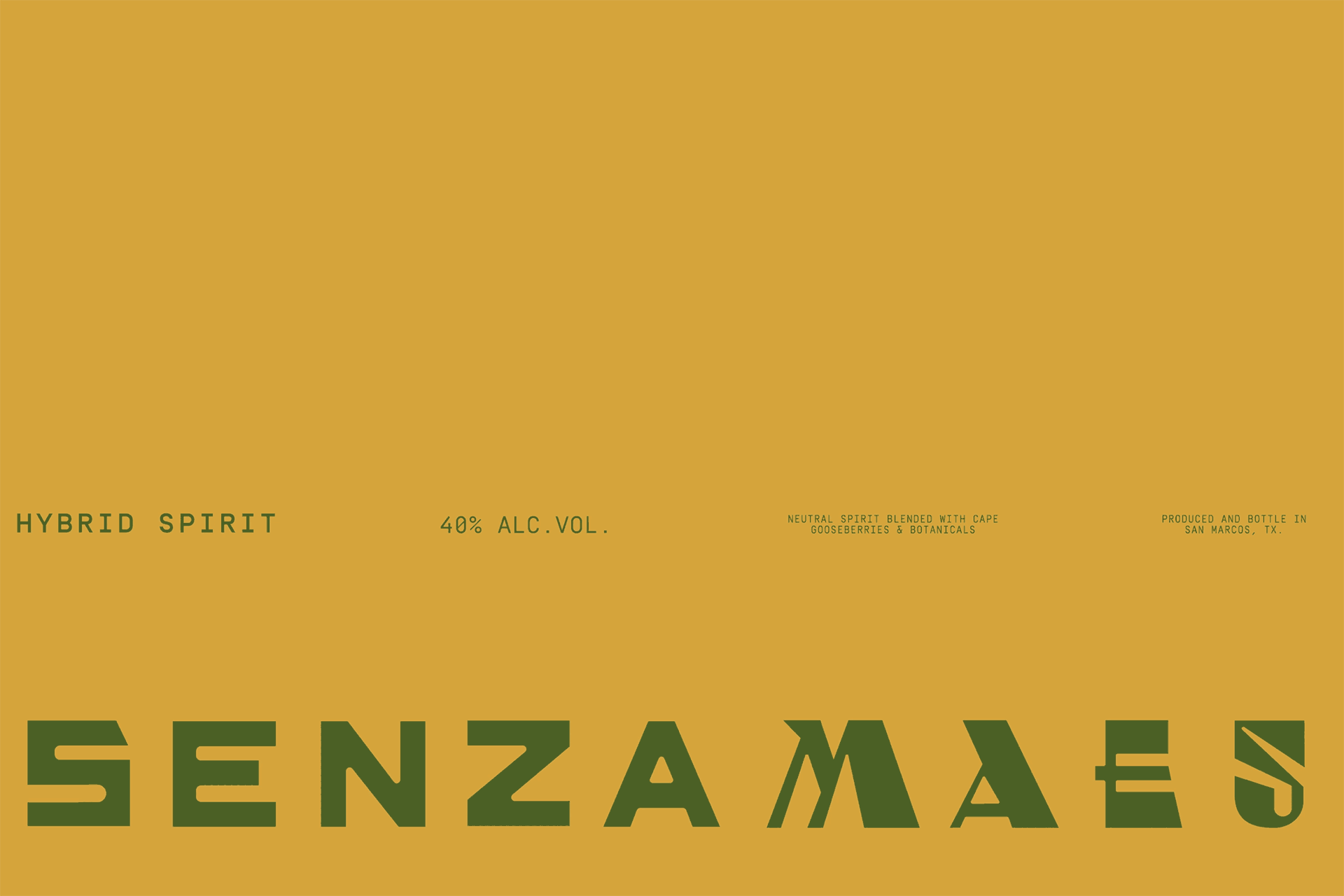
SENZA MAESO
HYBRID SPIRIT
—
BRANDING, PACKAGING. 2021
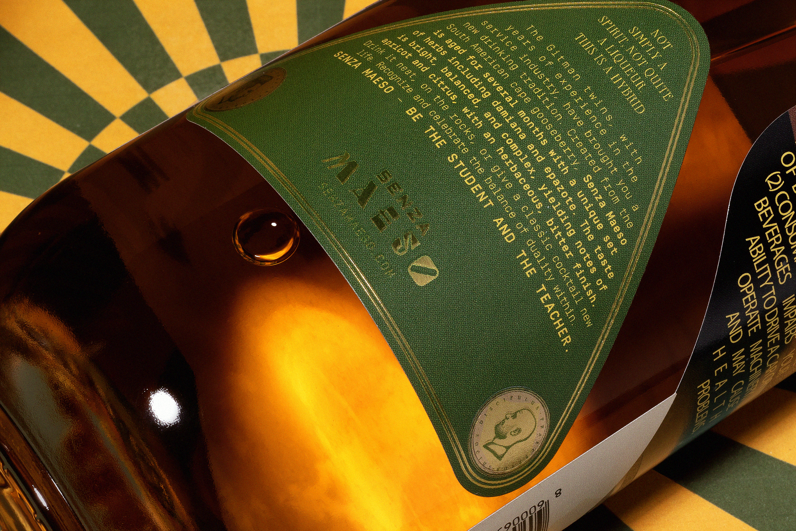
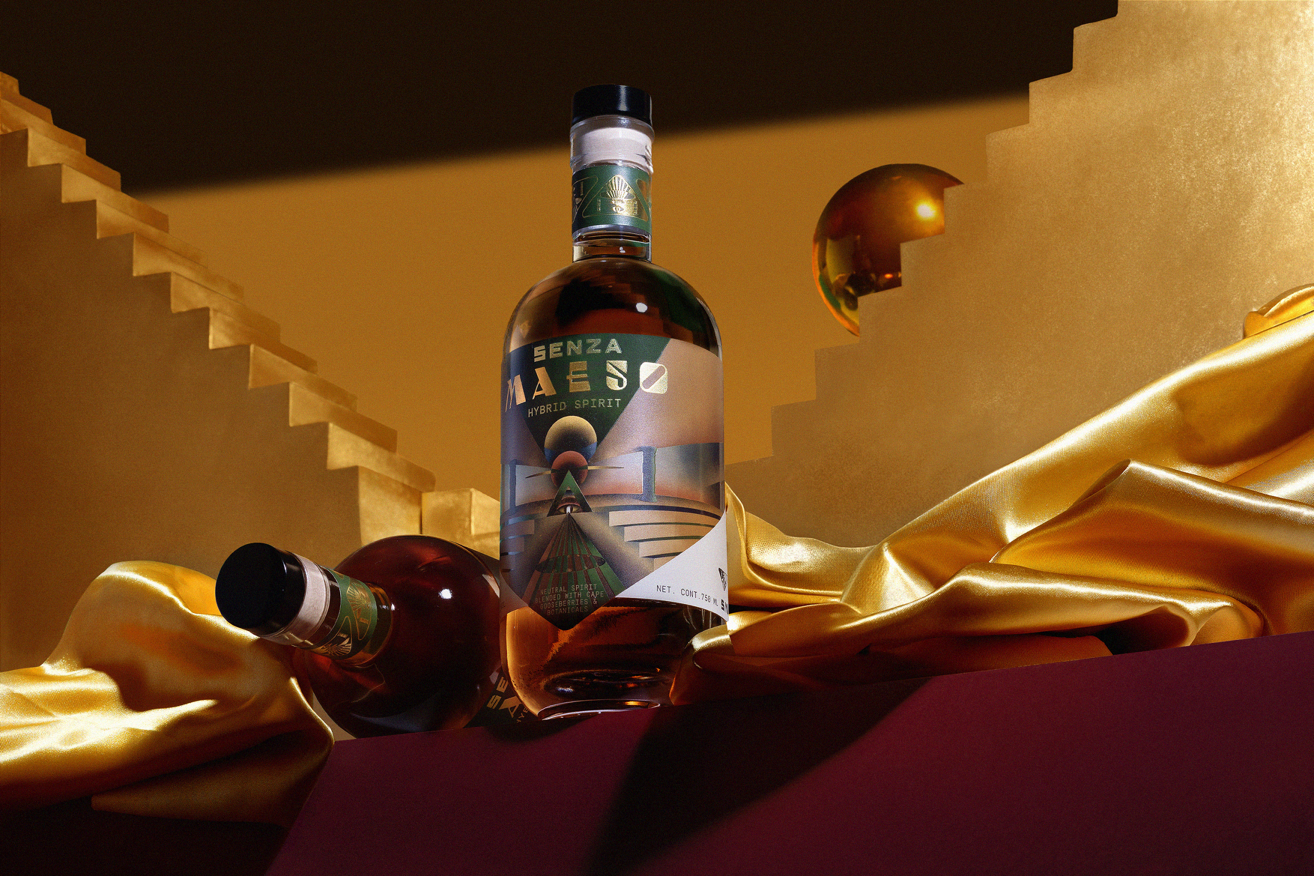
Senza Maeso® is not just another alcoholic drink; it’s a high-proof hybrid spirit crafted for mixology, with no sugar added and a bold, tangy profile that challenges expectations. Designed to transcend traditional categories, it explores the mystical realms of rebellion, occultism, and sci-fi aesthetics.
Launched in Austin, TX, by twin brothers Ryan and Jay Gitman, the brand embodies a dynamic duality. Ryan, a soulful musician, and Jay, a hardcore businessman, fuse their distinct energies to create a product that is as multifaceted as they are.
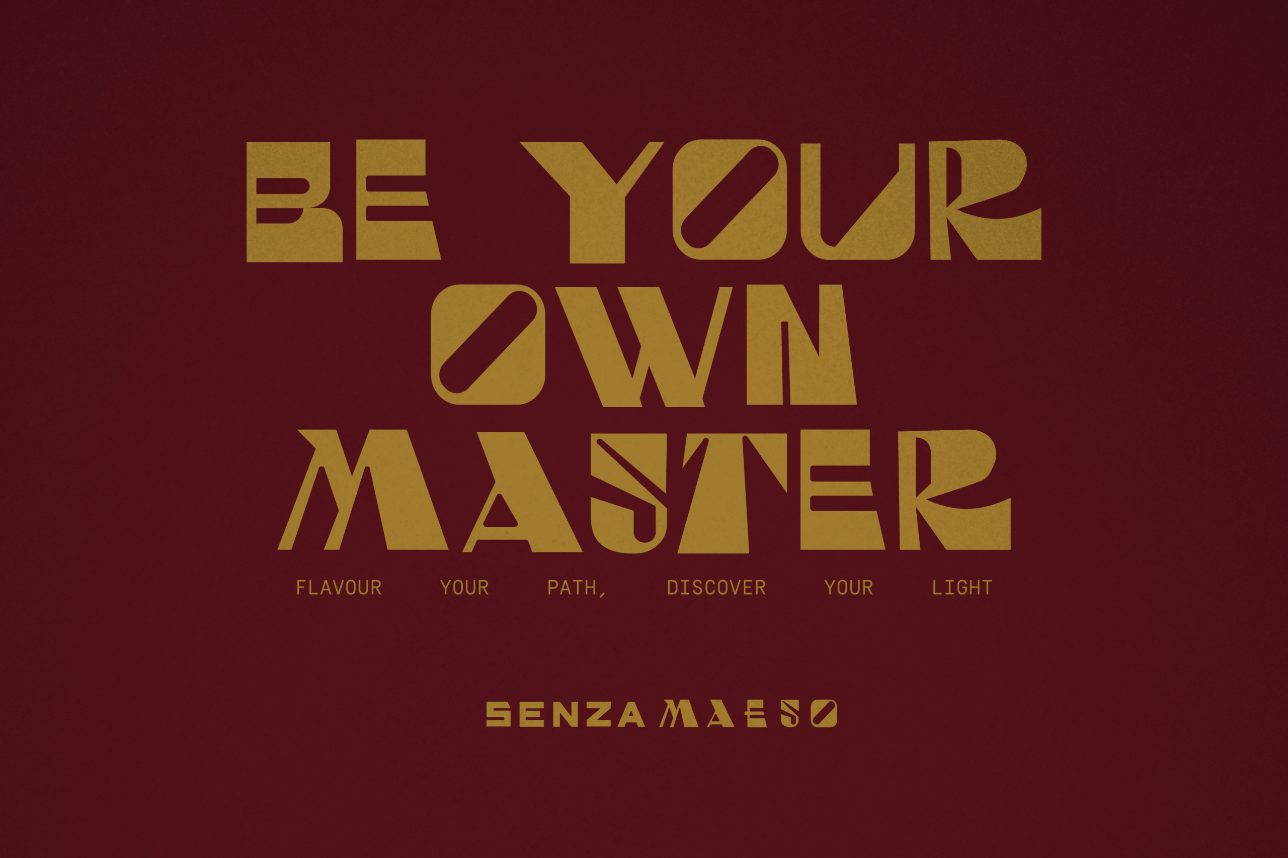
Infused with culturally significant ingredients like cape gooseberry, epazote, and damiana, Senza Maeso delivers a striking flavor experience that is both complex and versatile. Its sharp, vibrant notes make it a perfect canvas for innovative cocktails. More than just a liquor or spirit, Senza Maeso is an experience, a philosophy, and a challenge to conventional thinking—captured perfectly in the brand’s motto: “Be your own master, be your own student.
—
CREDITS
ART DIRECTION: MARIO HGNO BALLESTEROS
COPYWRITING: OLGA VILLEGAS, KAREN VIZCARRA
DESIGN: MARIO HIGINIO BALLESTEROS, SANDRA GARCÍA
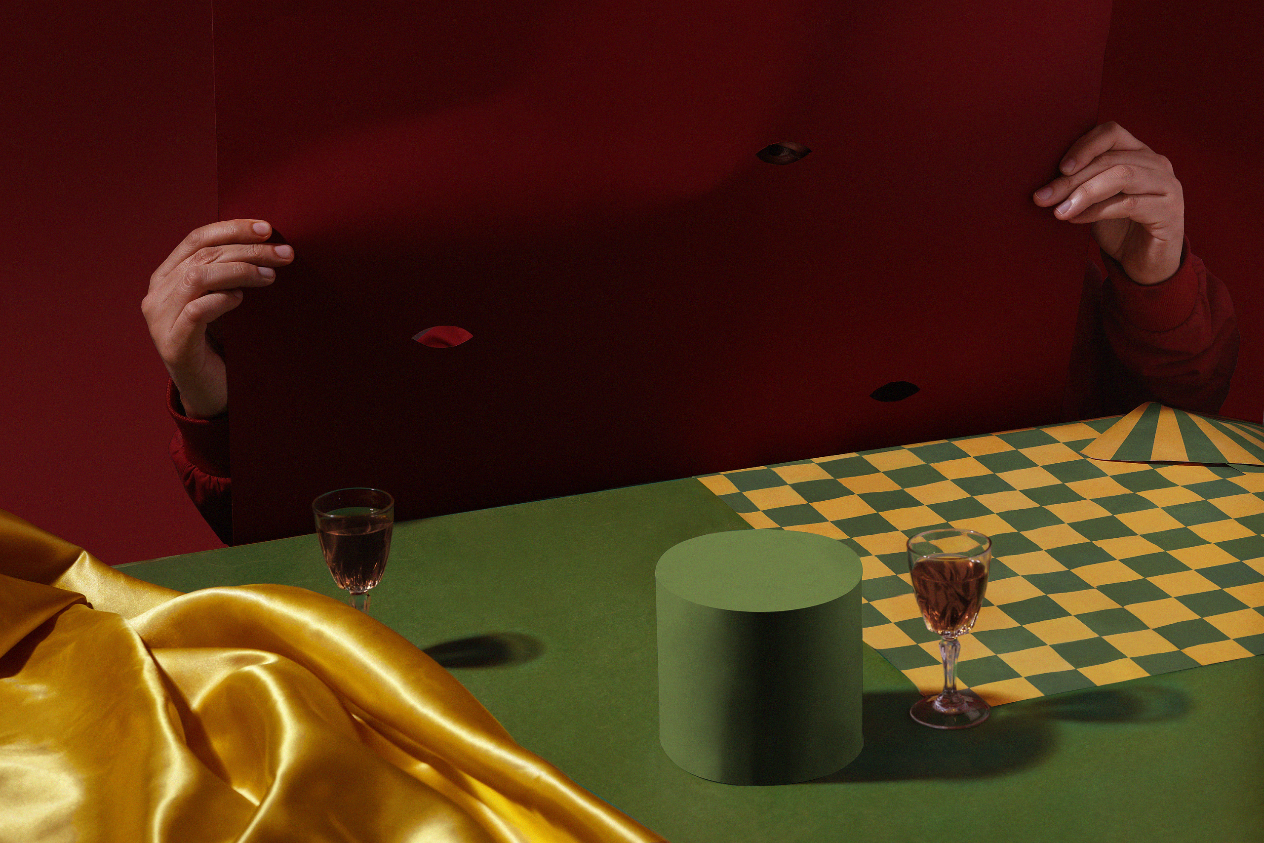
PHOTOGRAHY: FREDY “EL GATO” MORFÍN
EDITION: CARO BALLESTEROS
ANIMATIONS: FREDY “EL GATO” MORFÍN
CHALLENGE
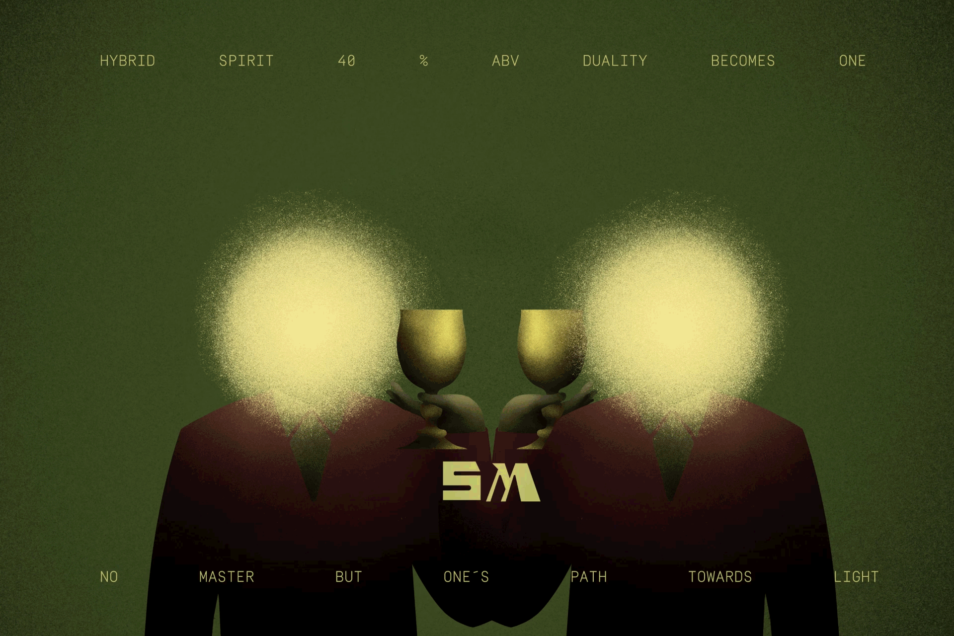
The primary challenge for our team was to encapsulate the complex duality and the mystical, rebellious spirit of Senza Maeso into a cohesive and compelling brand identity. The brand required a visual and narrative system that not only represented its eclectic blend of cultural ingredients but also resonated with the deeper, philosophical underpinnings of its name and ethos. We needed to craft an identity that would communicate the brand’s core essence: the tension between dark and light forces, and the journey towards self-enlightenment amidst these opposing energies.
BRAND SOLUTION
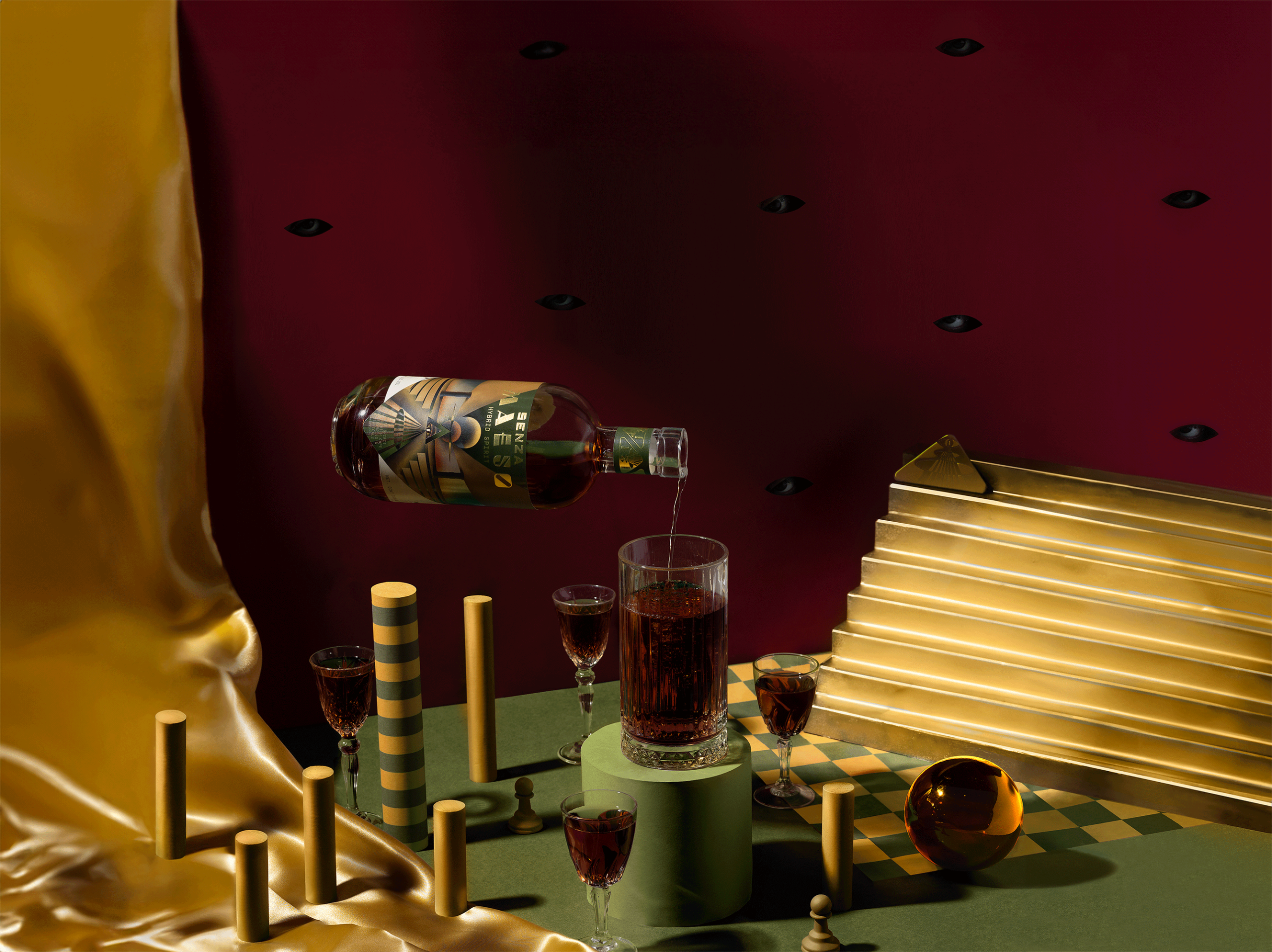
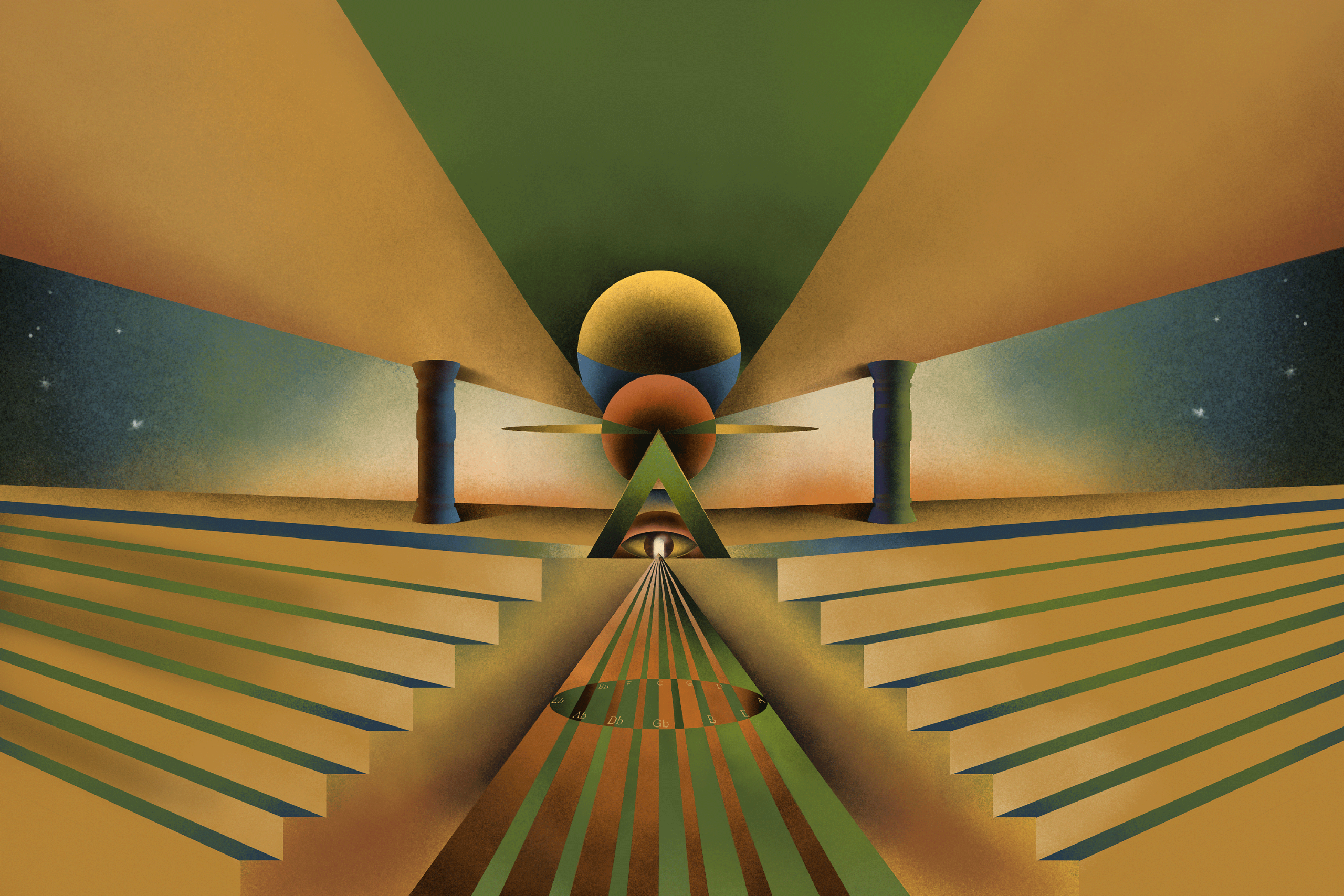
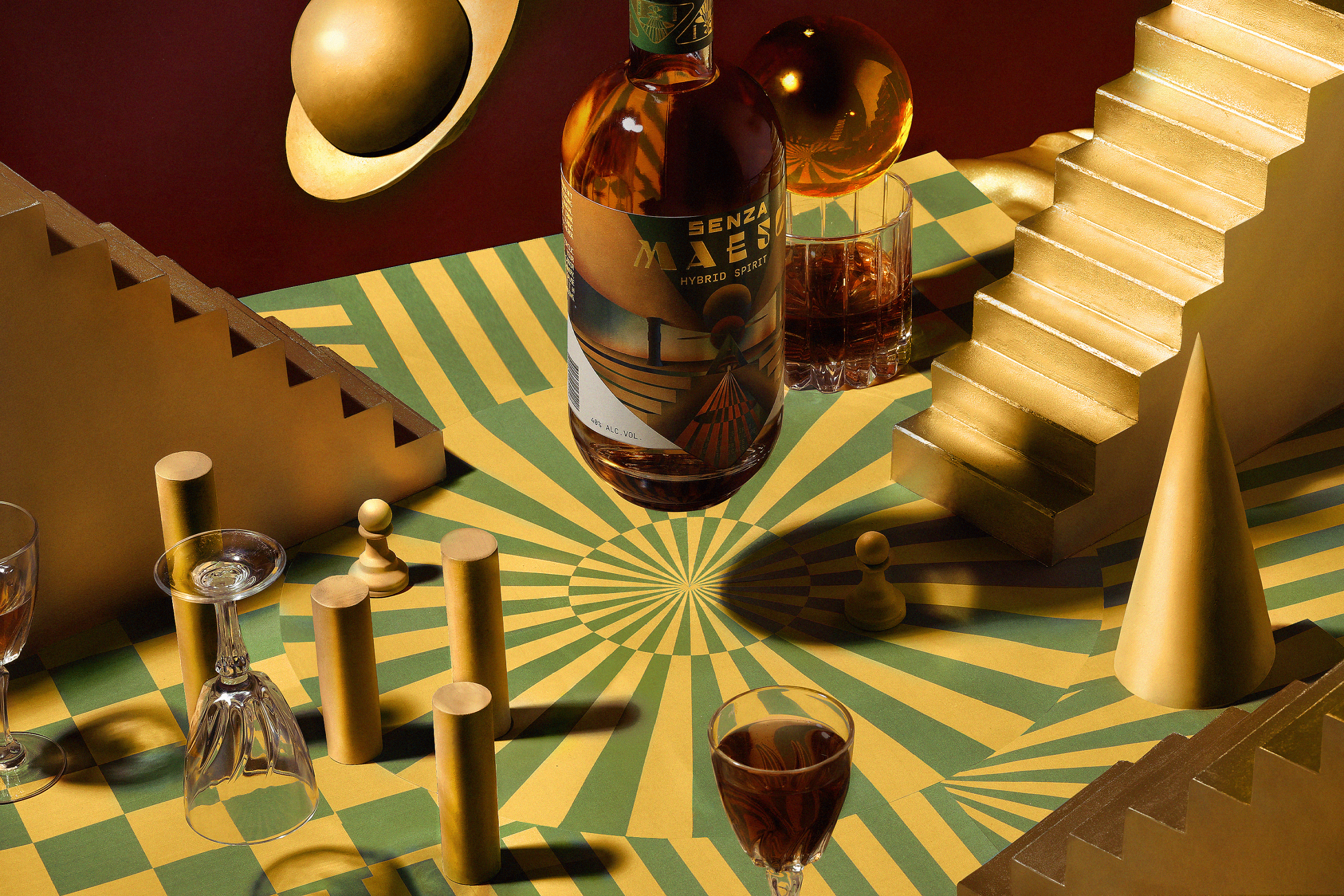
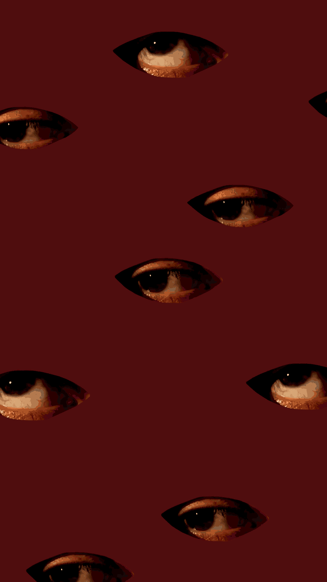
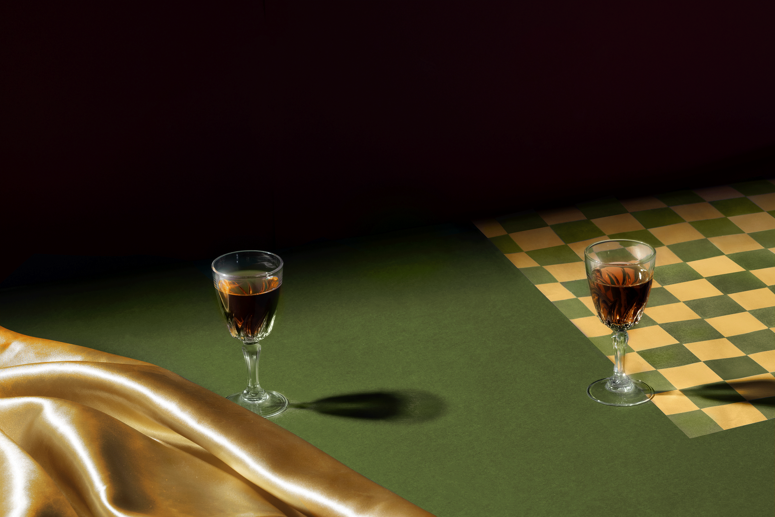
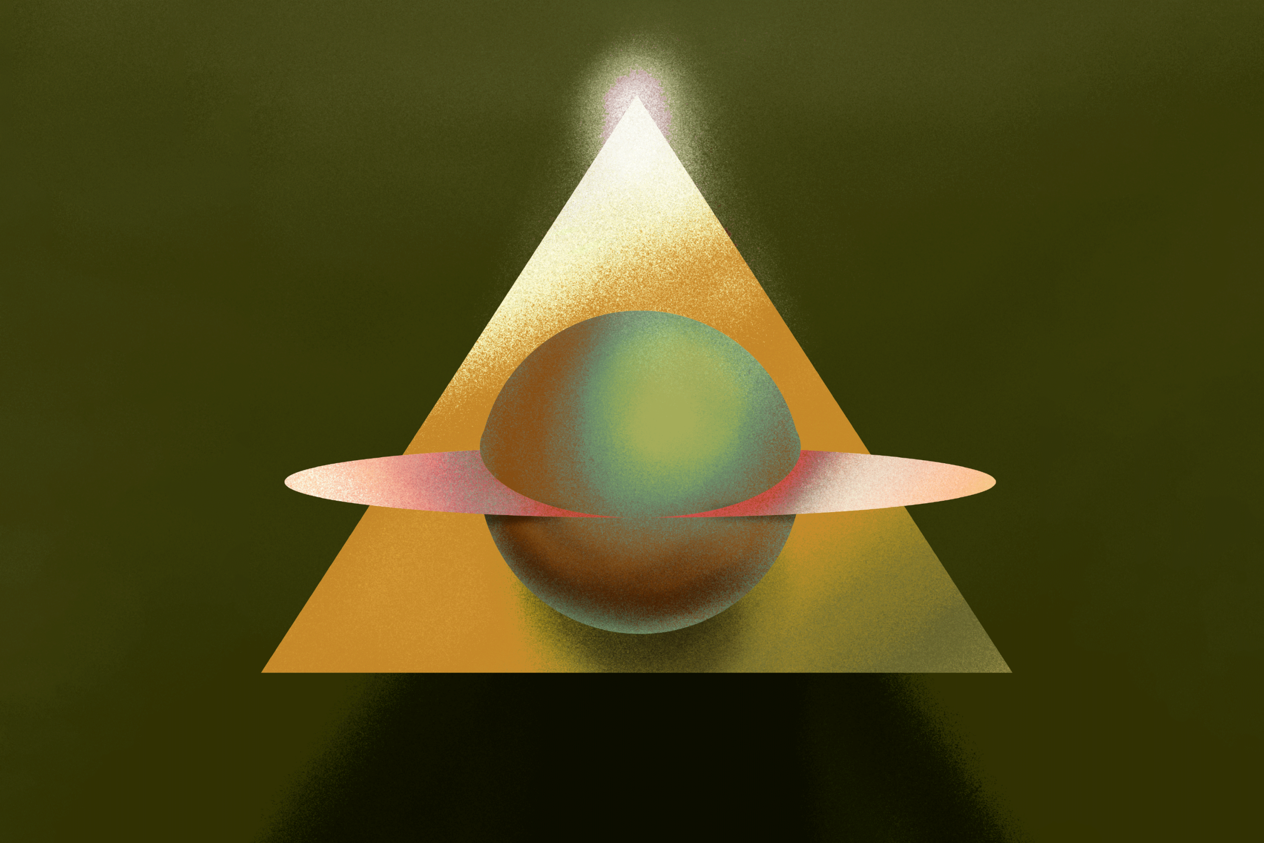
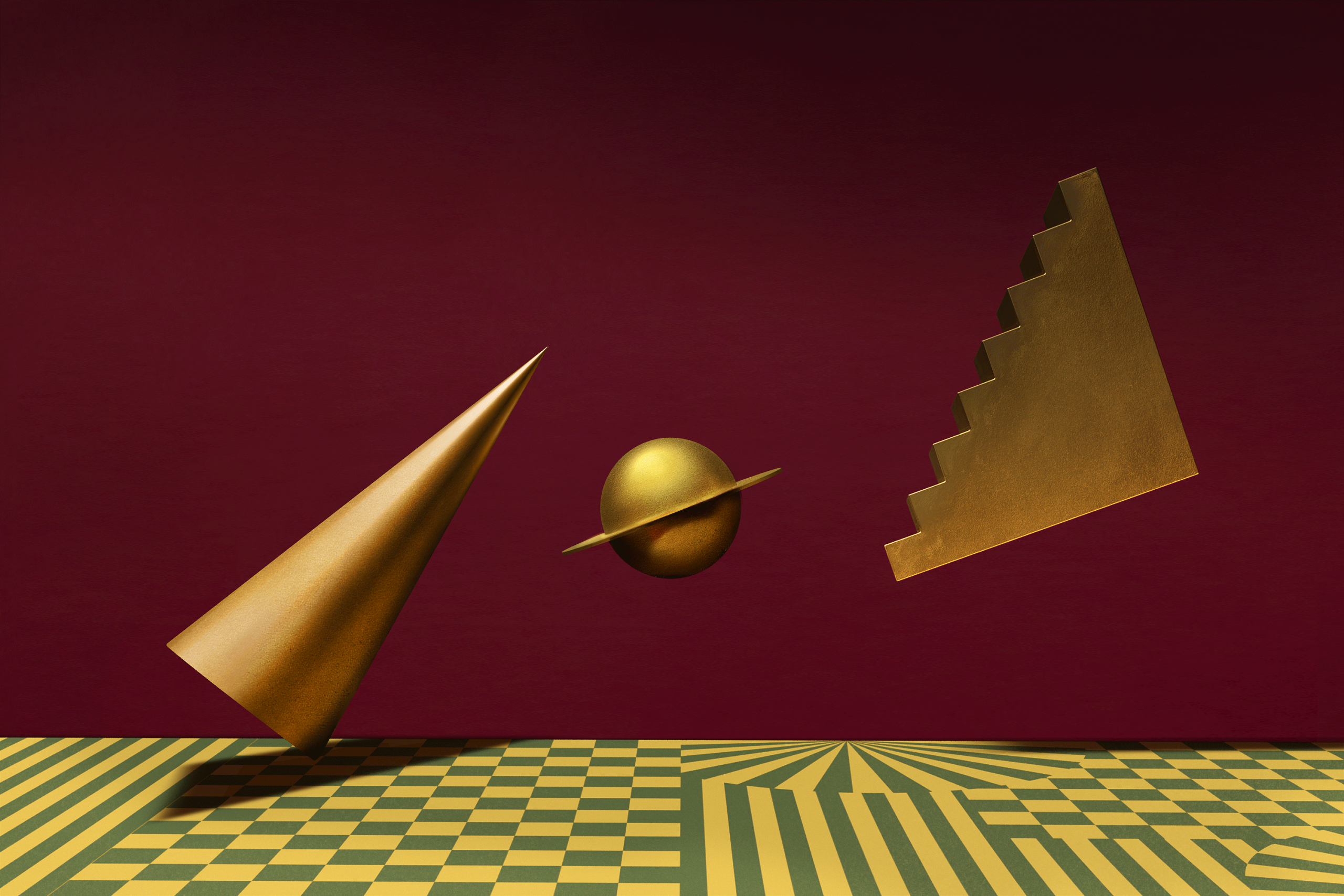
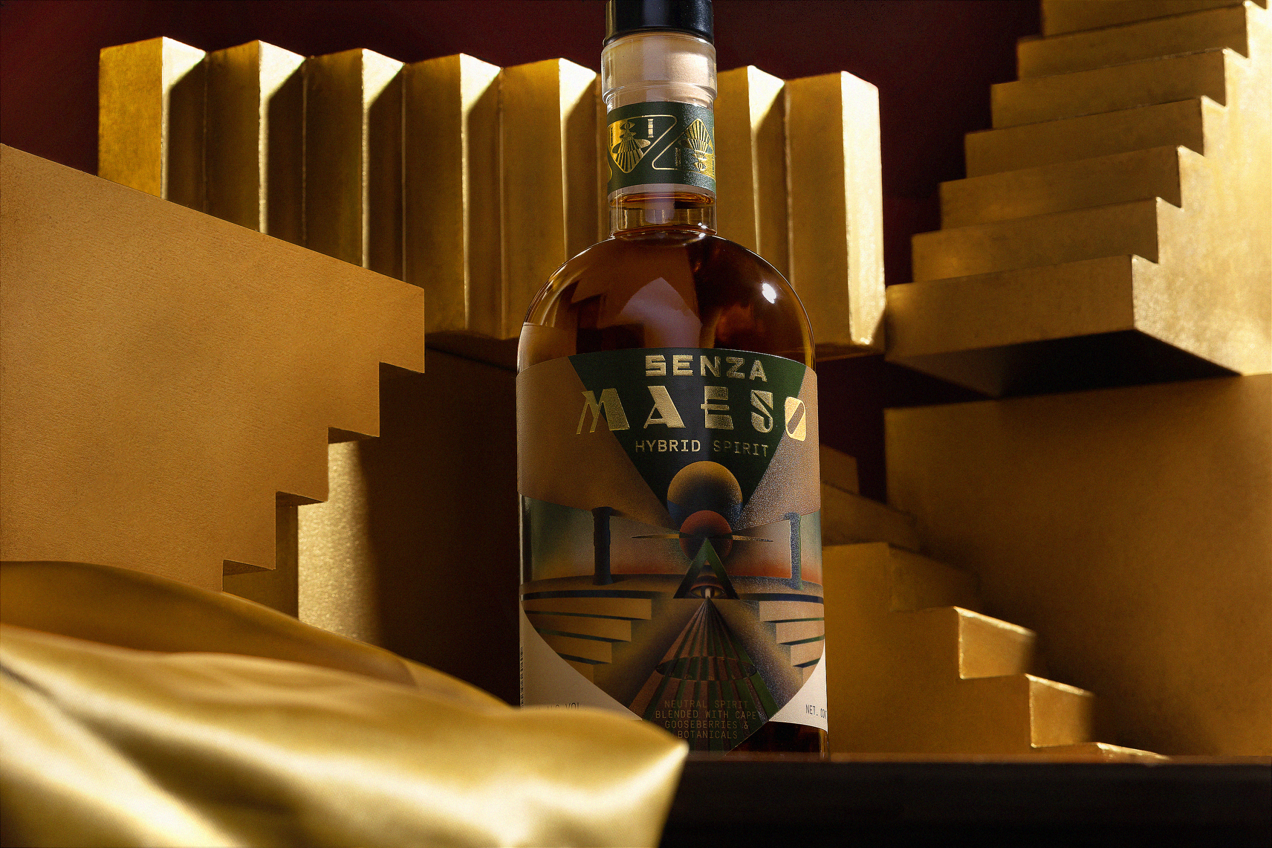
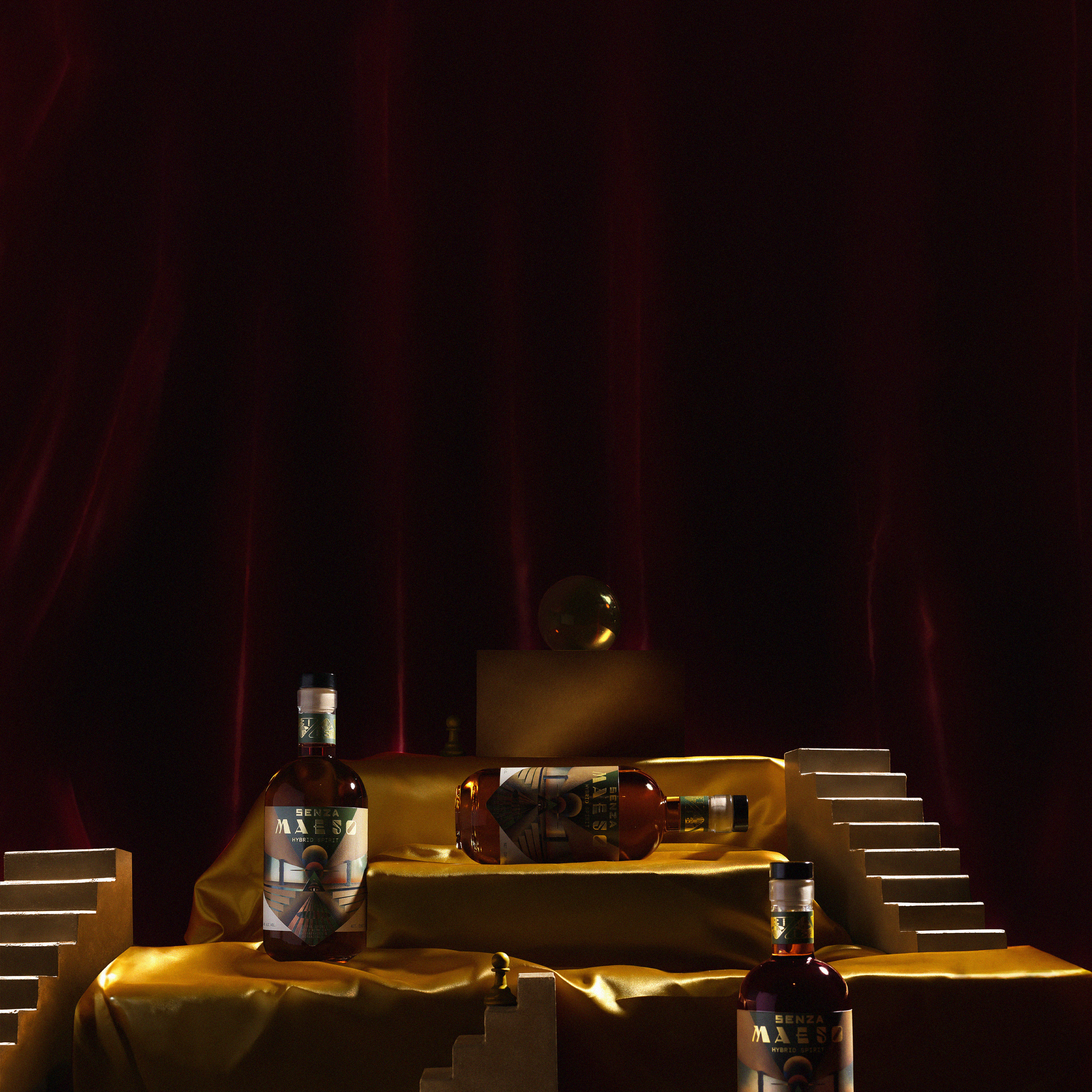
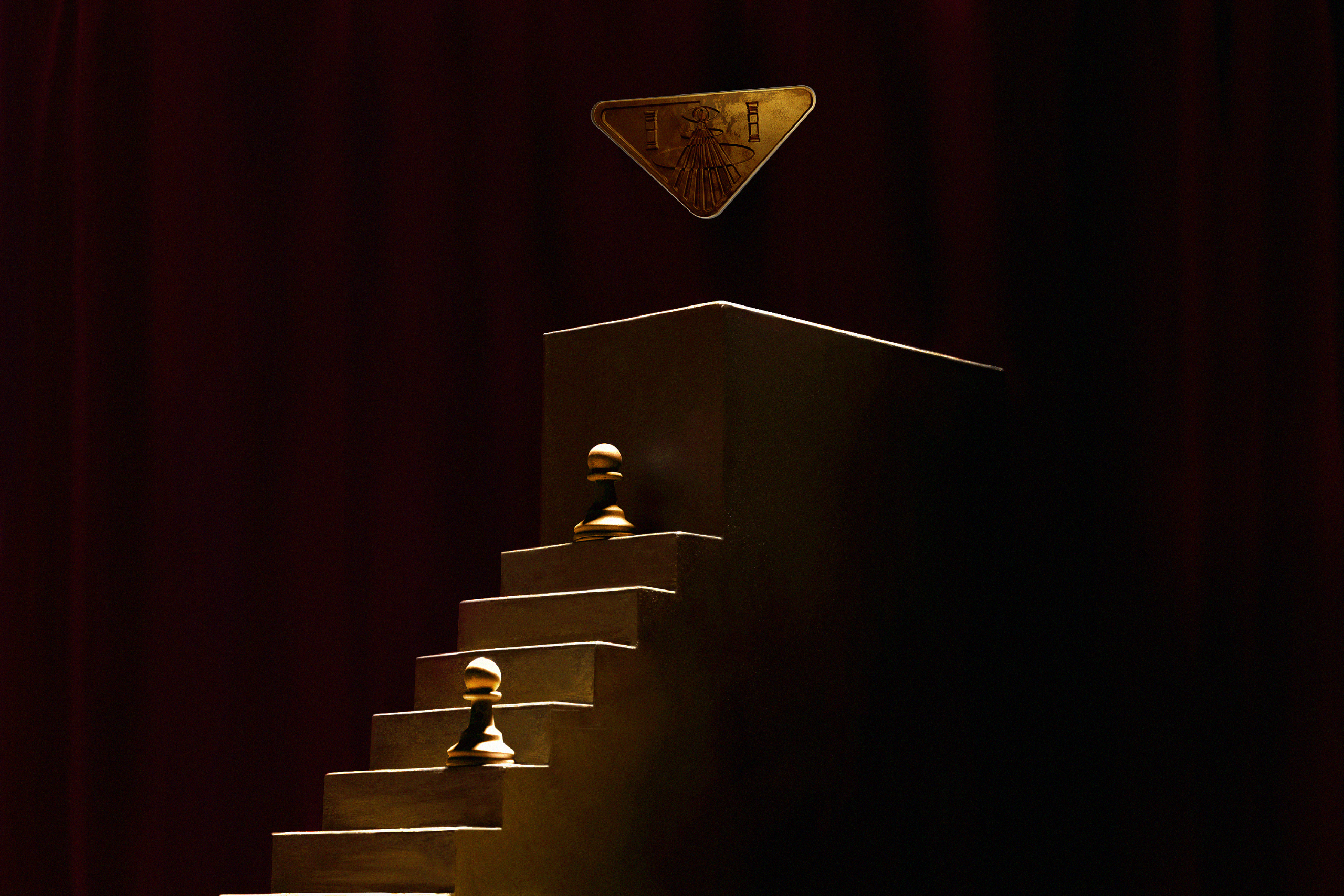
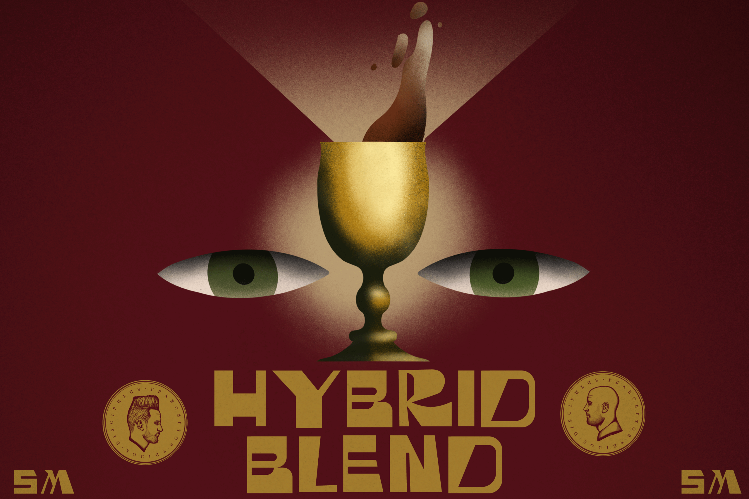
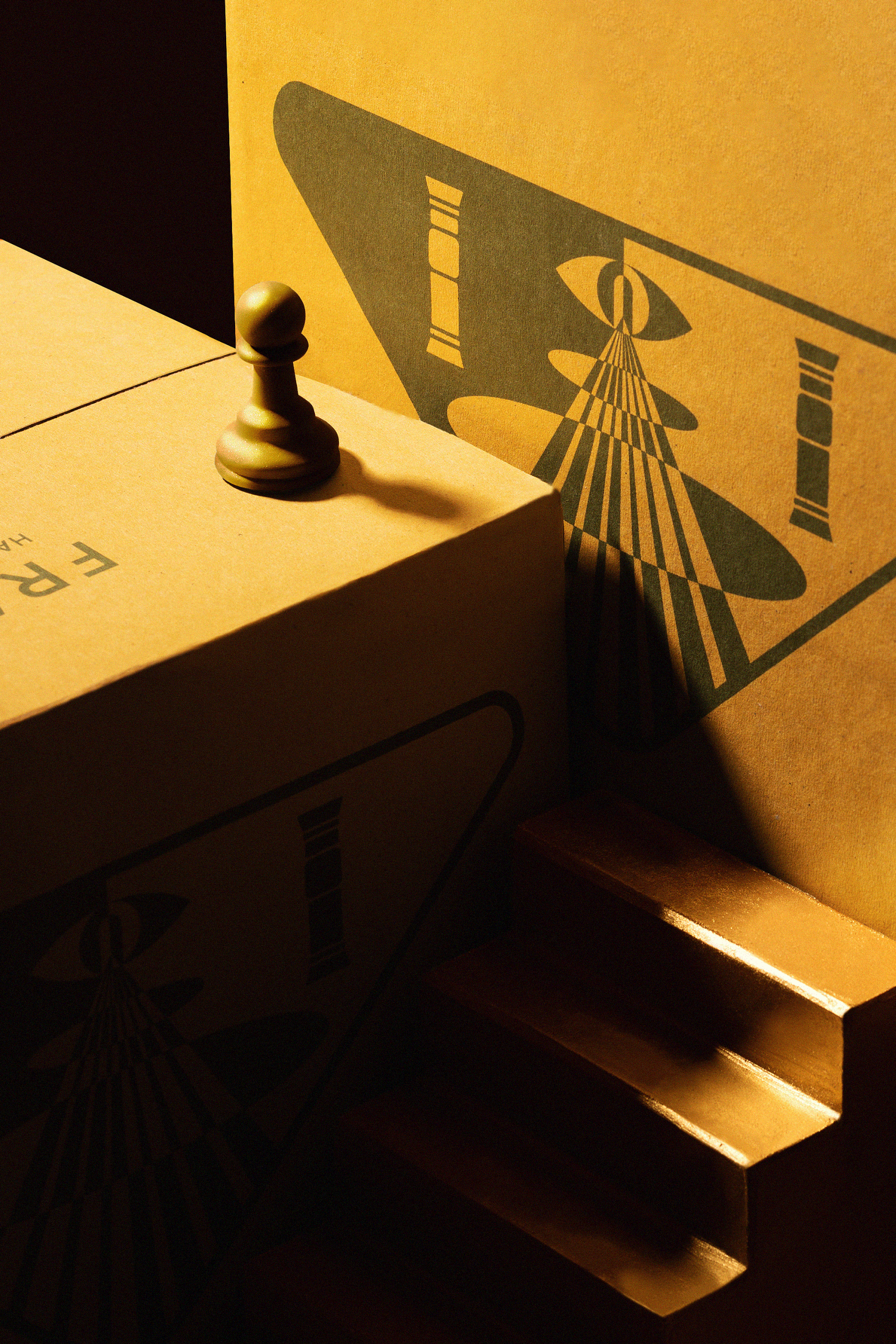
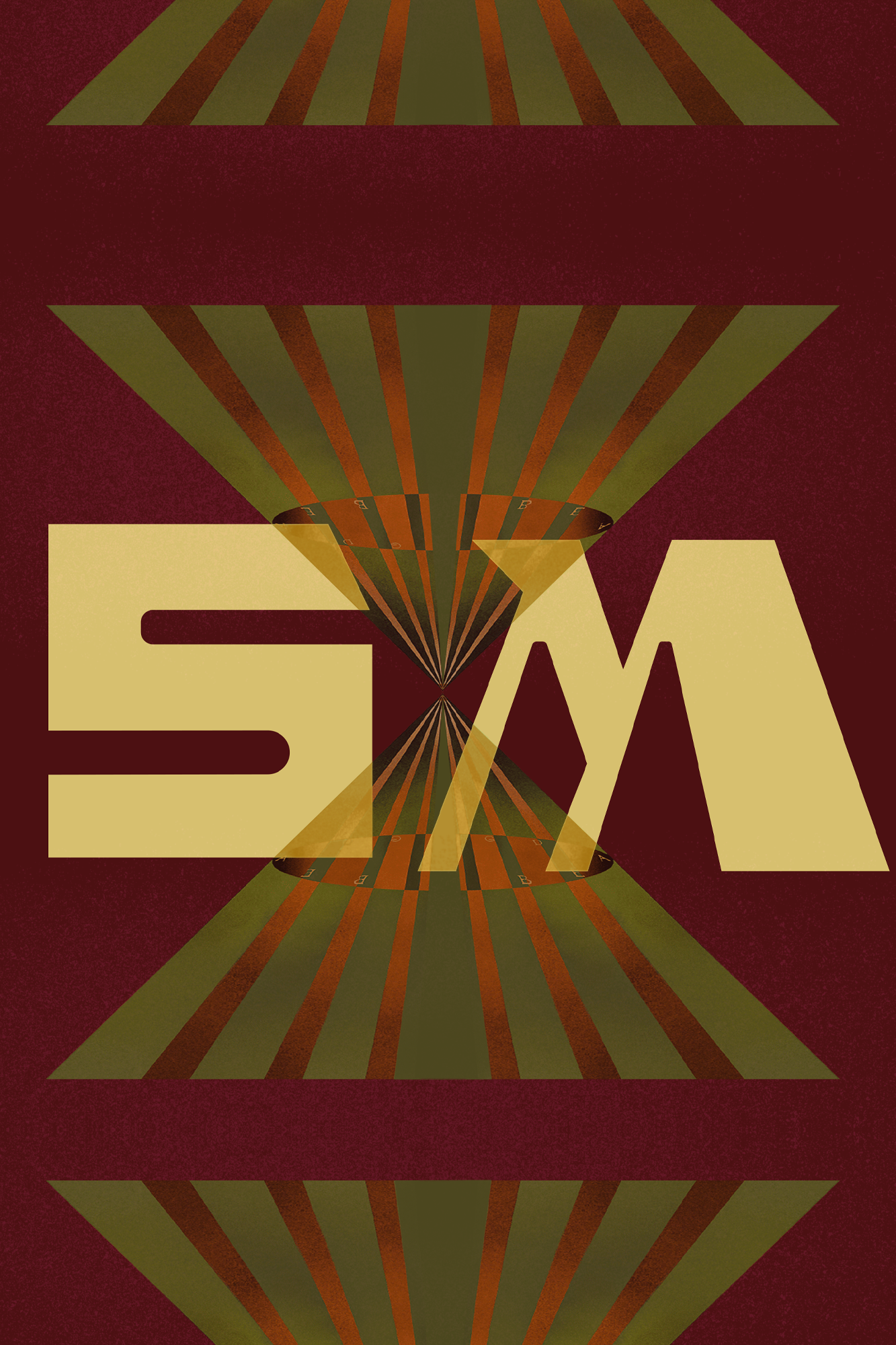
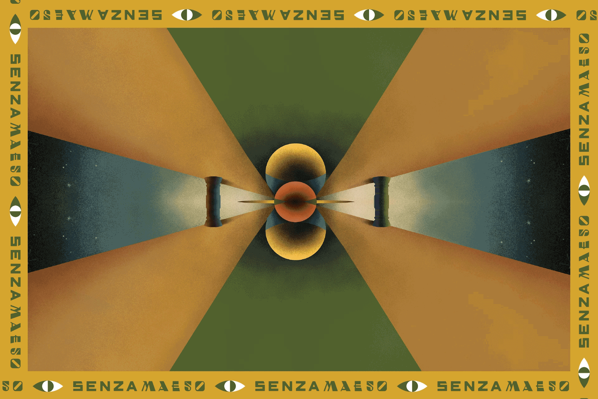
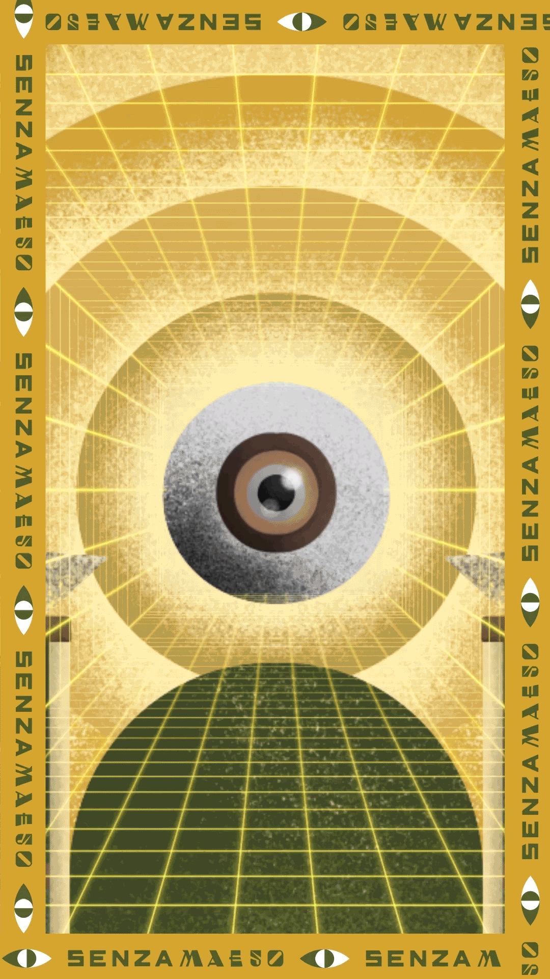
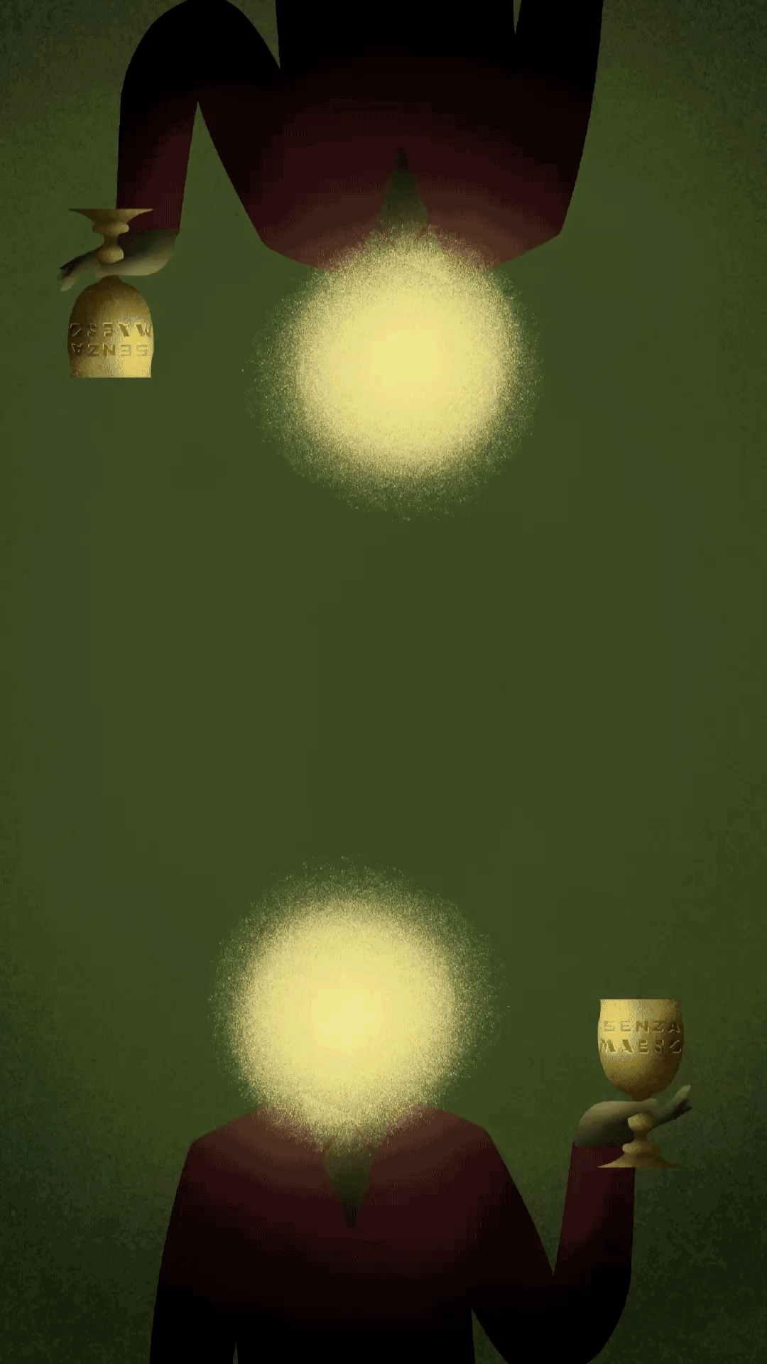
Our solution was to create a brand system that seamlessly blends elements of surrealism, retro-futurism, and ancient symbolism. Drawing inspiration from pre-Hispanic and Egyptian iconography, we developed an art and identity system that illustrates a space of spiritual illumination amidst the ongoing battle between opposing forces. The design language juxtaposes the dark, oppressive energies that seek to constrain the spirit, reminiscent of dystopian narratives like 1984 and Brave New World, with the self-enlightening forces that inspire the spirit to rise above.
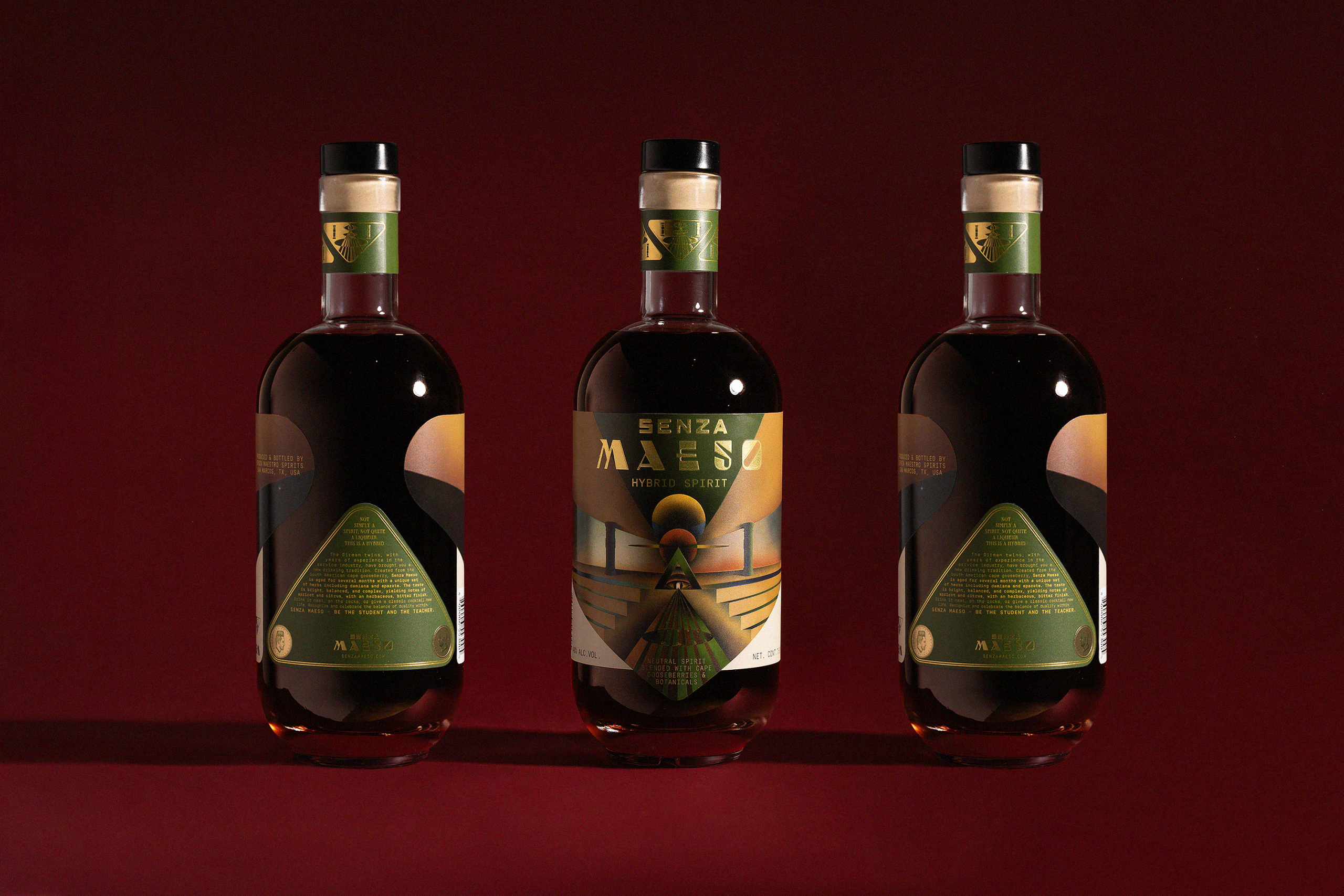
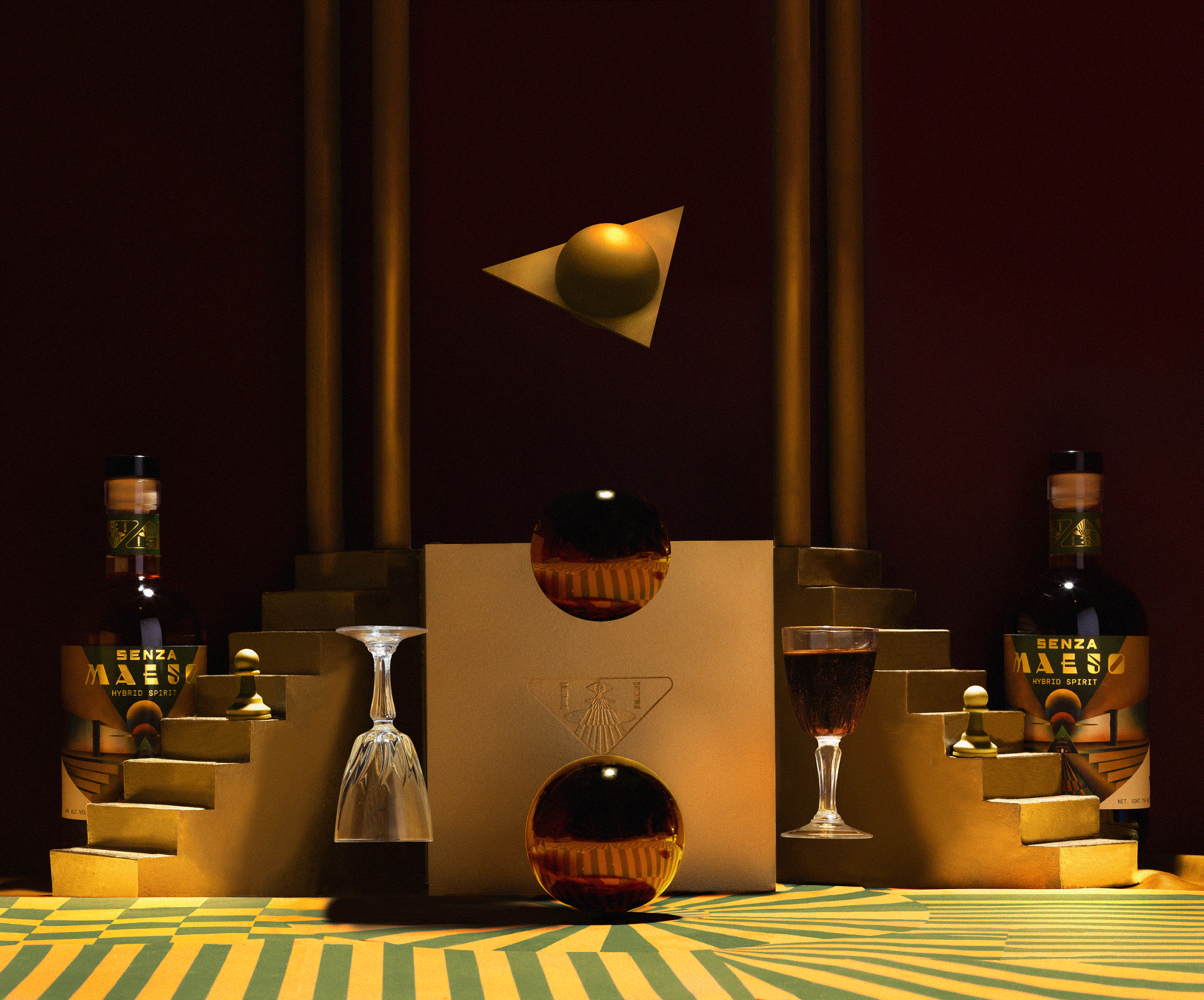
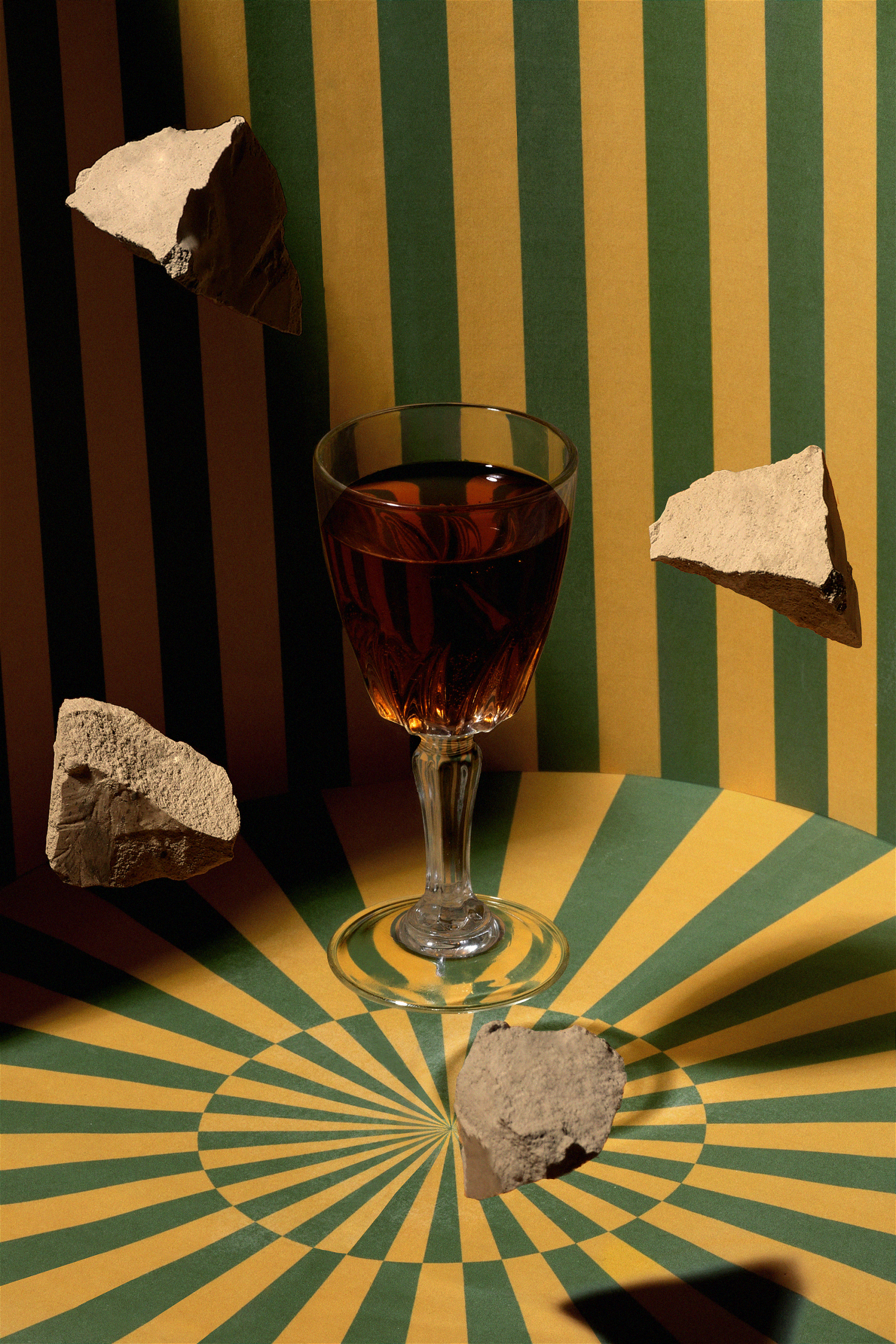
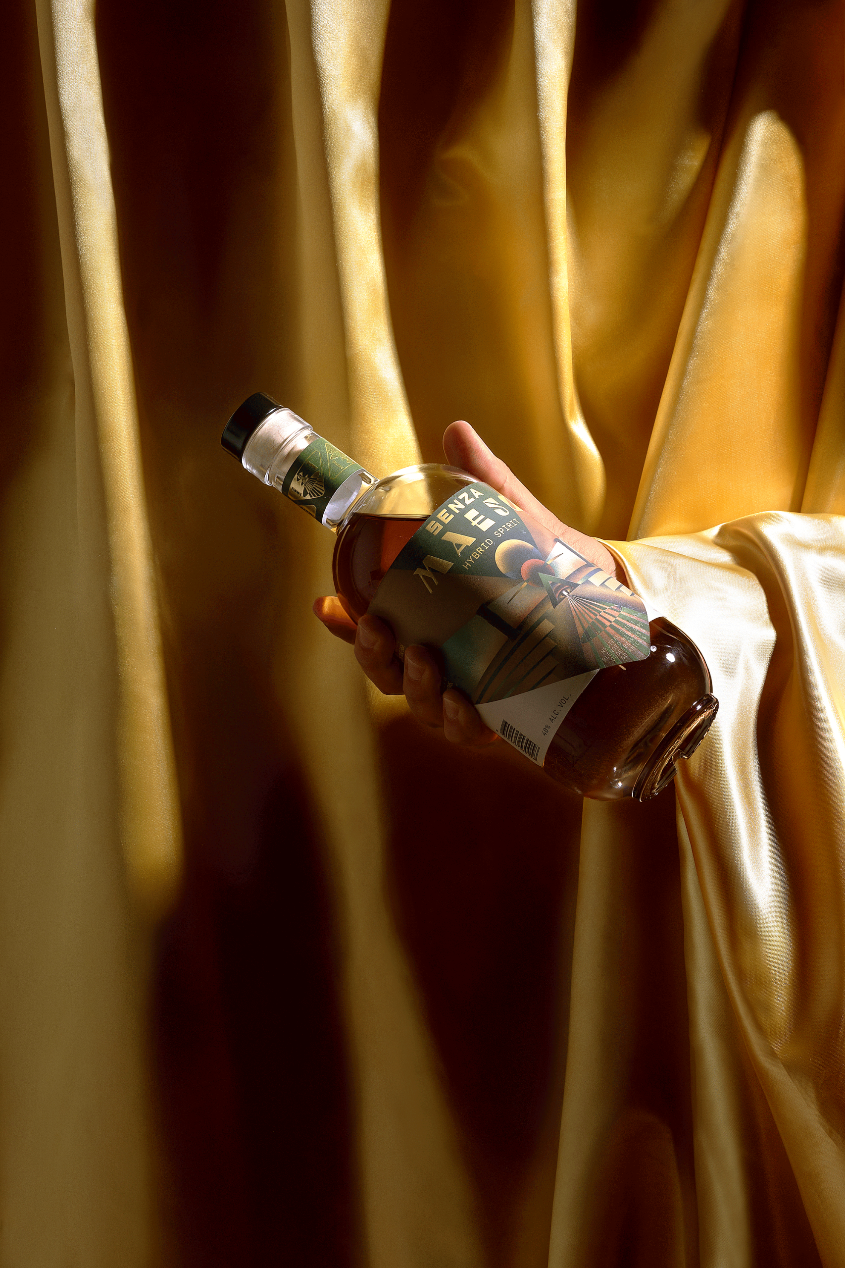
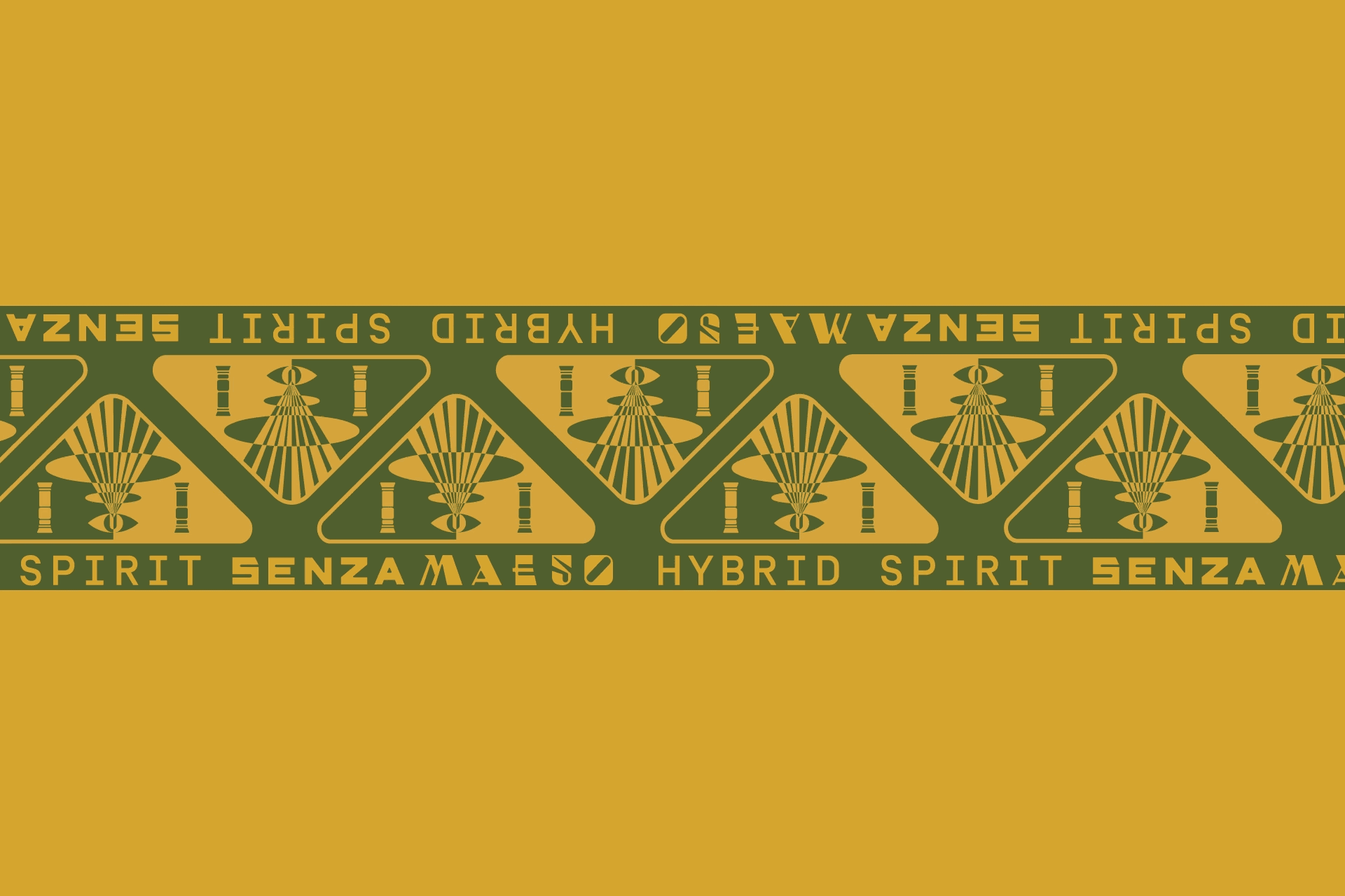
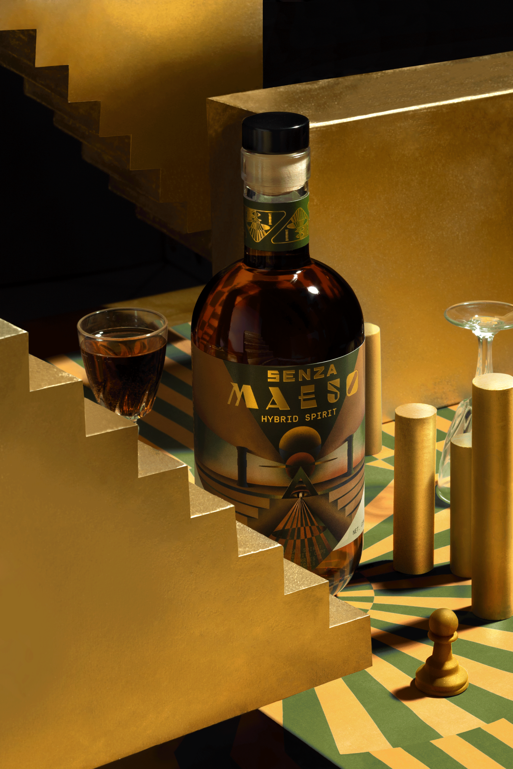
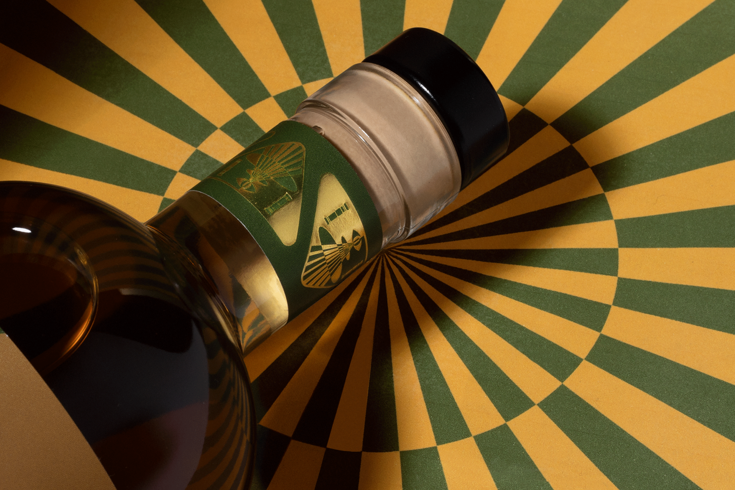
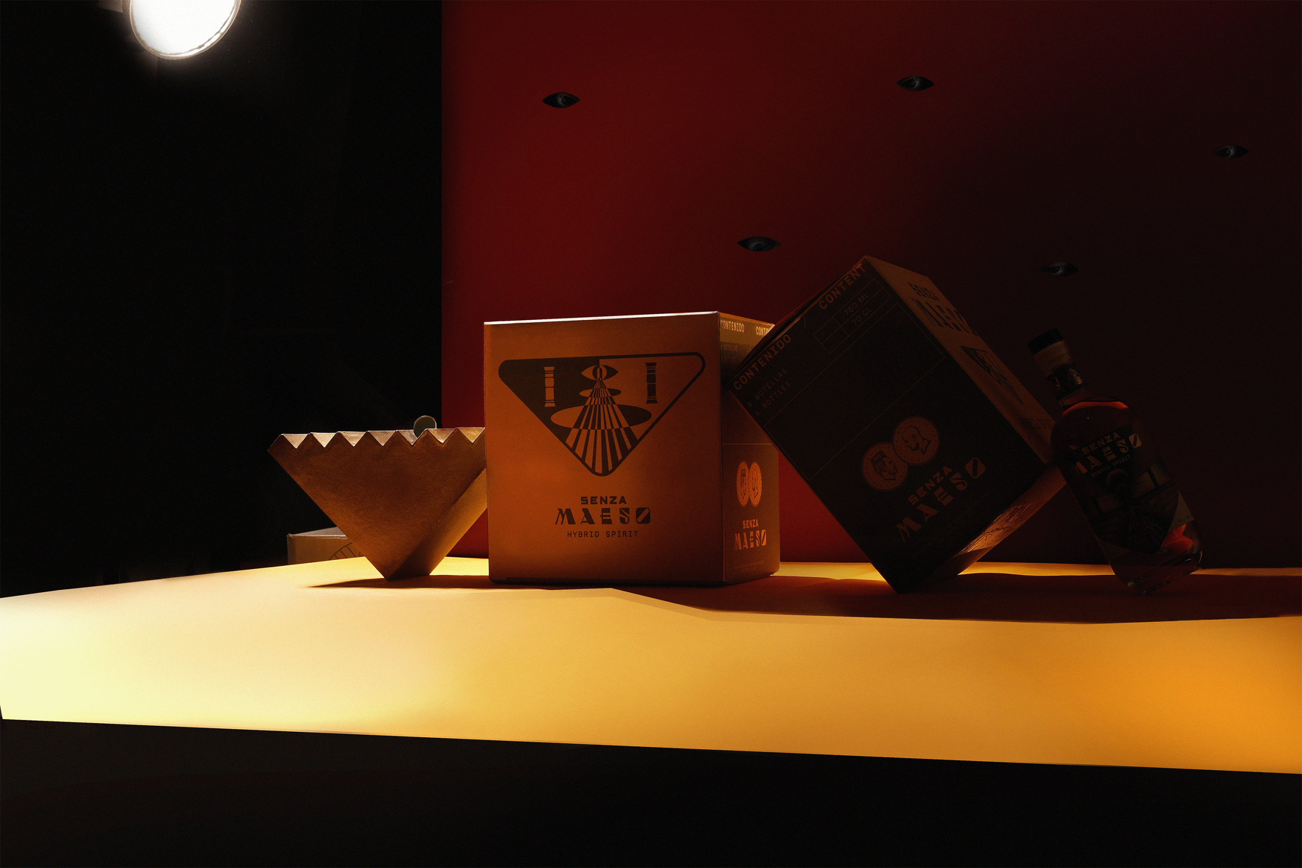
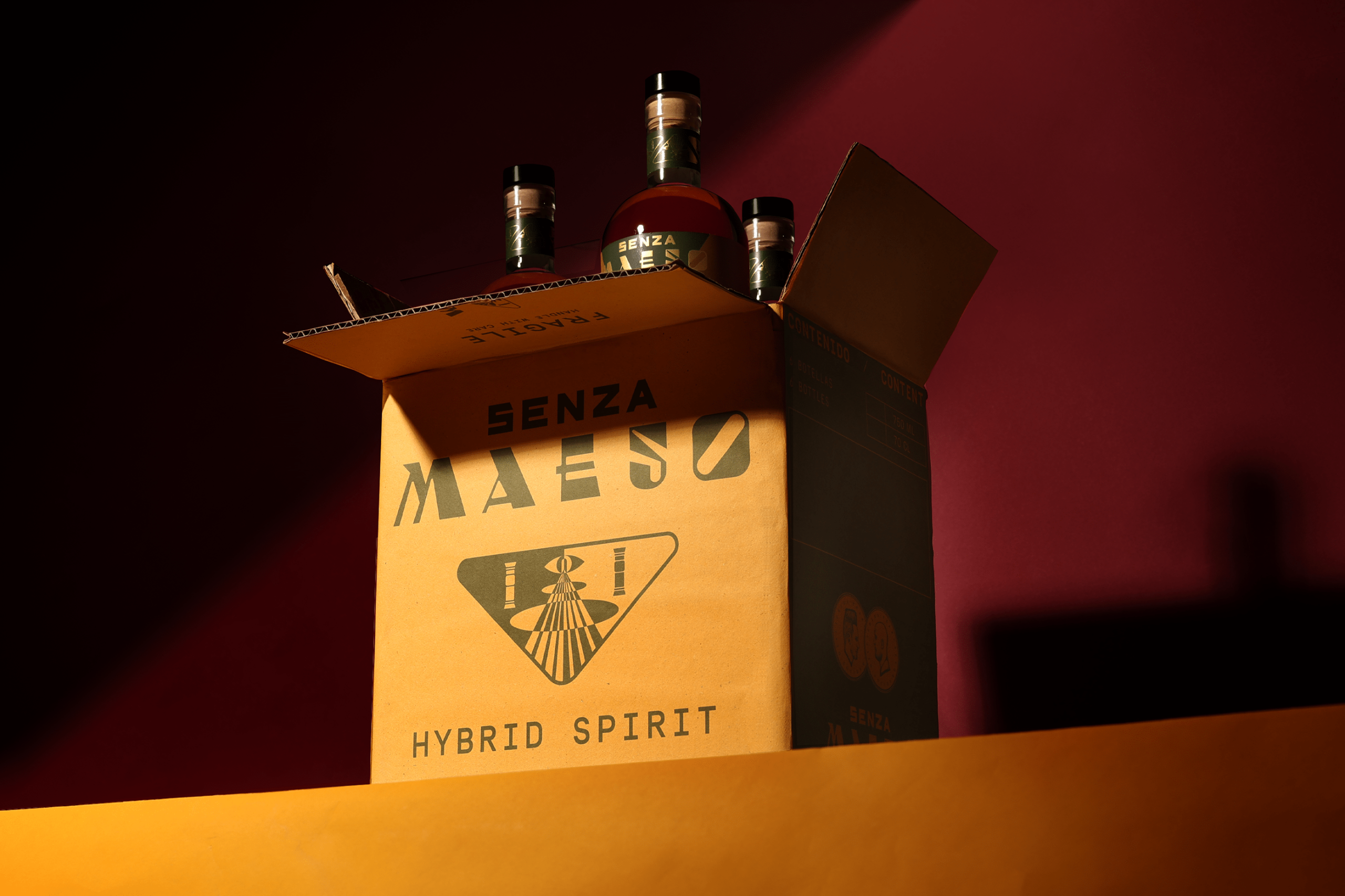
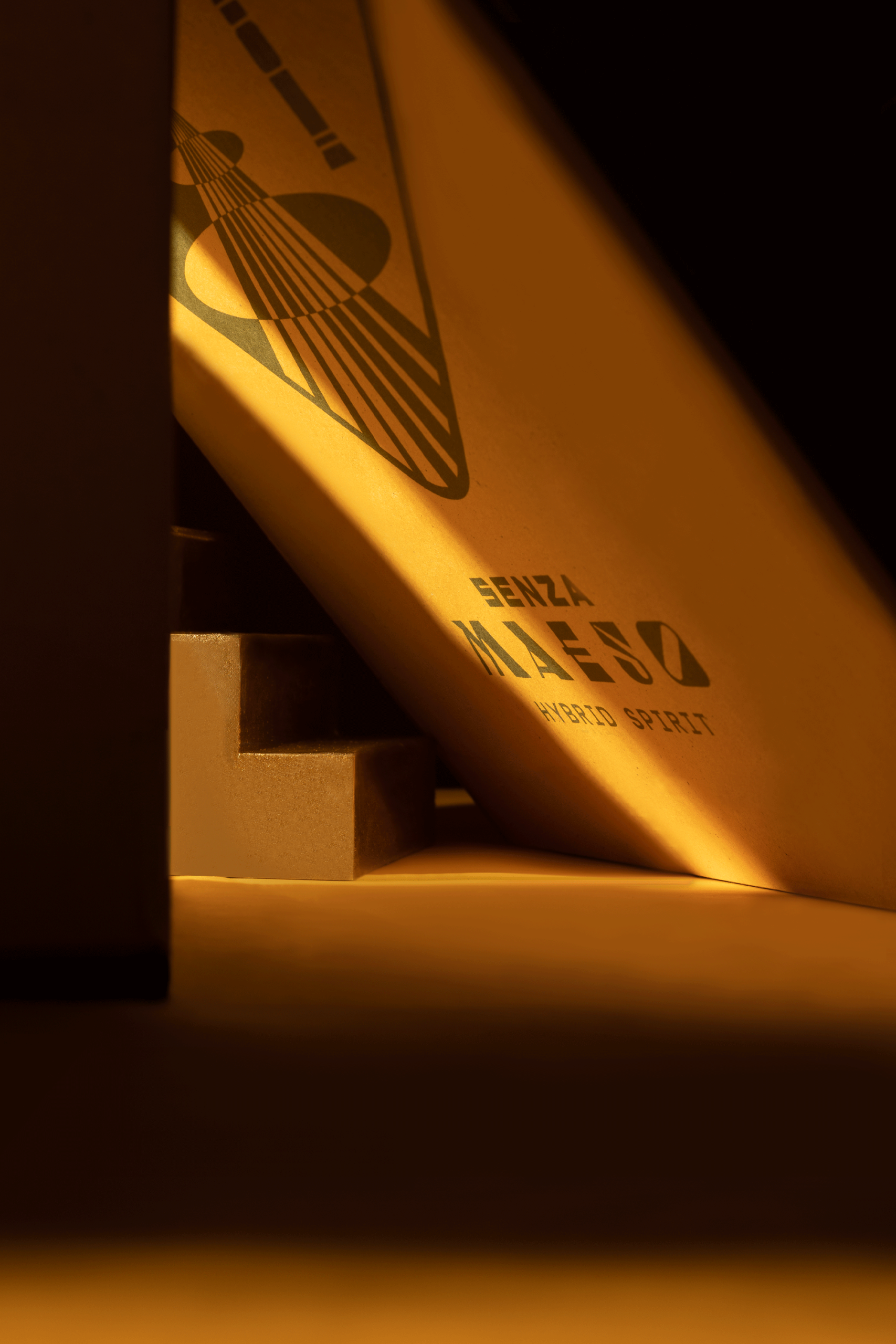
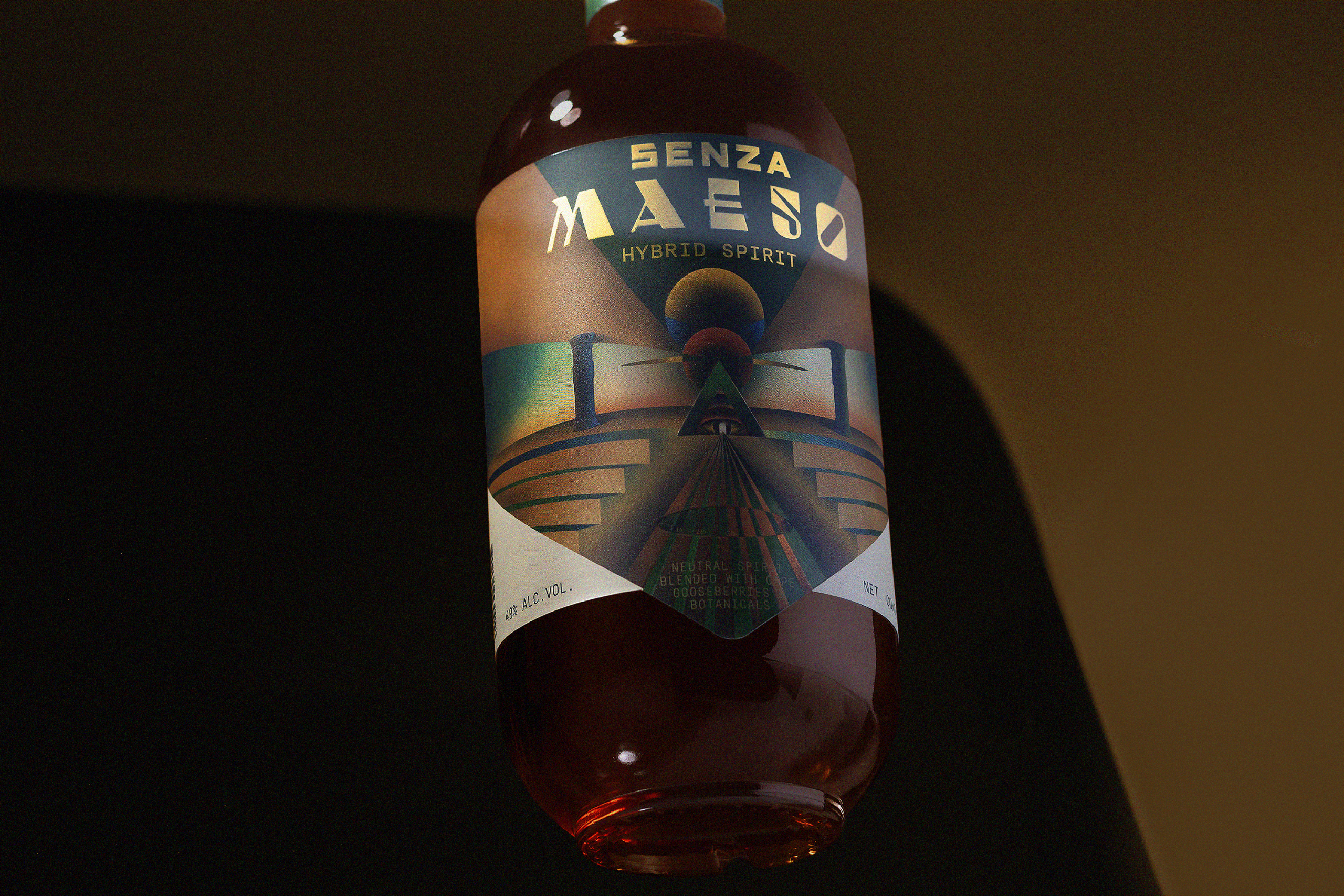
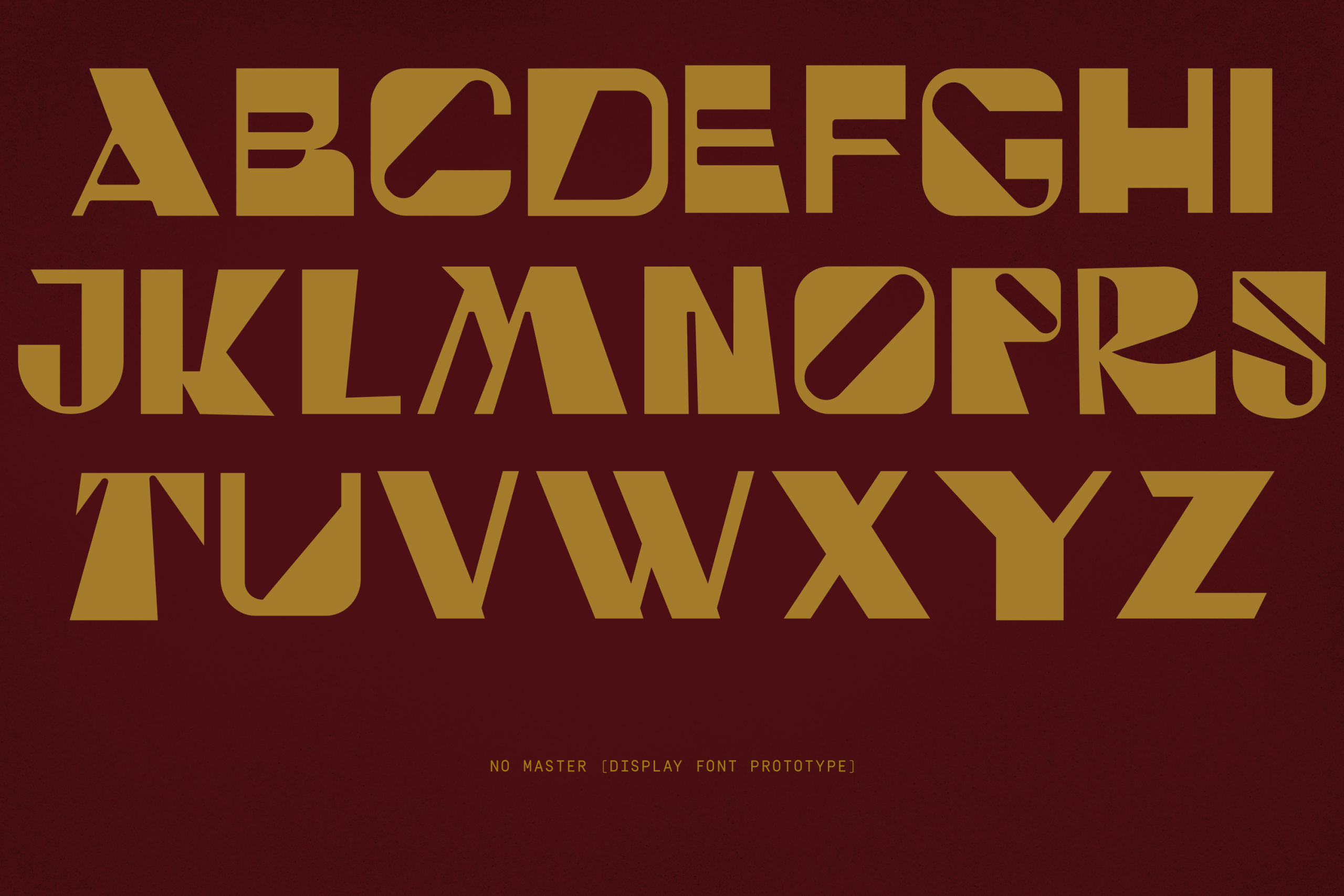
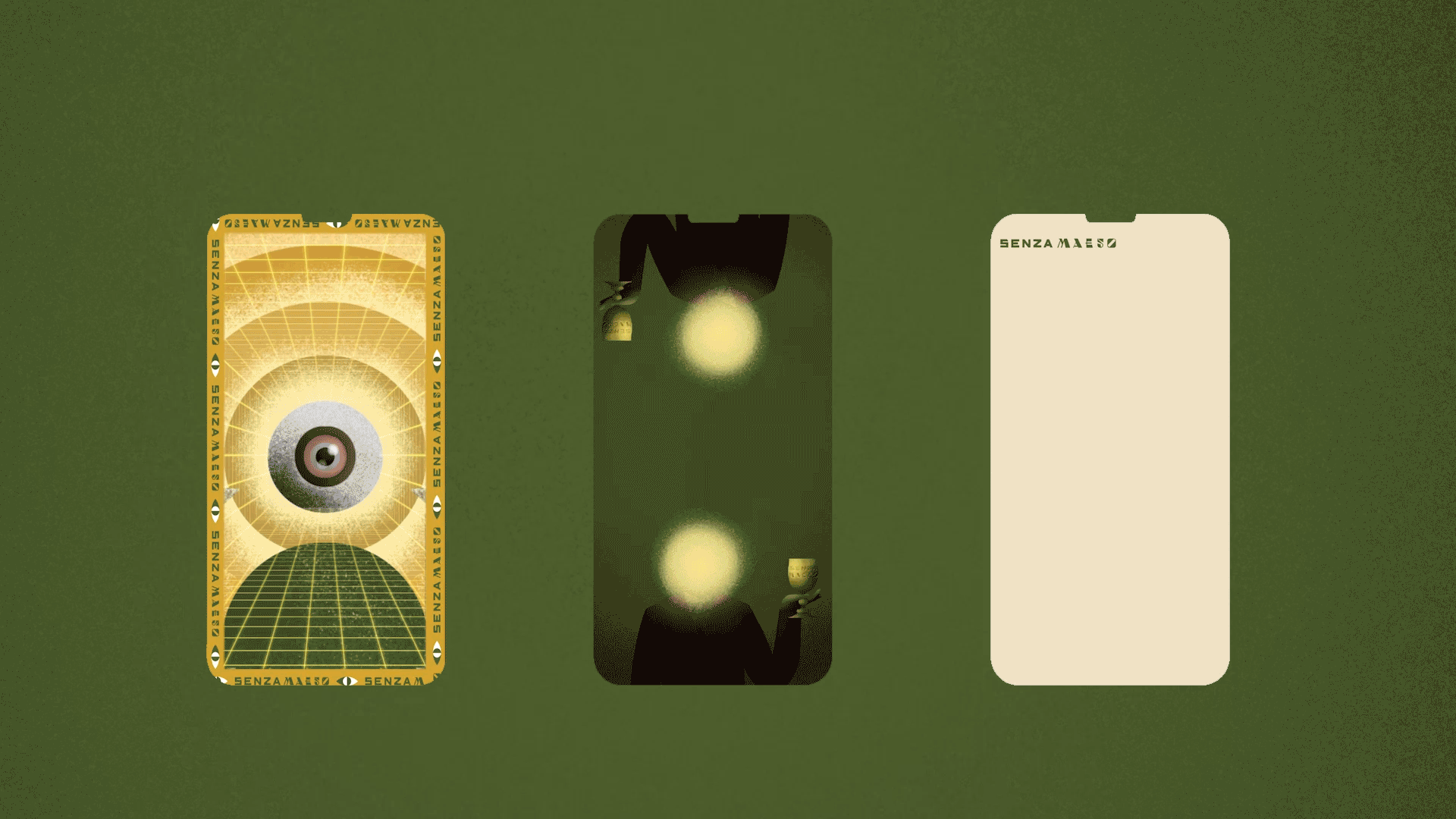
The visual identity features a harmonious blend of mystical and futuristic elements, using symbolism to evoke the brand’s core message of duality and self-mastery. The packaging design, with its rich colors and intricate patterns, reflects this tension and harmony, drawing the consumer into an experience that is both otherworldly and deeply human. A custom typeface, inspired by retrofuturism, further enhances the brand’s distinct identity, blending the nostalgic with the forward-looking. The master brand icon symbolizes this duality, serving as a visual representation of the brand’s philosophical foundation.
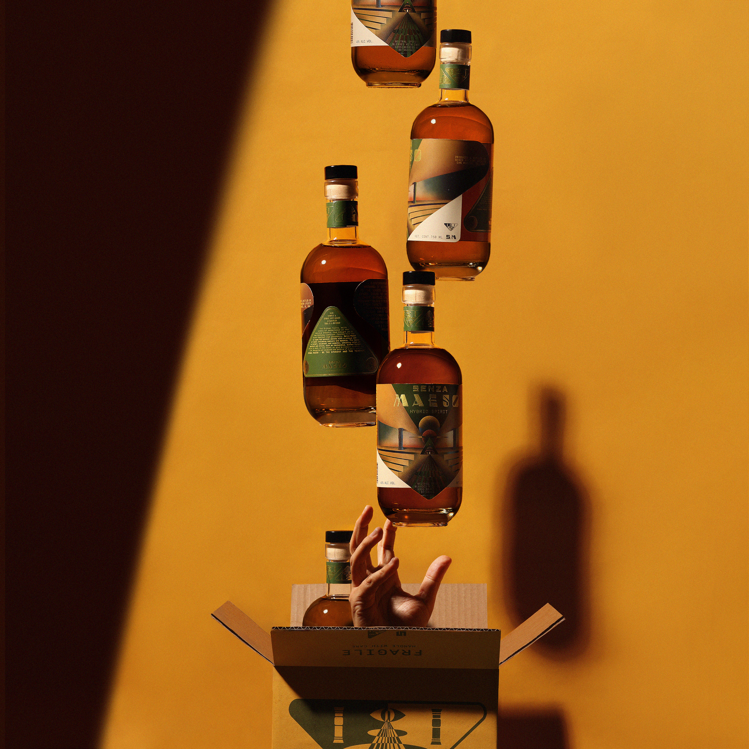

PRODUCT LINE
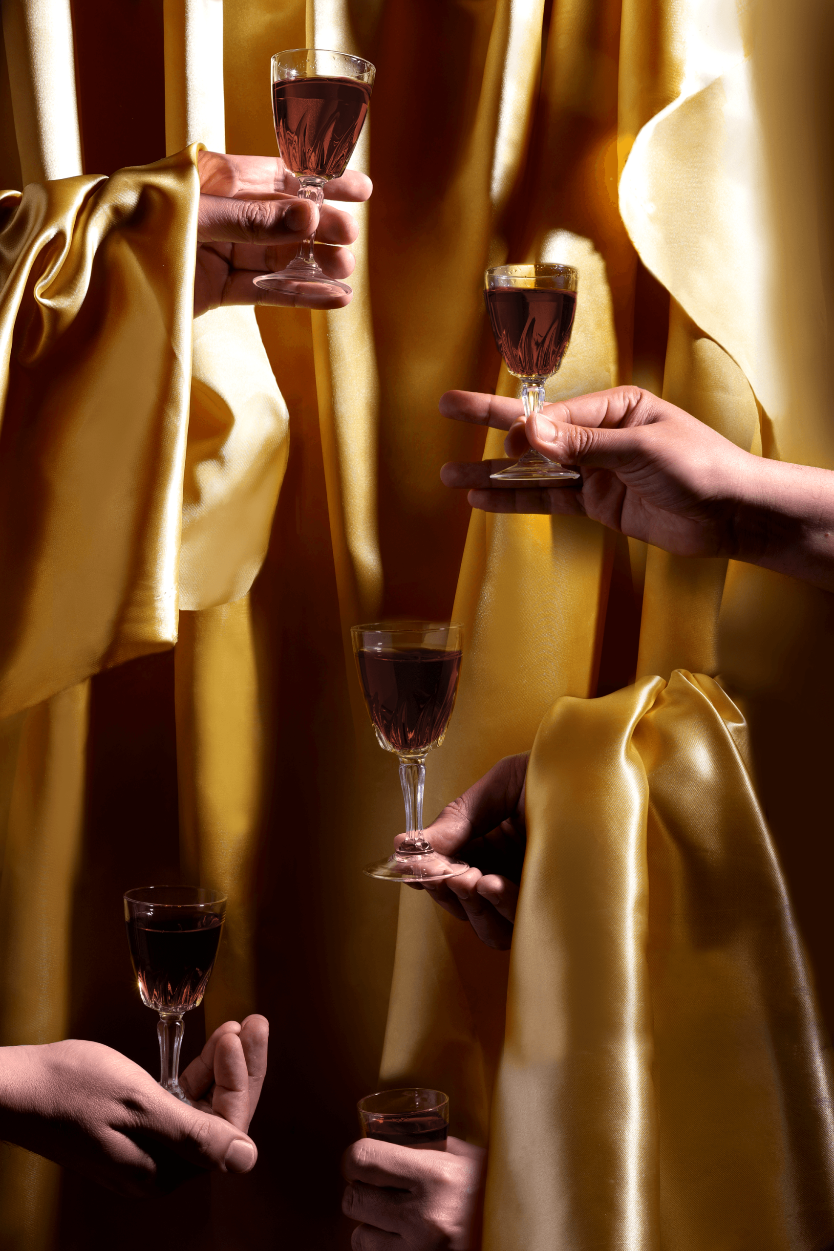
“Senza Maeso packaging and brand system tells a story—a journey from darkness to light, from oppression to enlightenment. The hybrid spirit is positioned as a new category in the world of alcoholic beverages, offering a unique experience that goes beyond mere consumption. It’s a drink that challenges the senses and the soul, encouraging the drinker to embark on their own journey of self-discovery and mastery. The branding and packaging system is designed to evoke curiosity and wonder, drawing inspiration from occult symbolism and the golden age of sci-fi. The bottle design features surreal landscapes and mystical symbols that serve as a visual metaphor for the brand’s core narrative. Every element, from the typography to the color palette, is carefully crafted to resonate with the brand’s target audience—those who seek not just to drink, but to explore, to discover, and to transcend.”
SHARE THIS PROJECT