AQAVE
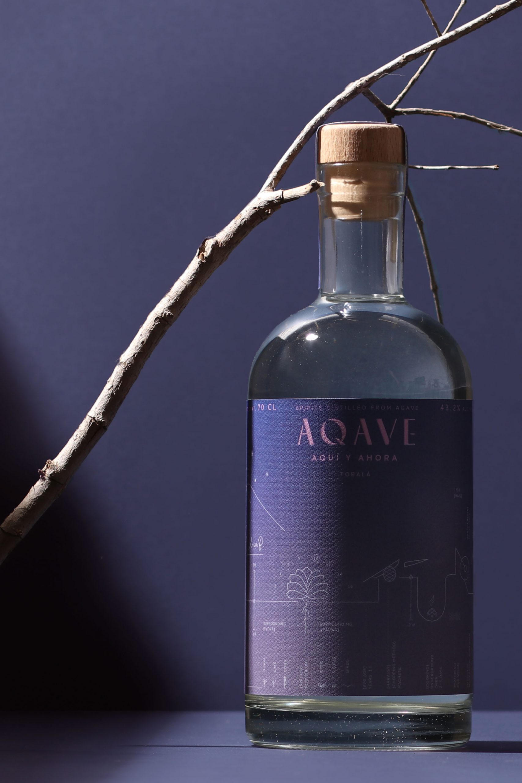
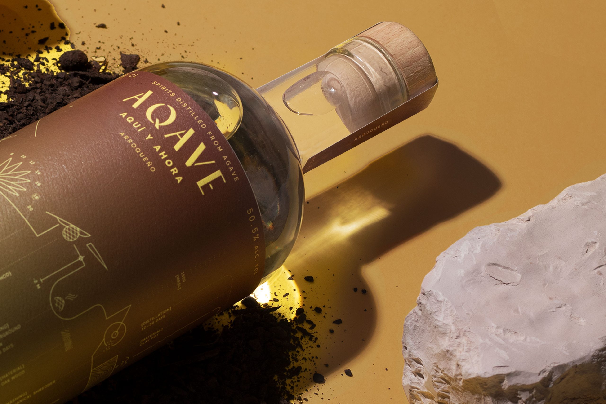
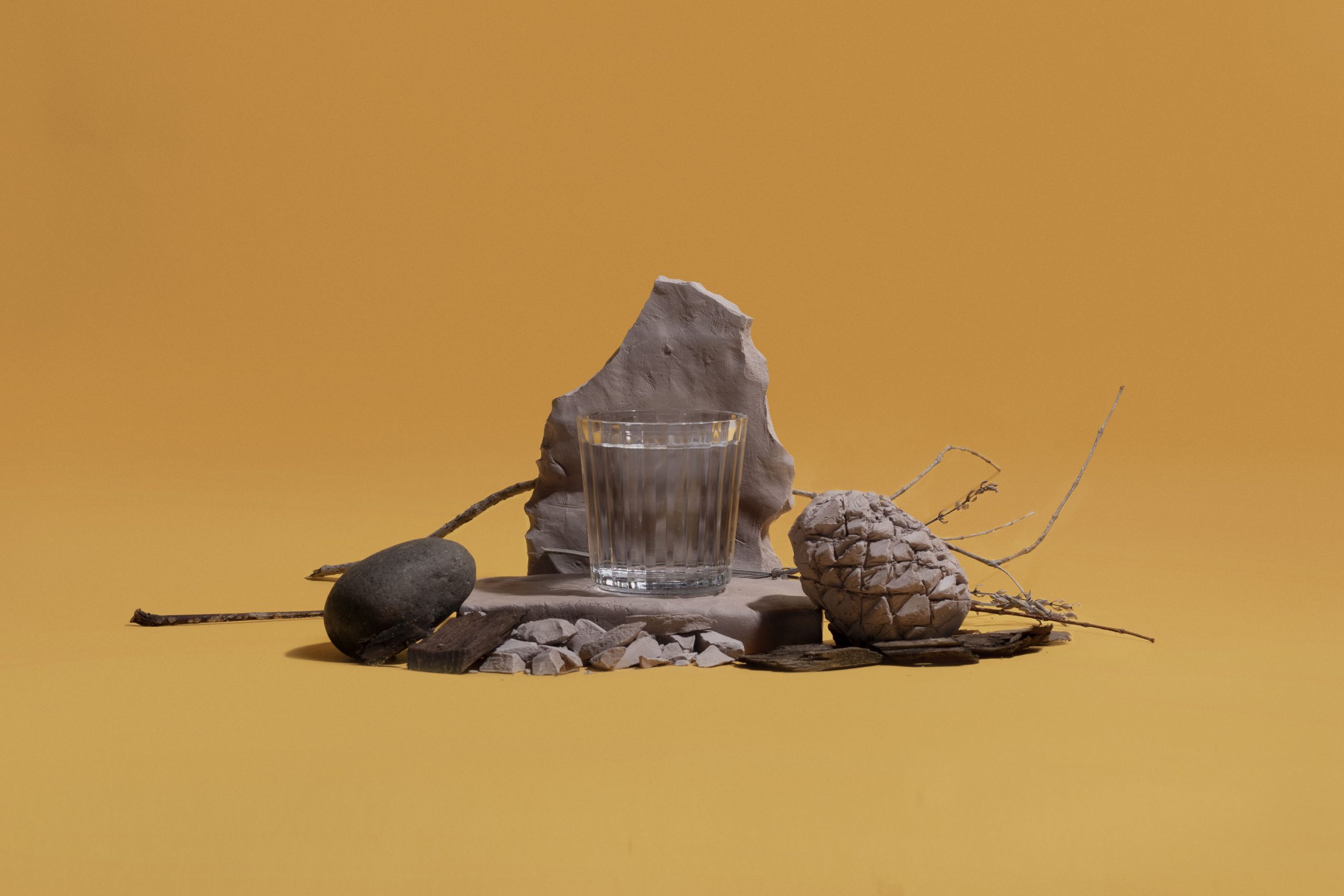
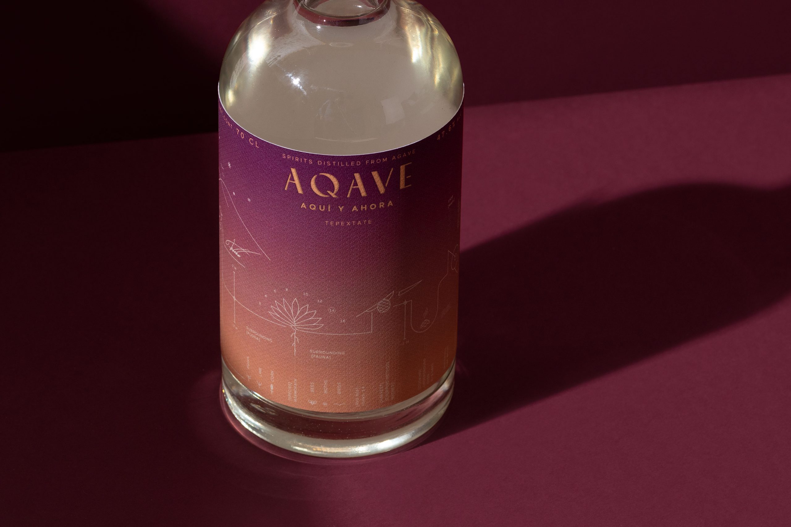
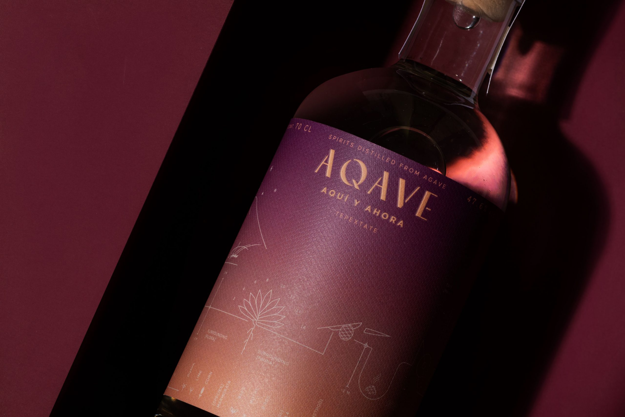
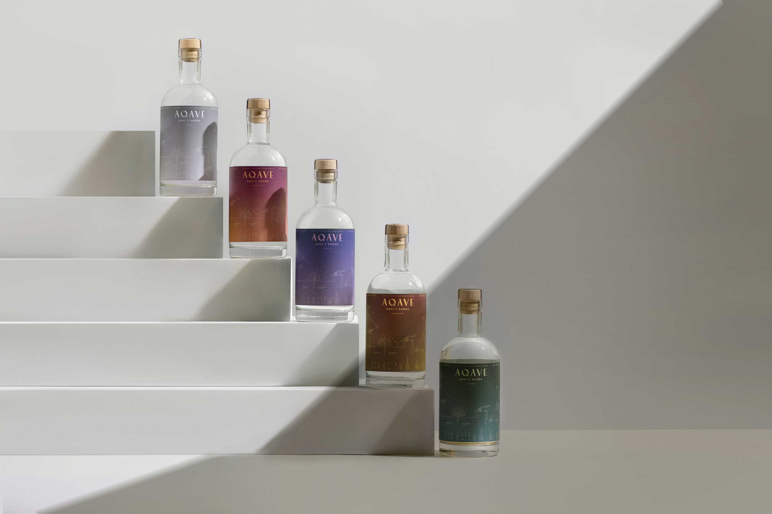
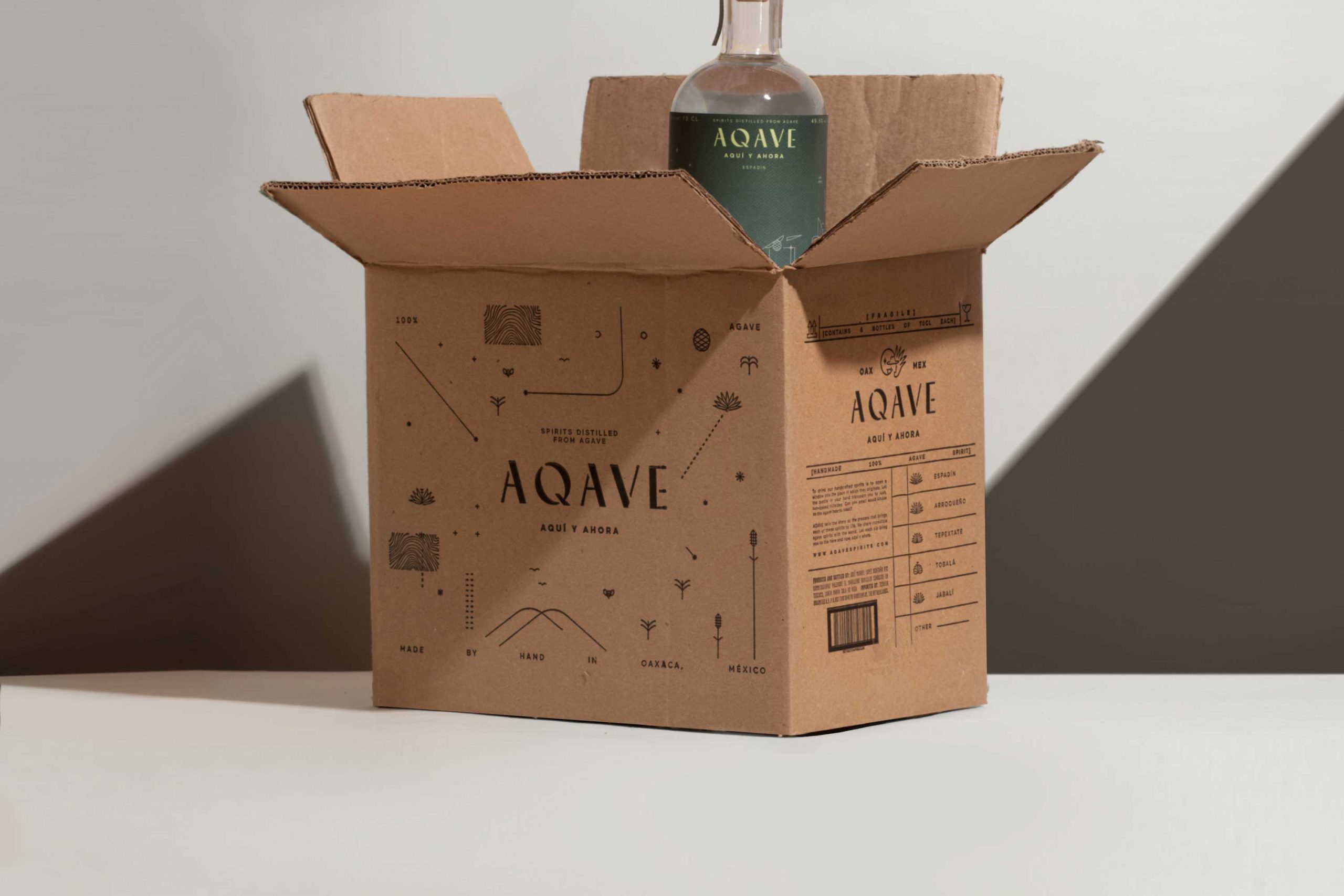
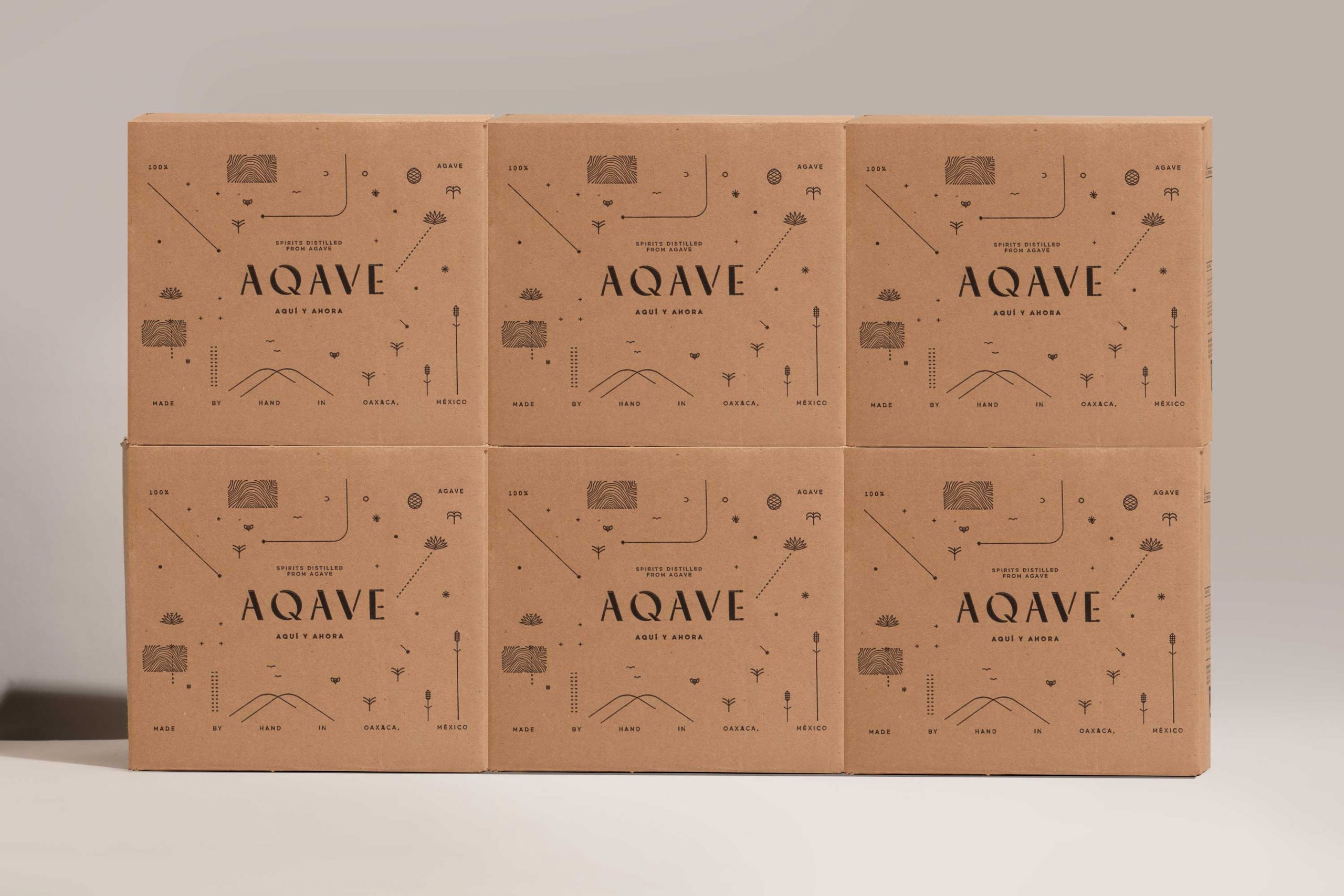
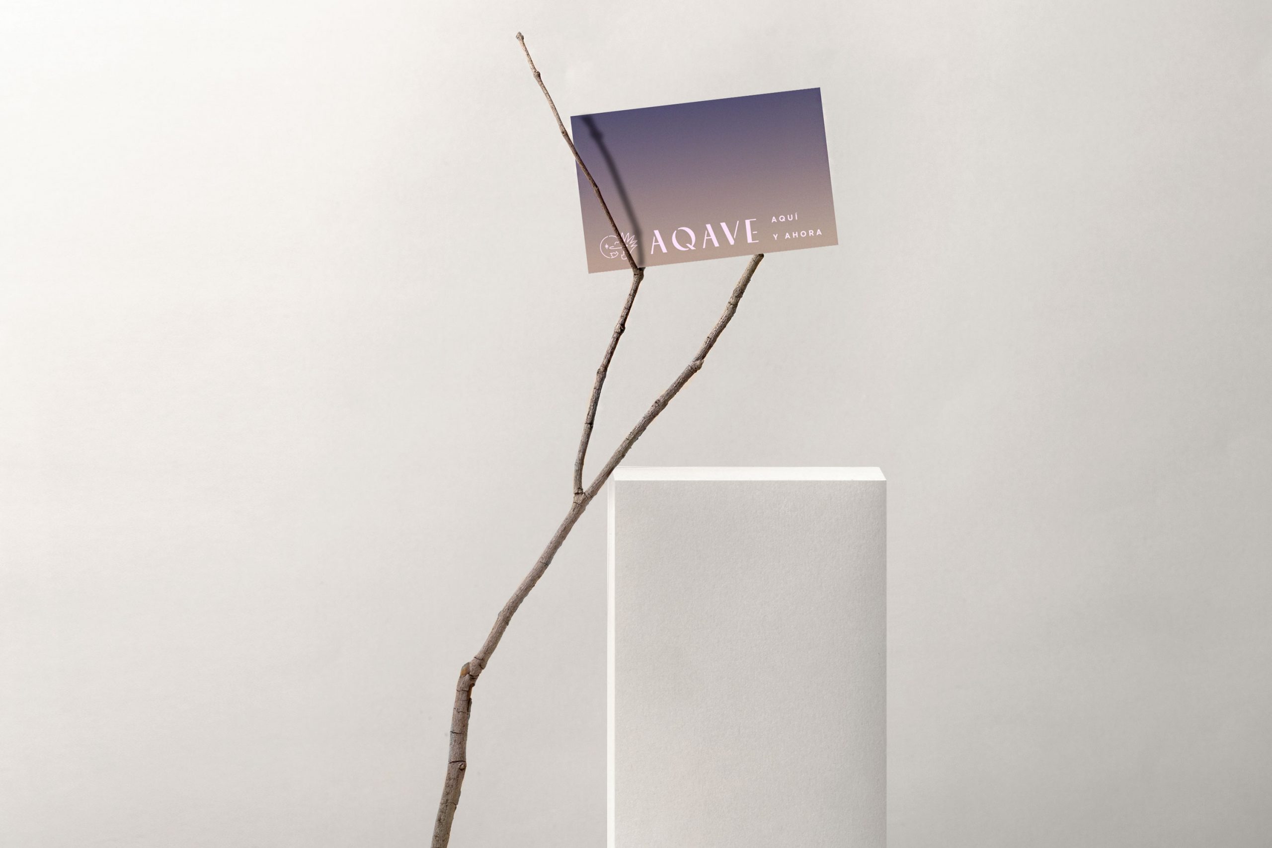
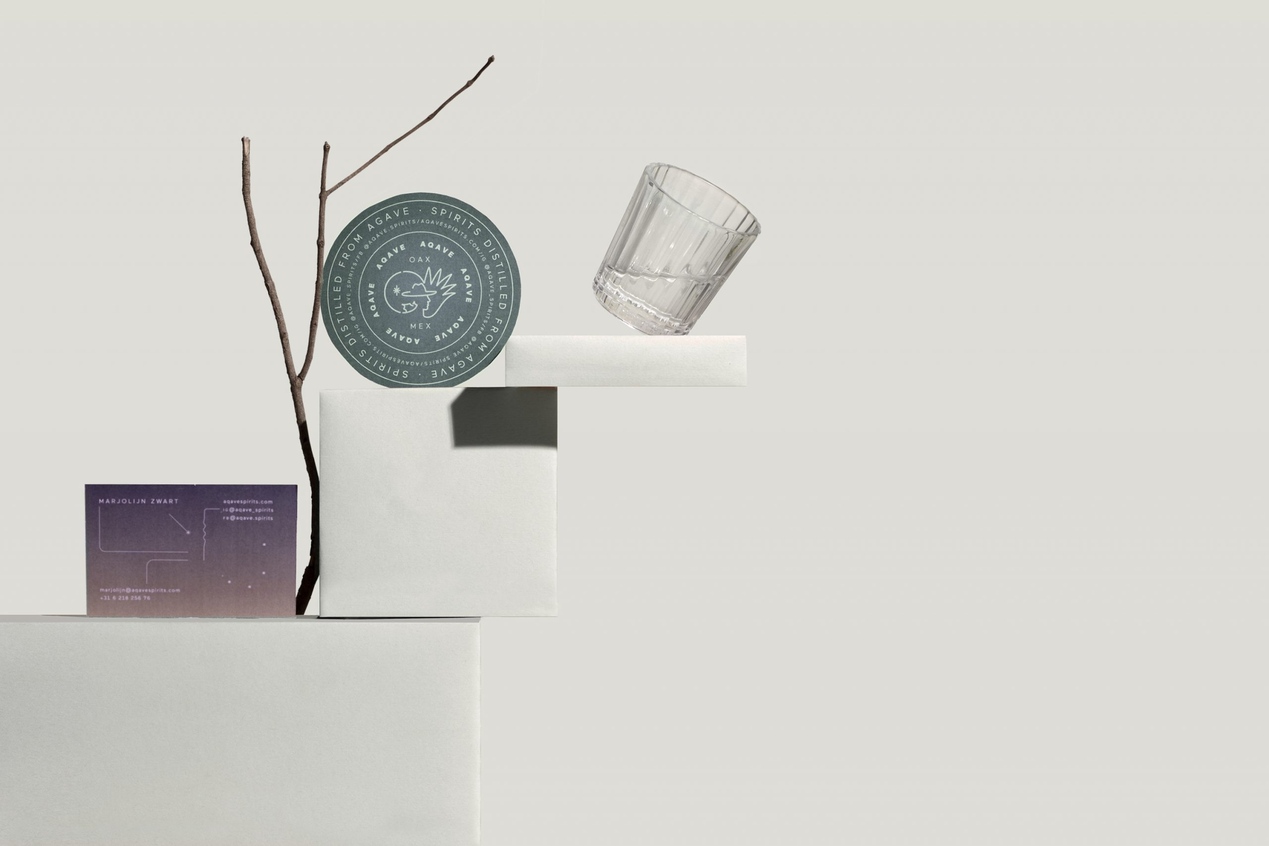
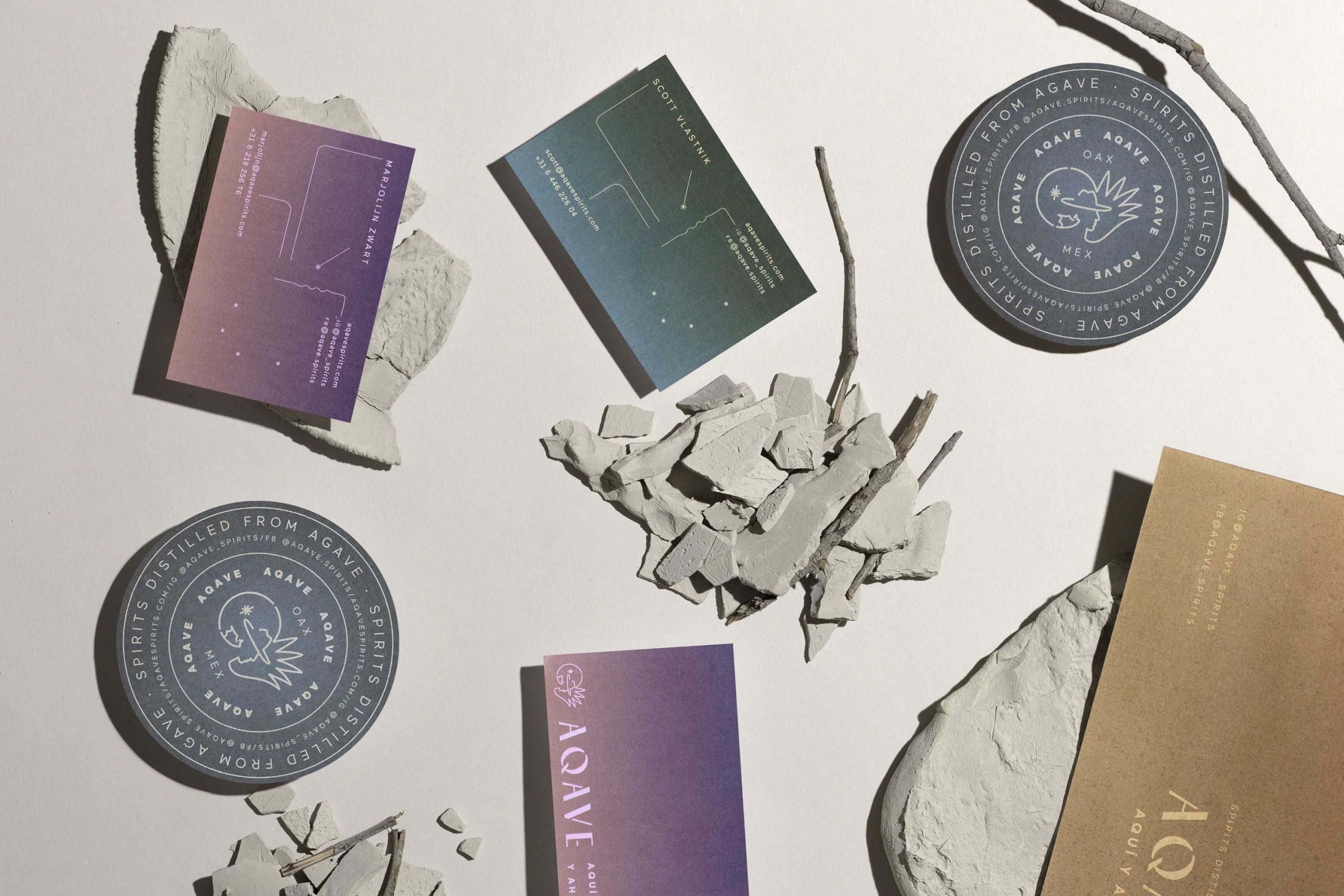
MAGUEY SPIRITS FROM OAXACA — BRANDING, PACKAGING. 2019AQAVE is a spirits brand that speaks about the origin and culture of agave within the Netherlands. On a trip to Oaxaca, our clients found an alternative way of looking at the rational European point of view. The cultural impact of Oaxaca’s self-sufficient communities was one of the main guides that inspired us to investigate the activities, processes, and traditions present in the region. All this to develop an identity that could be both technical and emotional.
—
CREDITS
ART DIRECTION: MARIO HGNO BALLESTEROS
COPYWRITING: OLGA VILLEGAS, KAREN VIZCARRA
DESIGN: MARIO HIGINIO BALLESTEROS, SANDRA GARCÍA
PHOTOGRAHY: FREDY “EL GATO” MORFÍN

VISUAL UNIVERSE
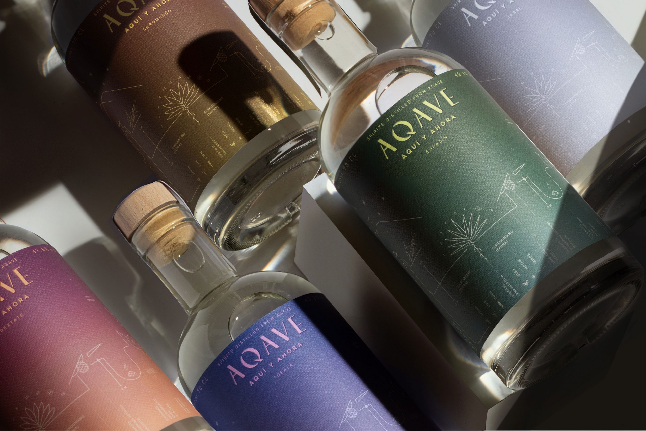
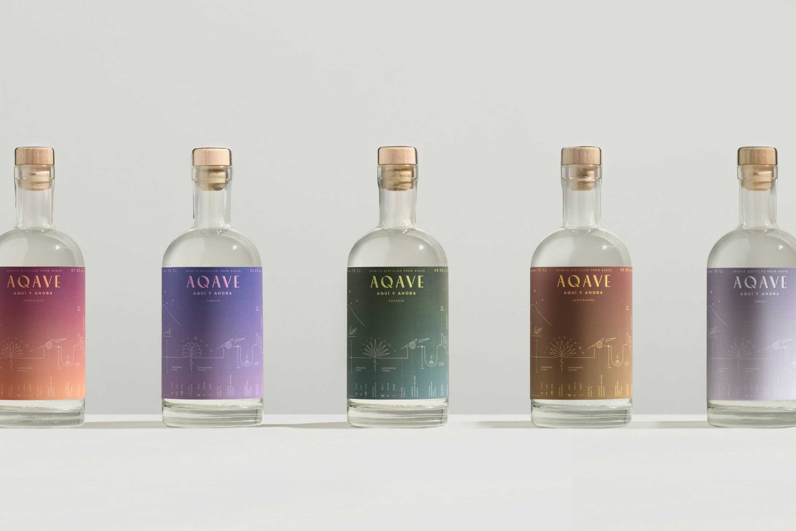
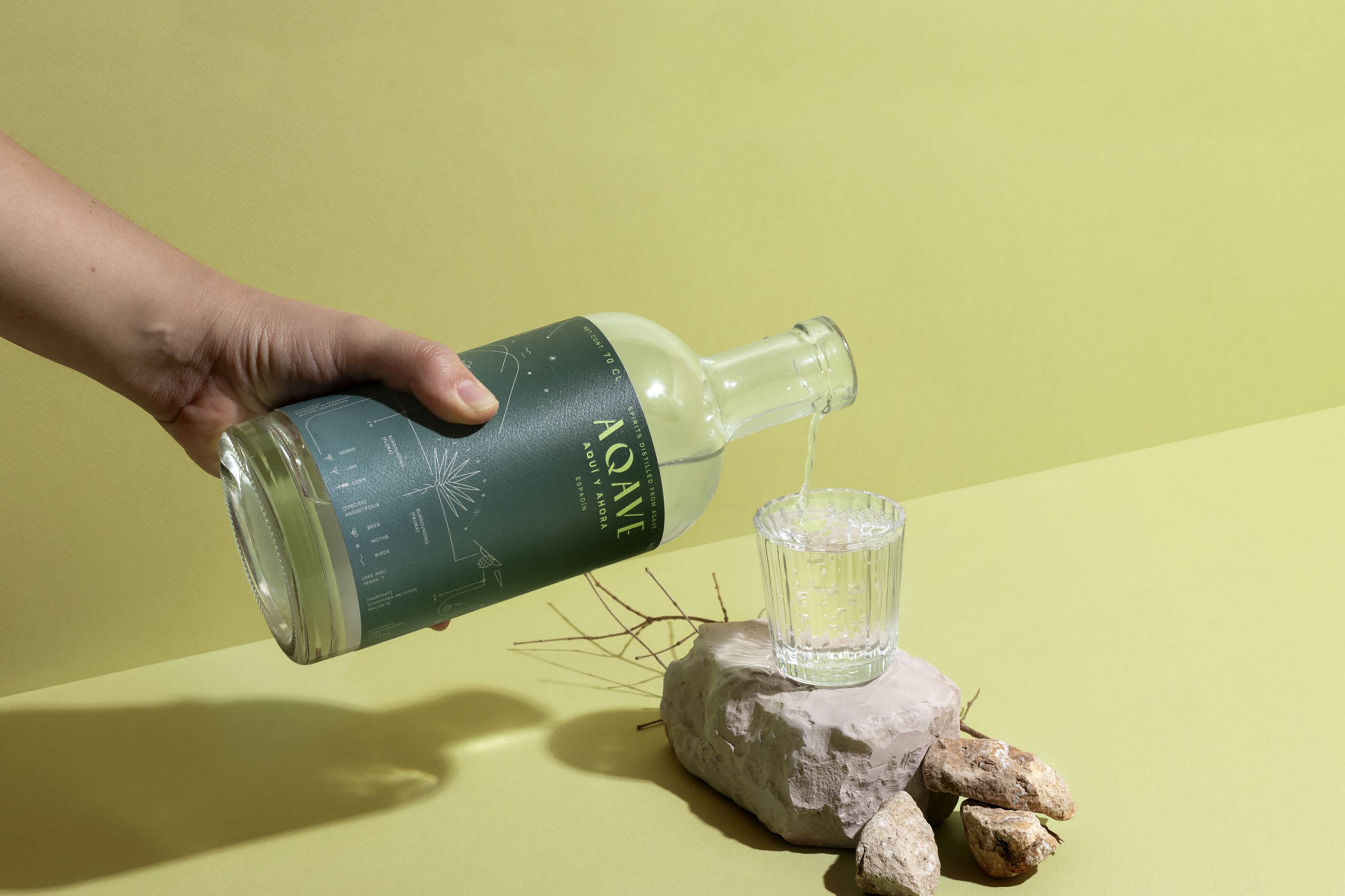
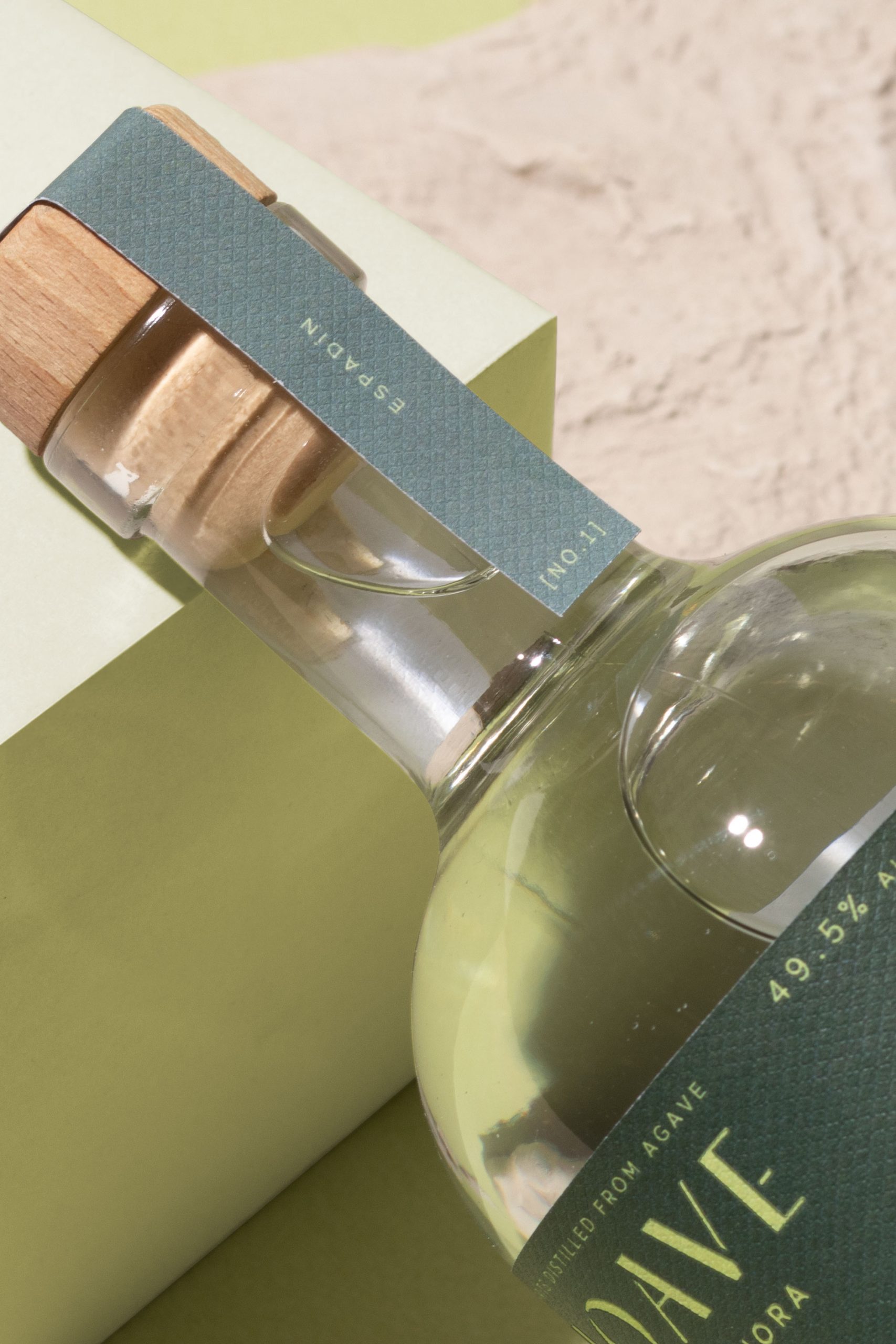
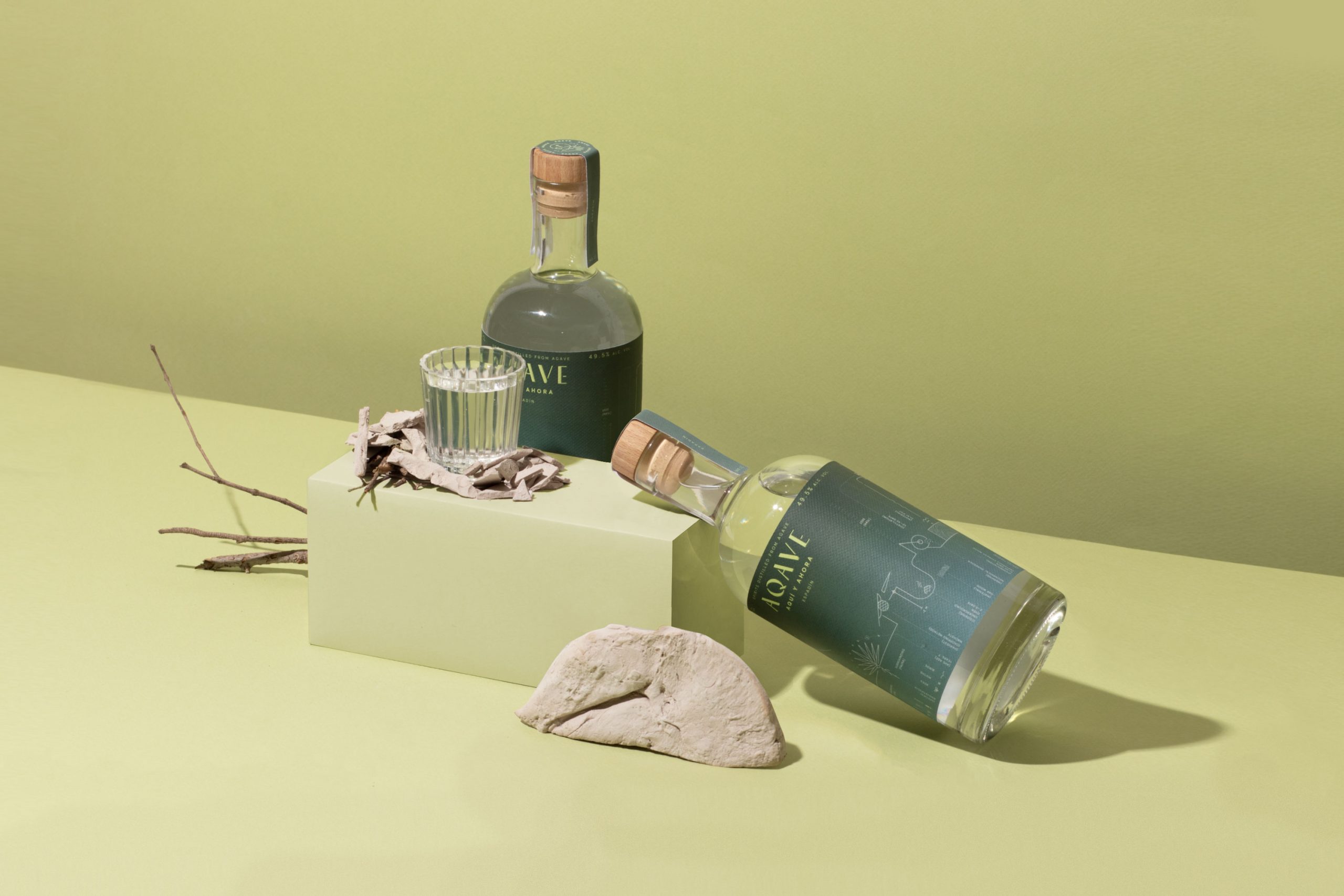
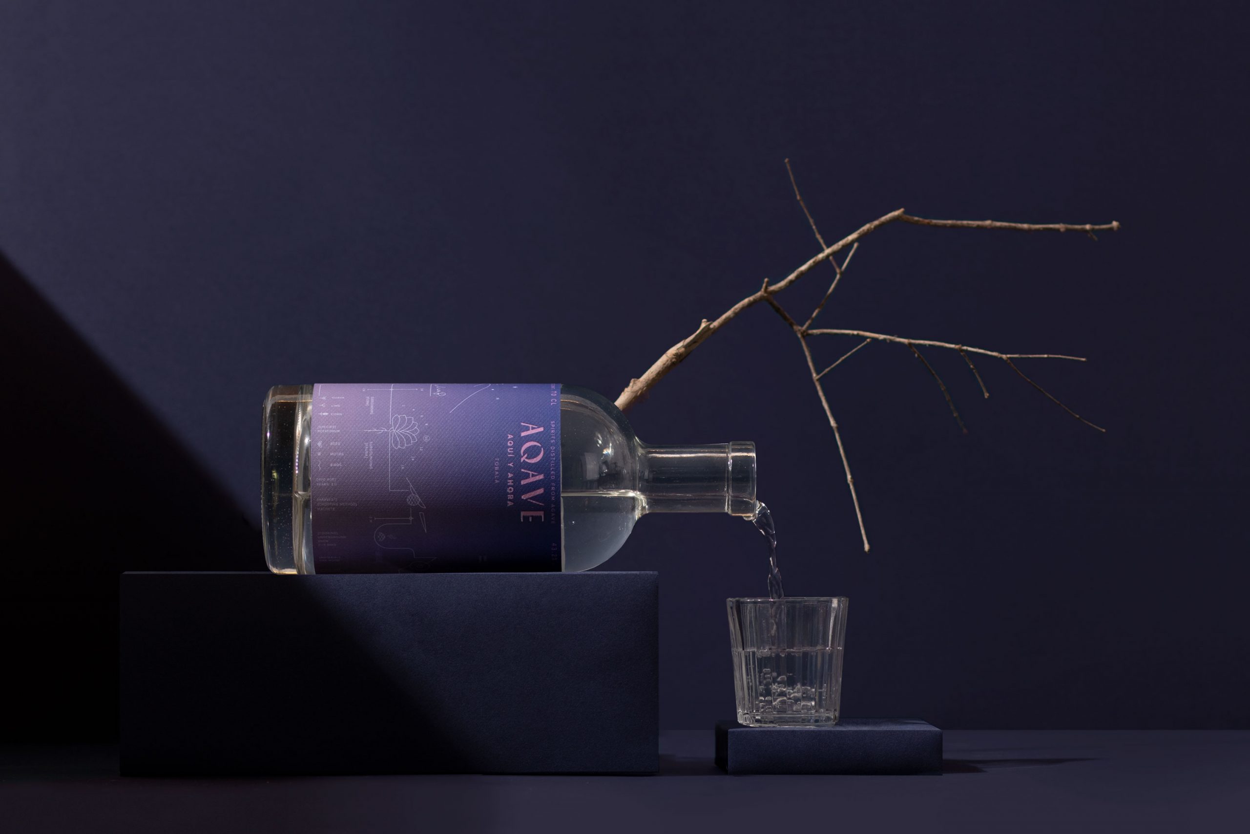
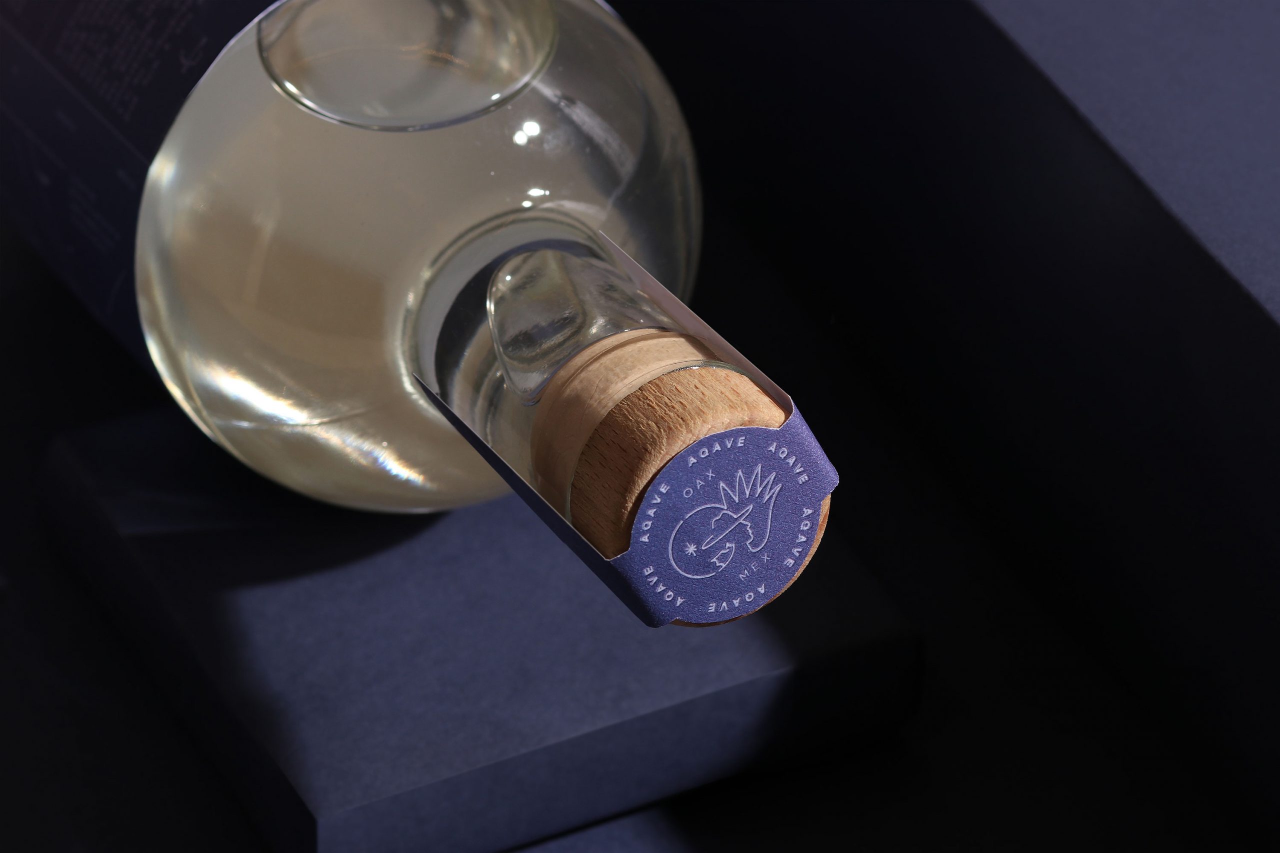
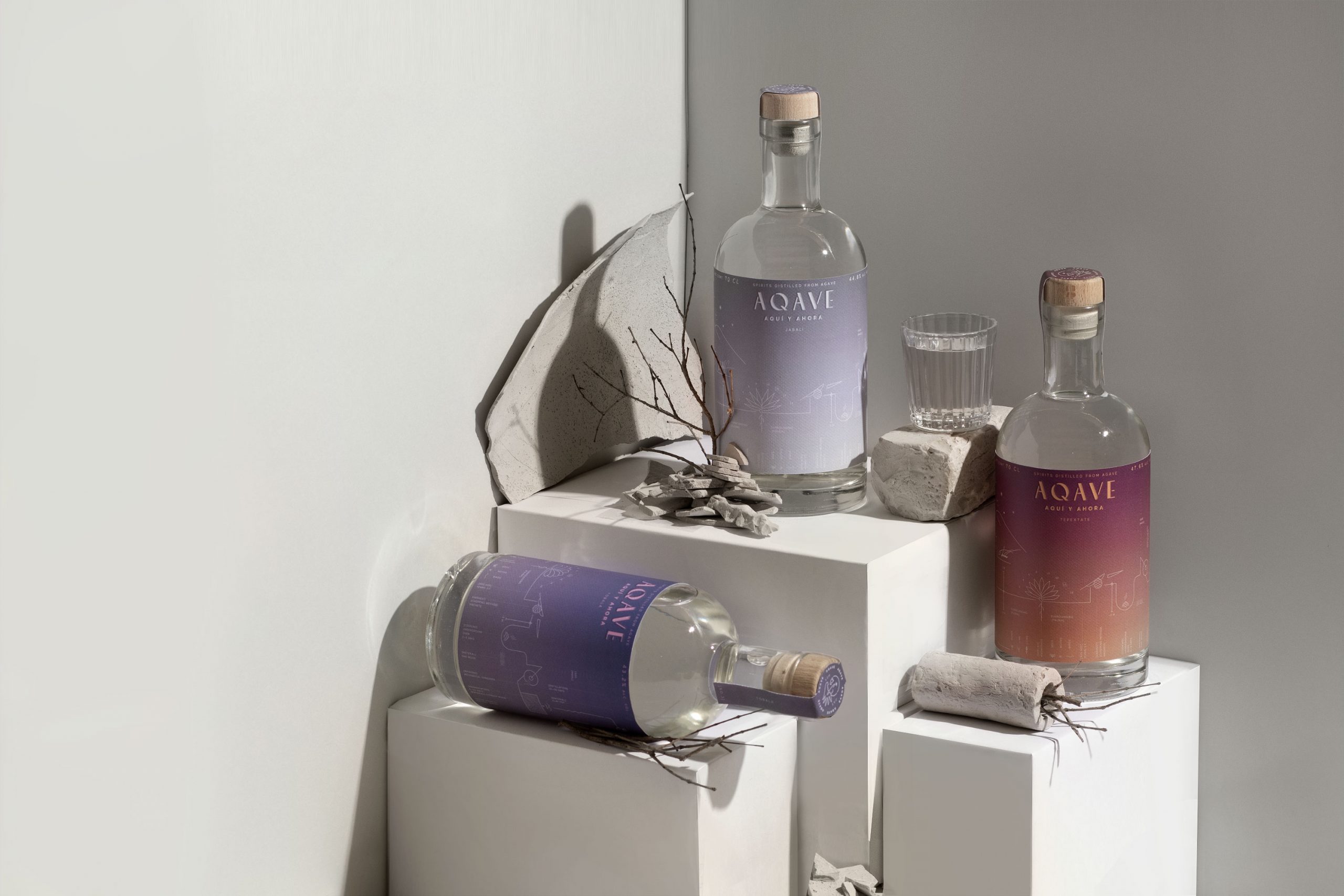
The brand describes the process between the synergy of the human touch, natural environments, and the relationships within communities. We created a system diagram that shows the union of this cultural universe through flow maps and technical symbolisms that are sensitive and emotional. Elements like climate, flora, fauna, and raw materials are presented in the flowchart of the different labels. These different flowcharts serve as a reminder and a way to present the research behind the brand.




NARRATIVE EXTRACT
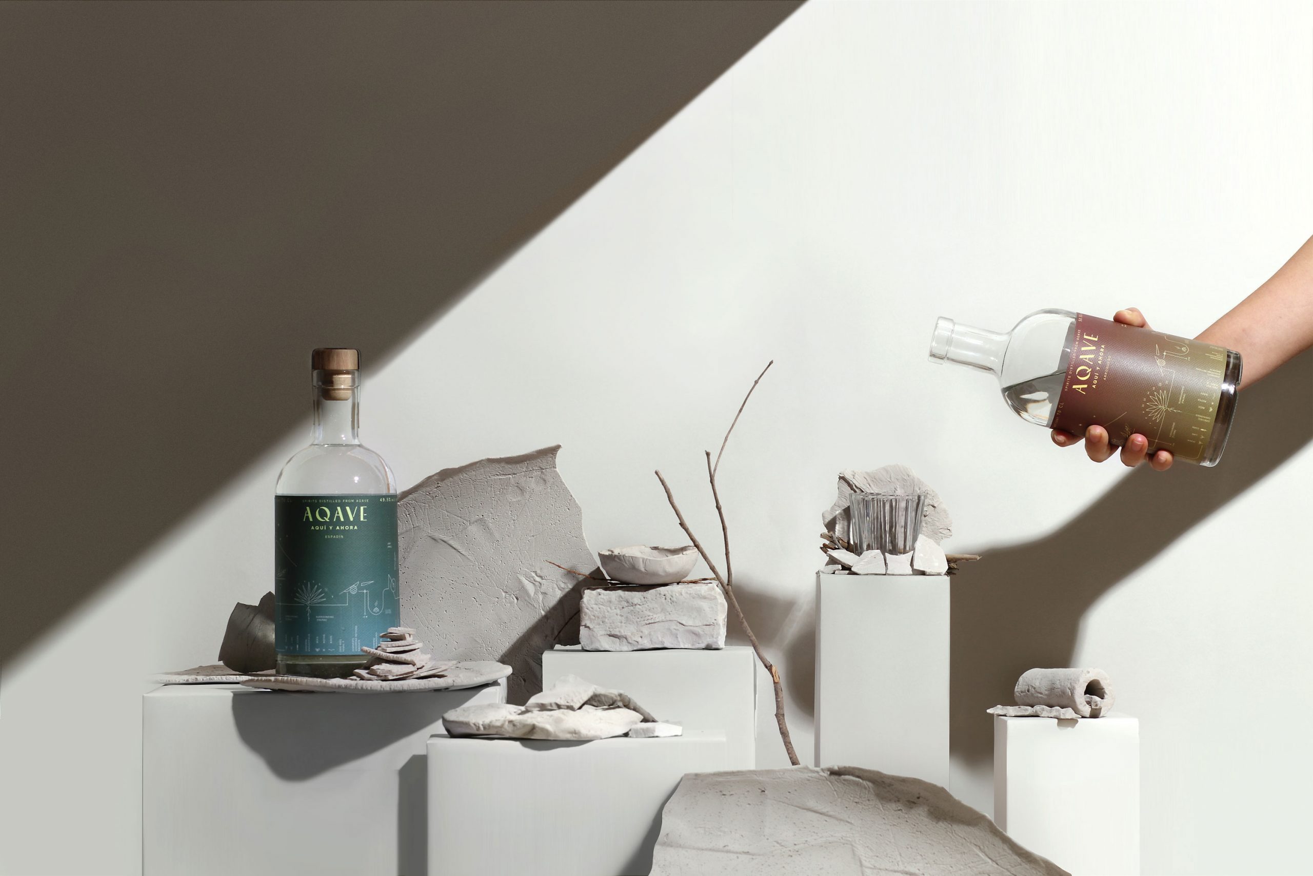
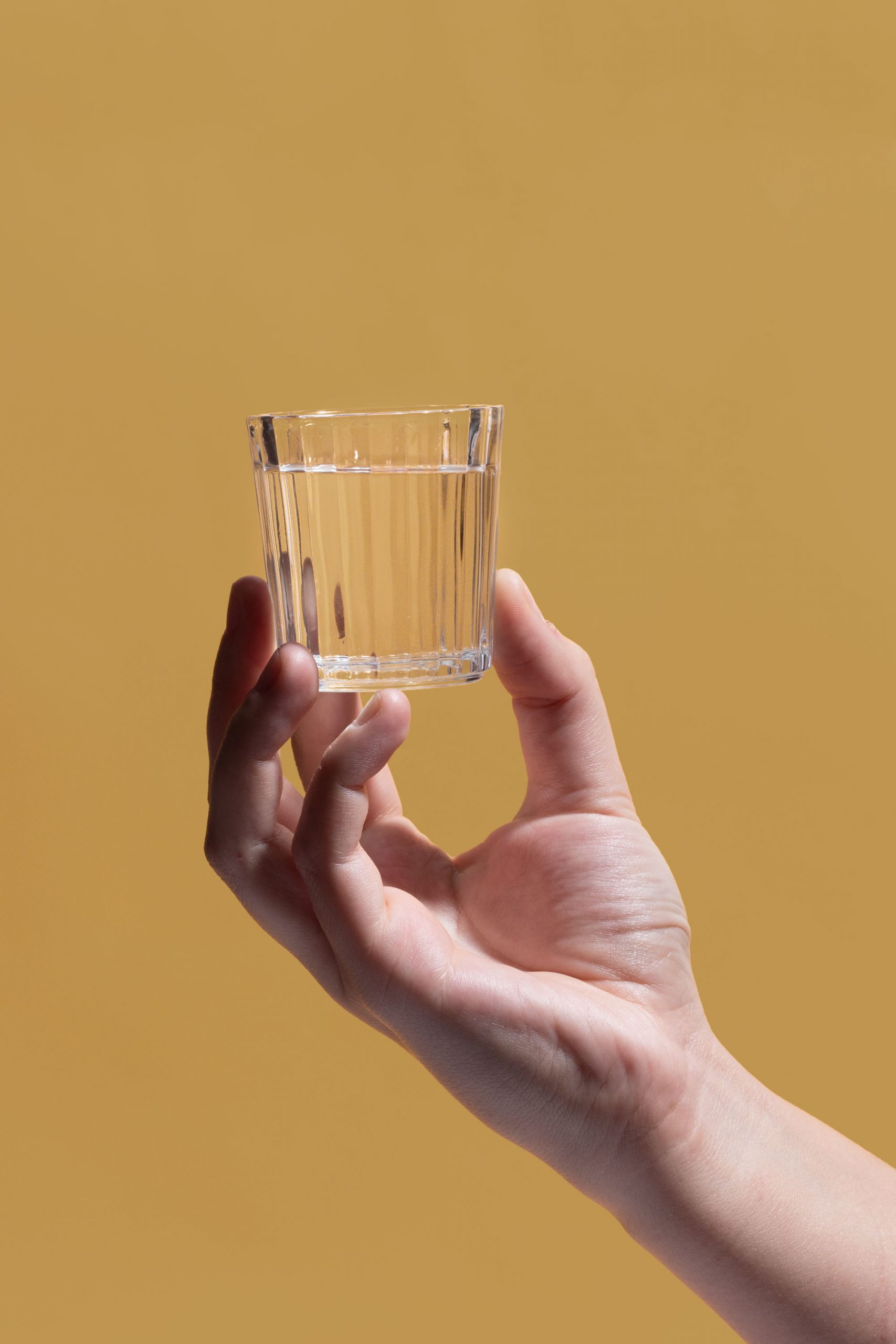
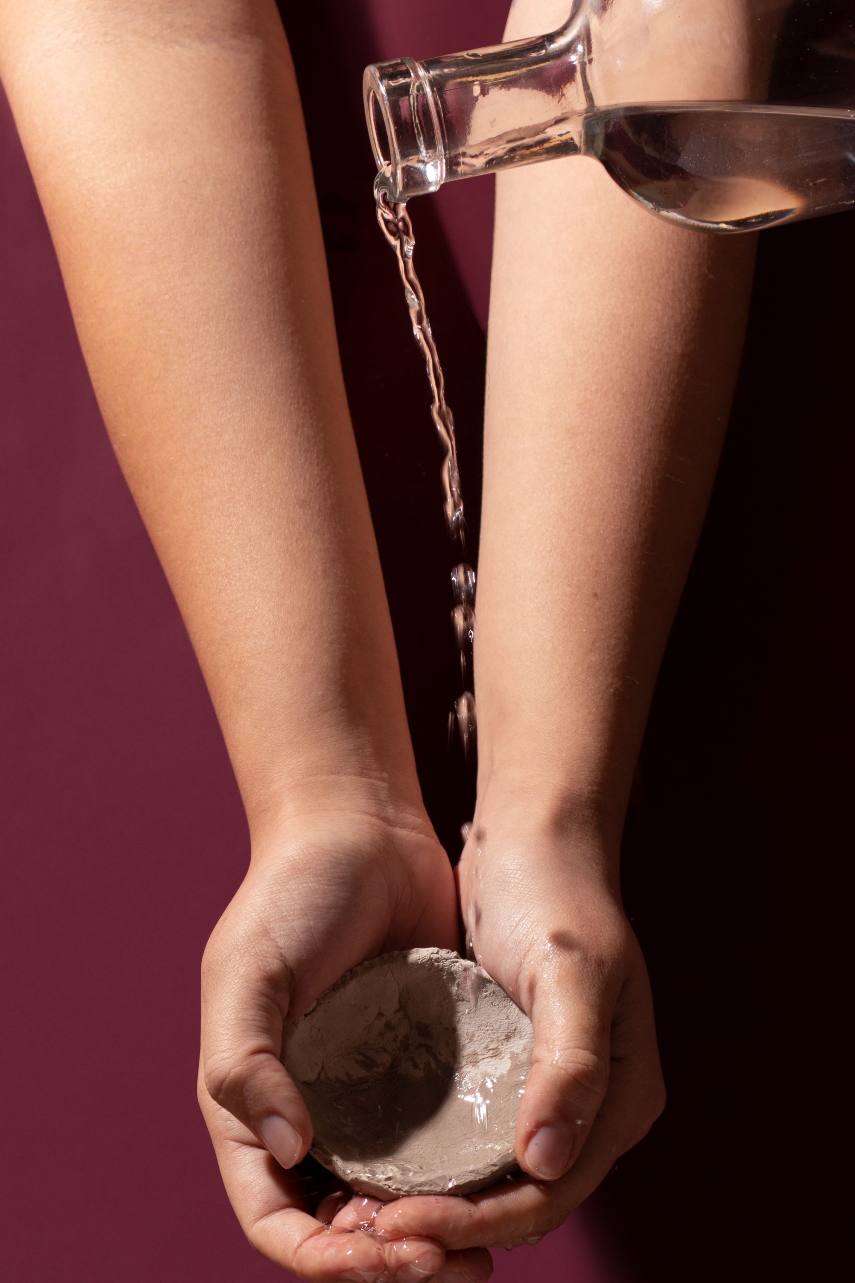
“To drink our handcrafted spirits is to open a window into the place in which they originate. Let the bottle in your hand transport you to lush, sun-baked hillsides. Can you smell wood smoke as the agave hearts roast?”
SHARE THIS PROJECT