Breana´s Toast
CRAFT BAKERY BRANDING
—
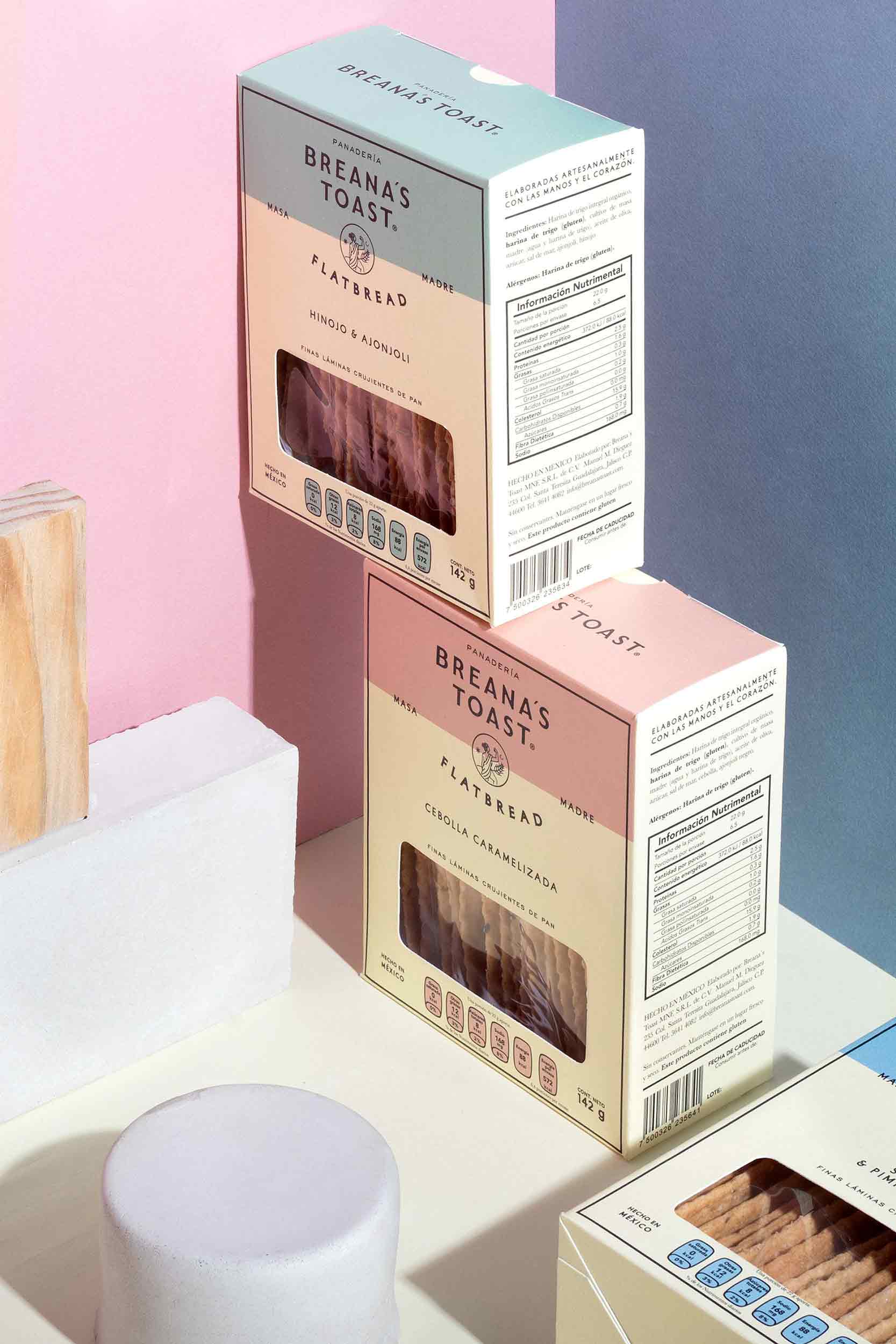
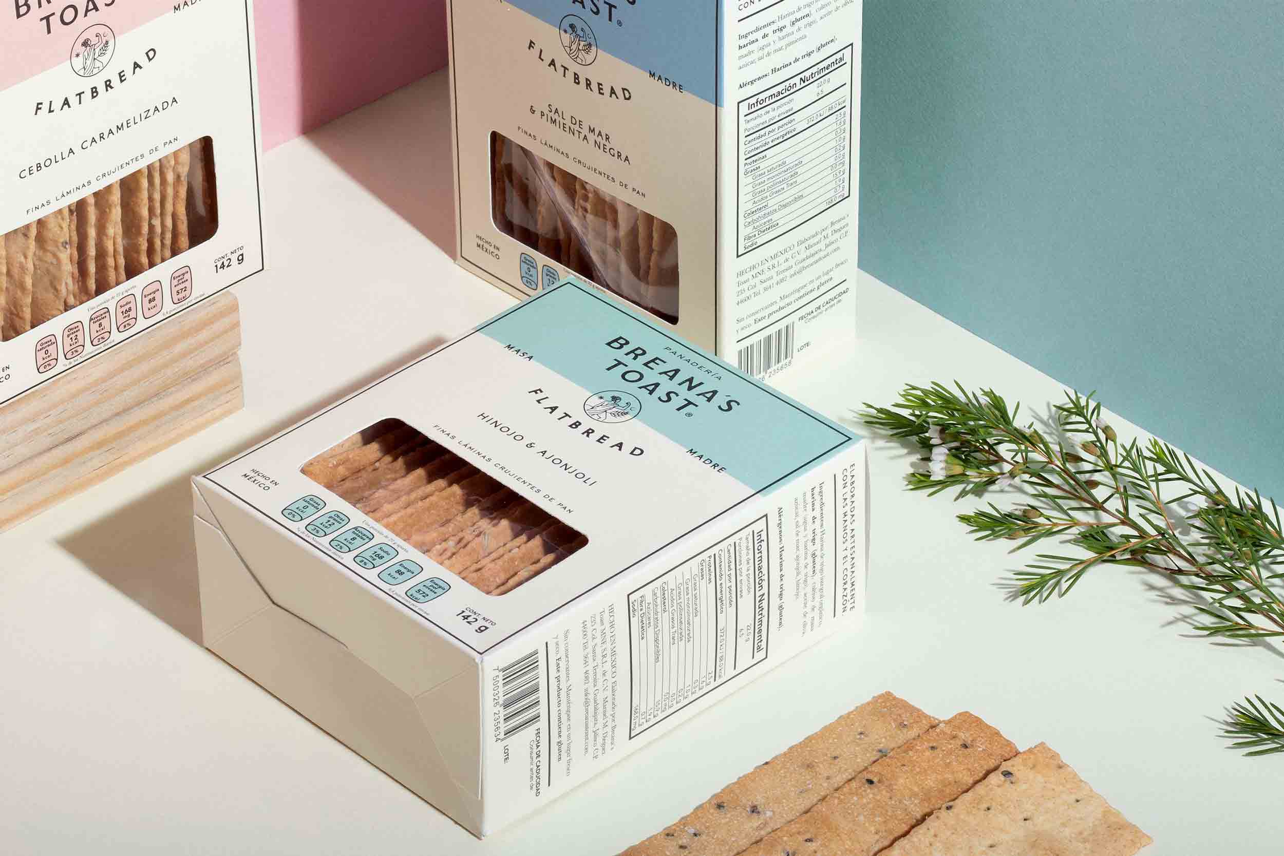
PACKAGING. 2019
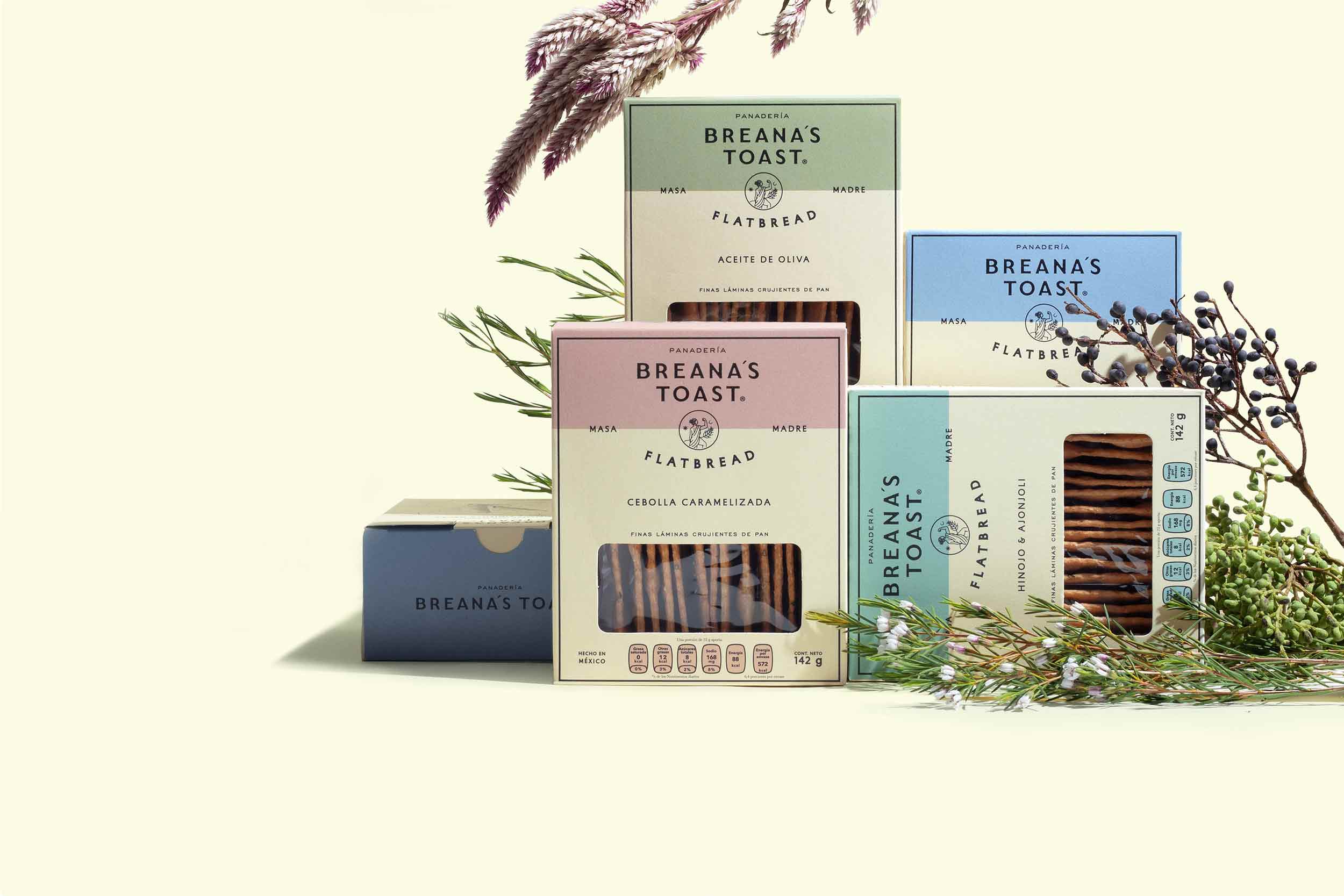
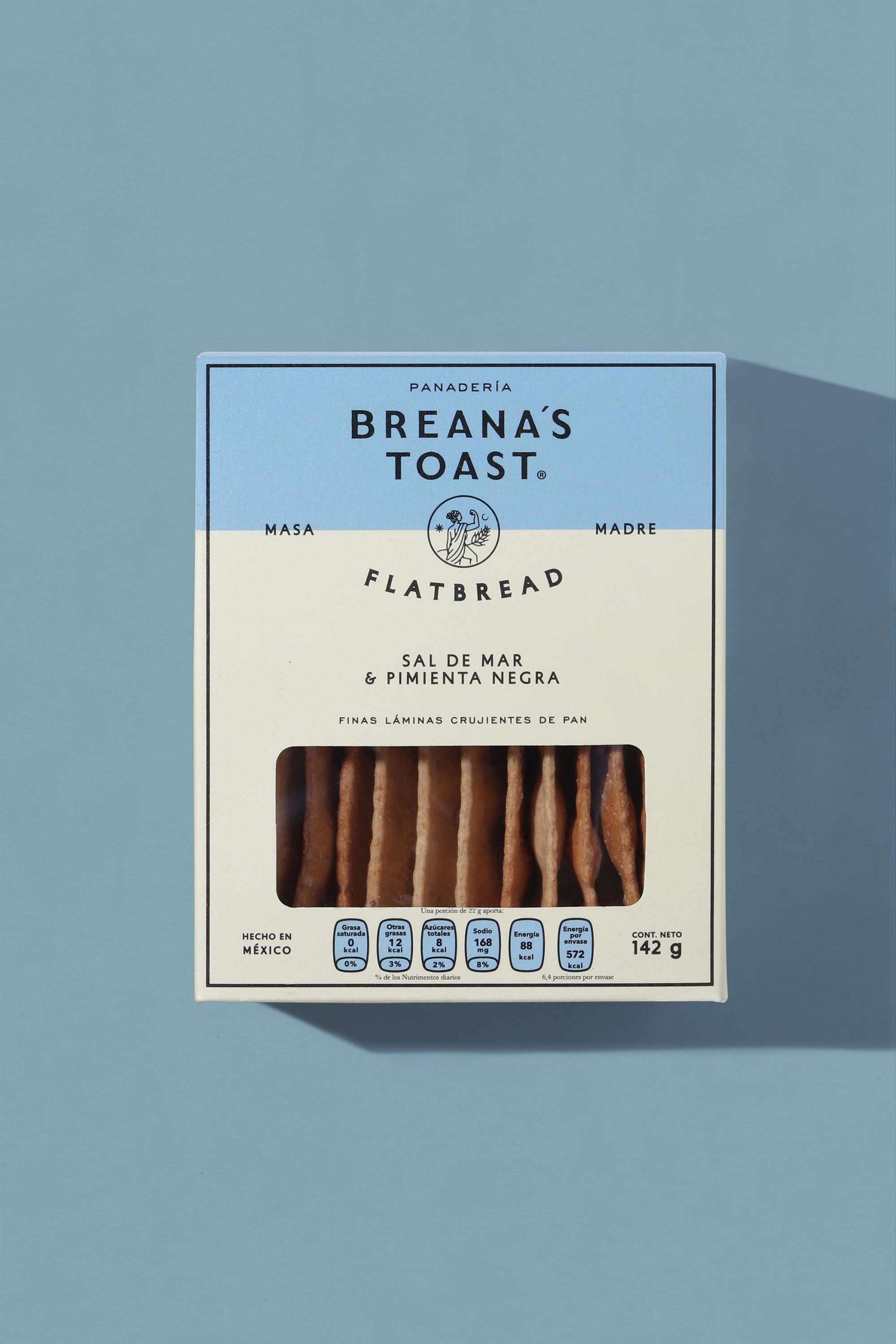
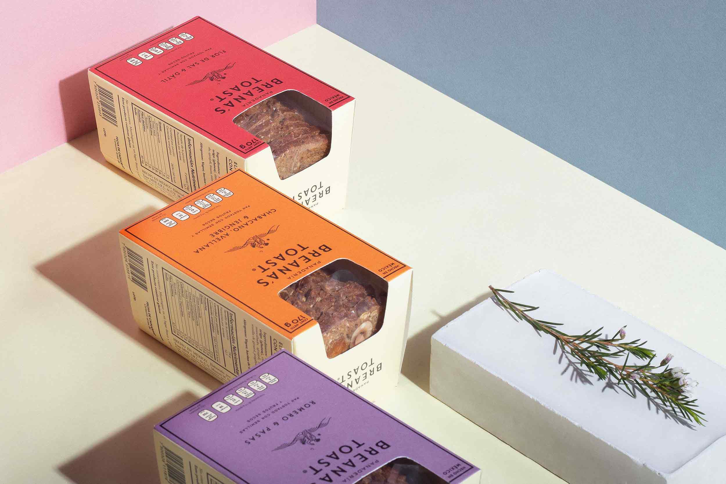
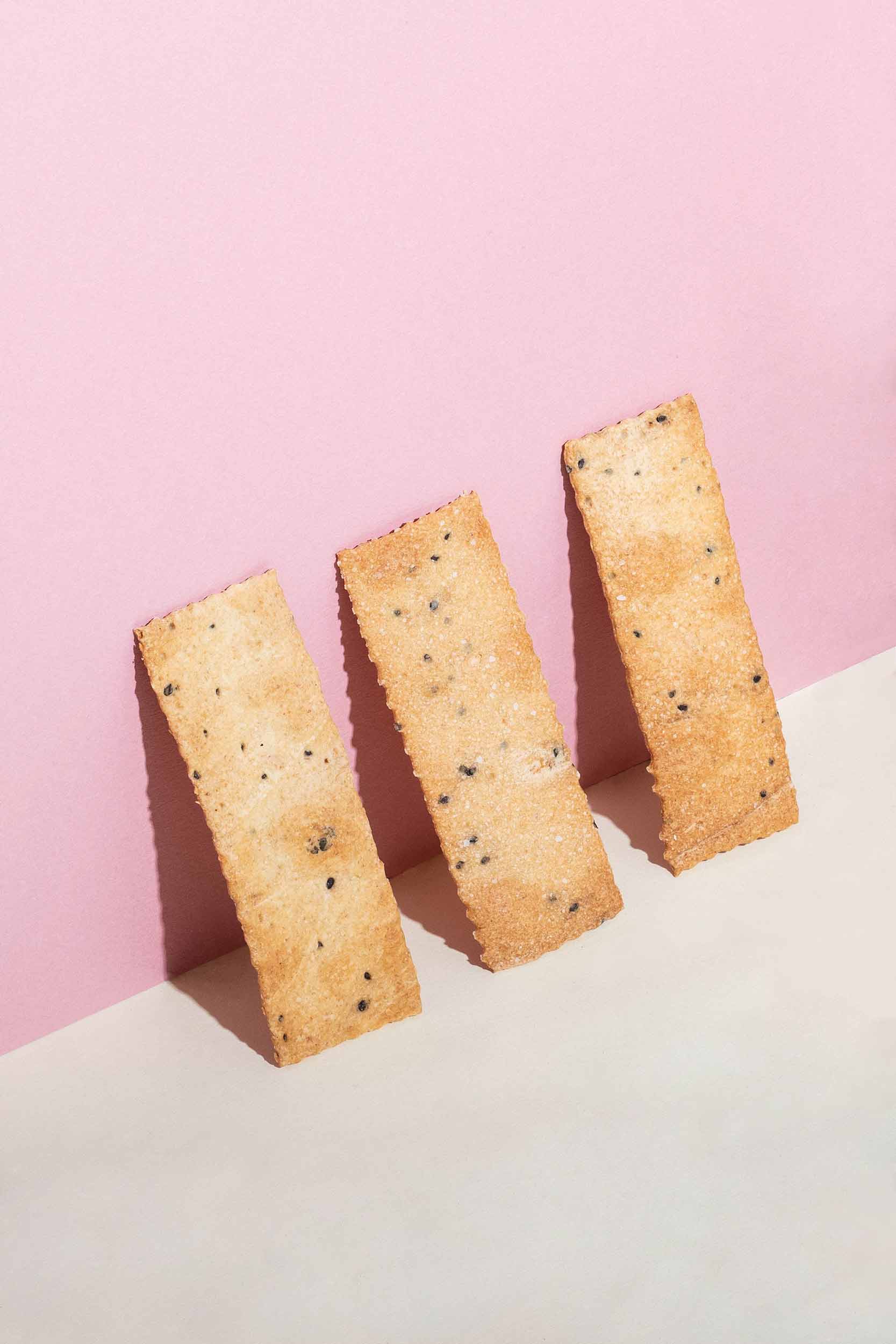
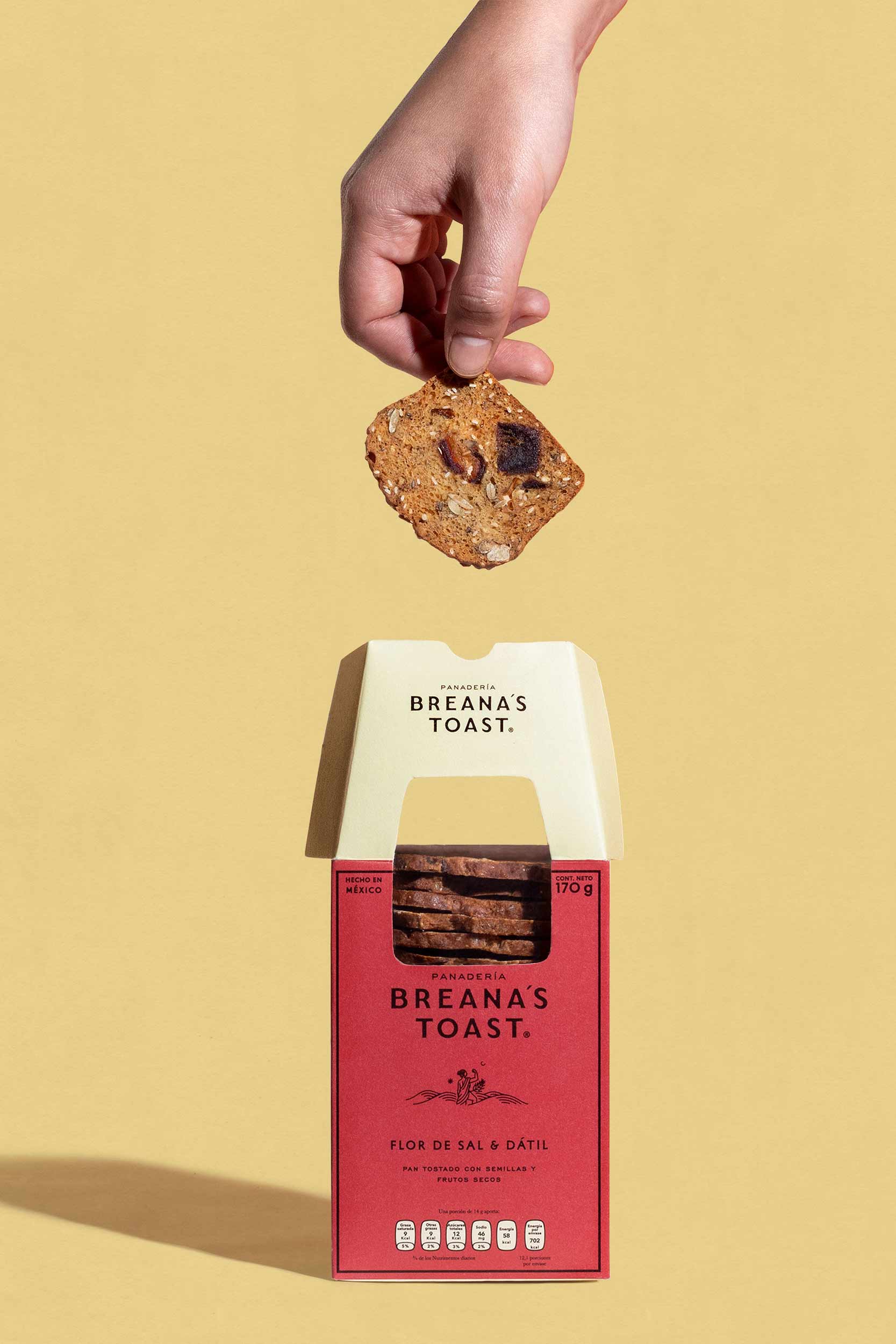
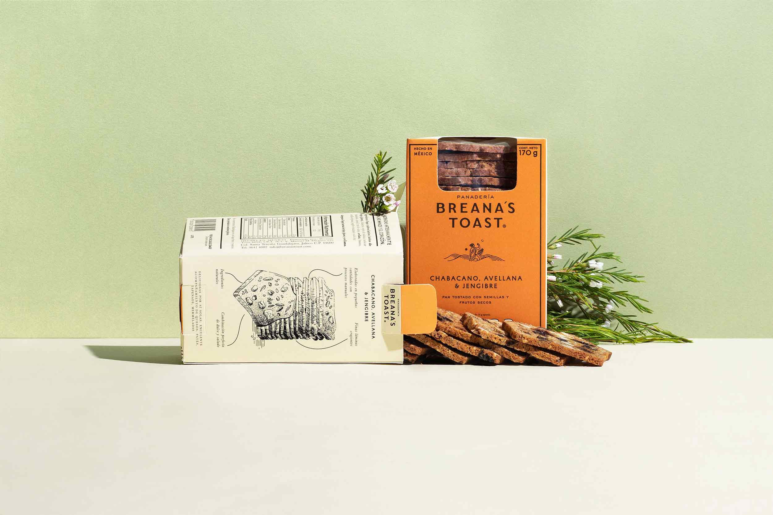
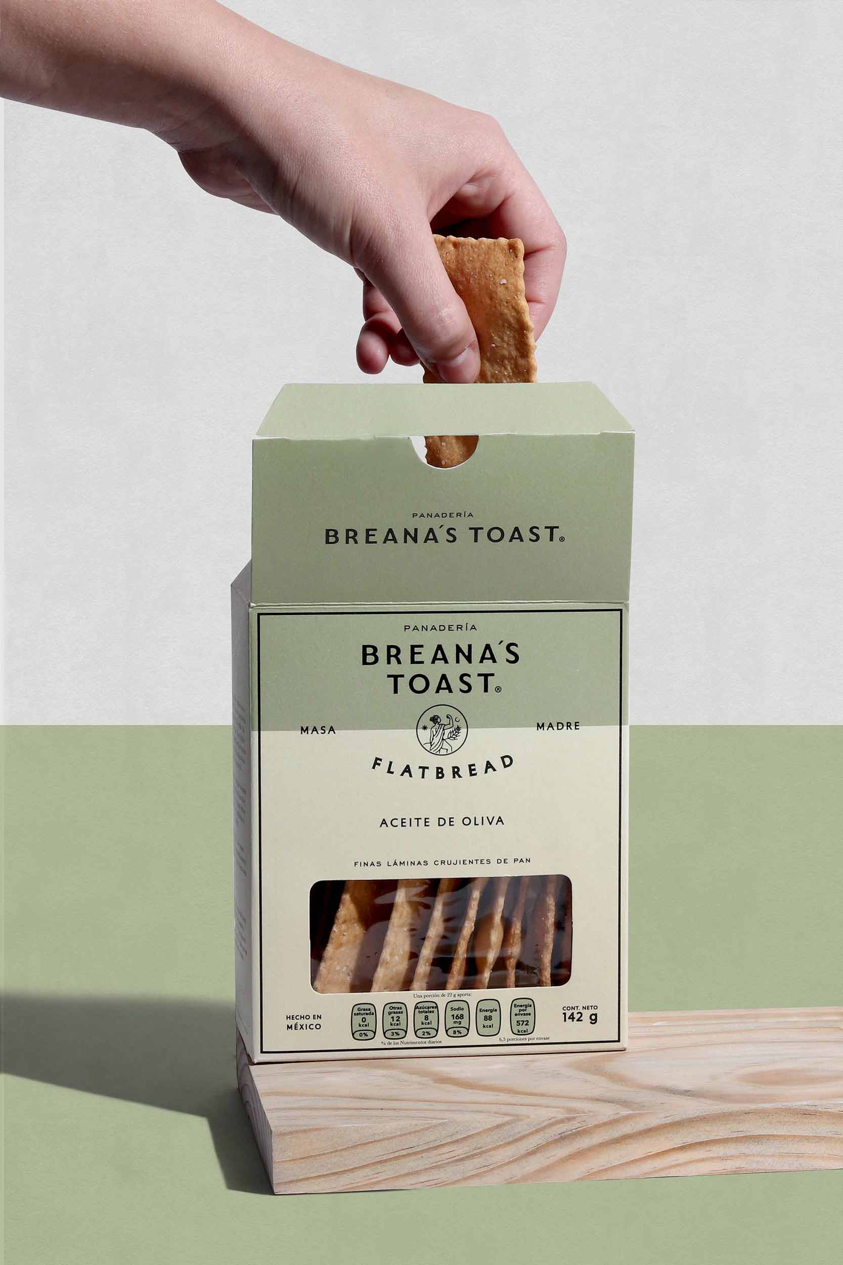
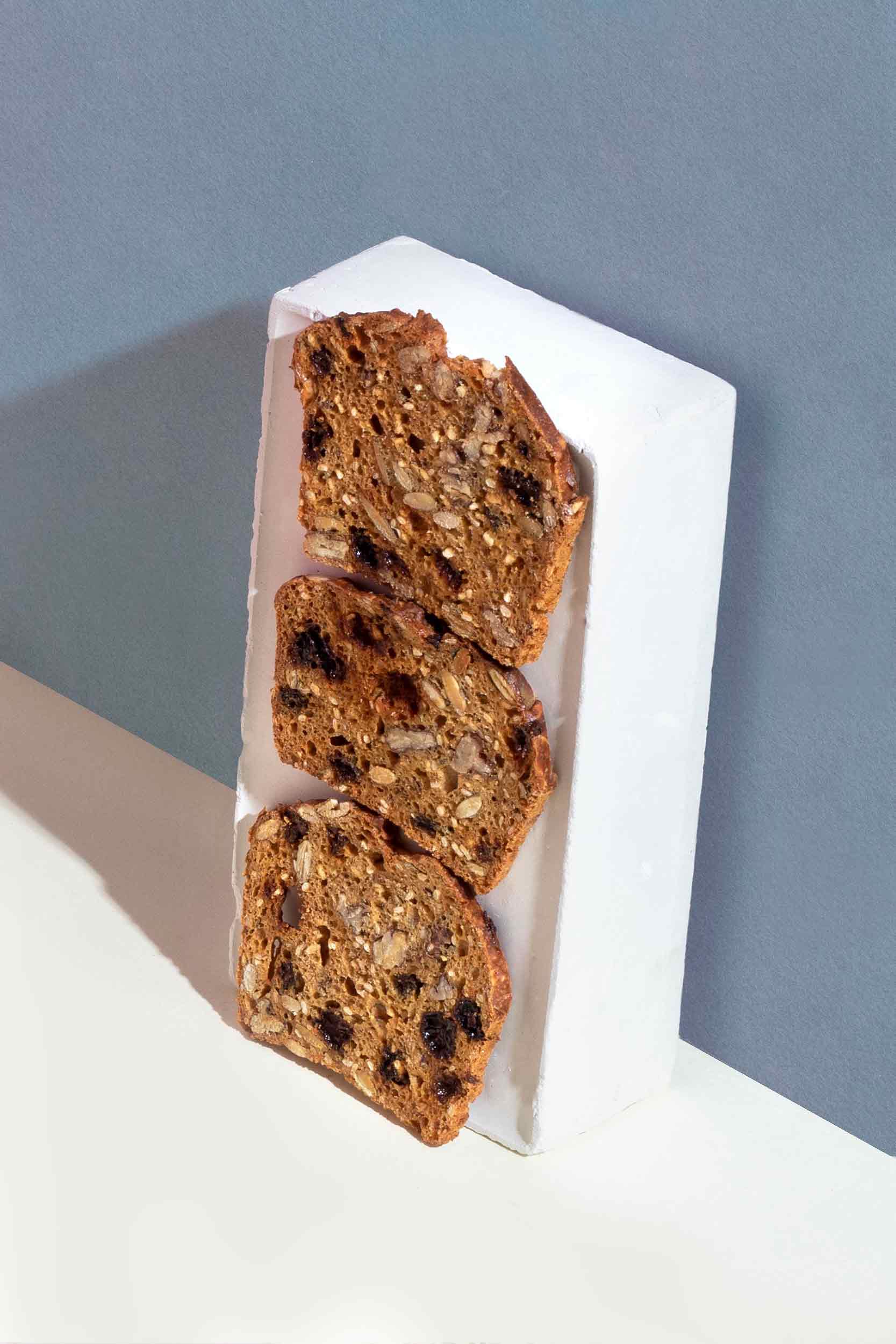
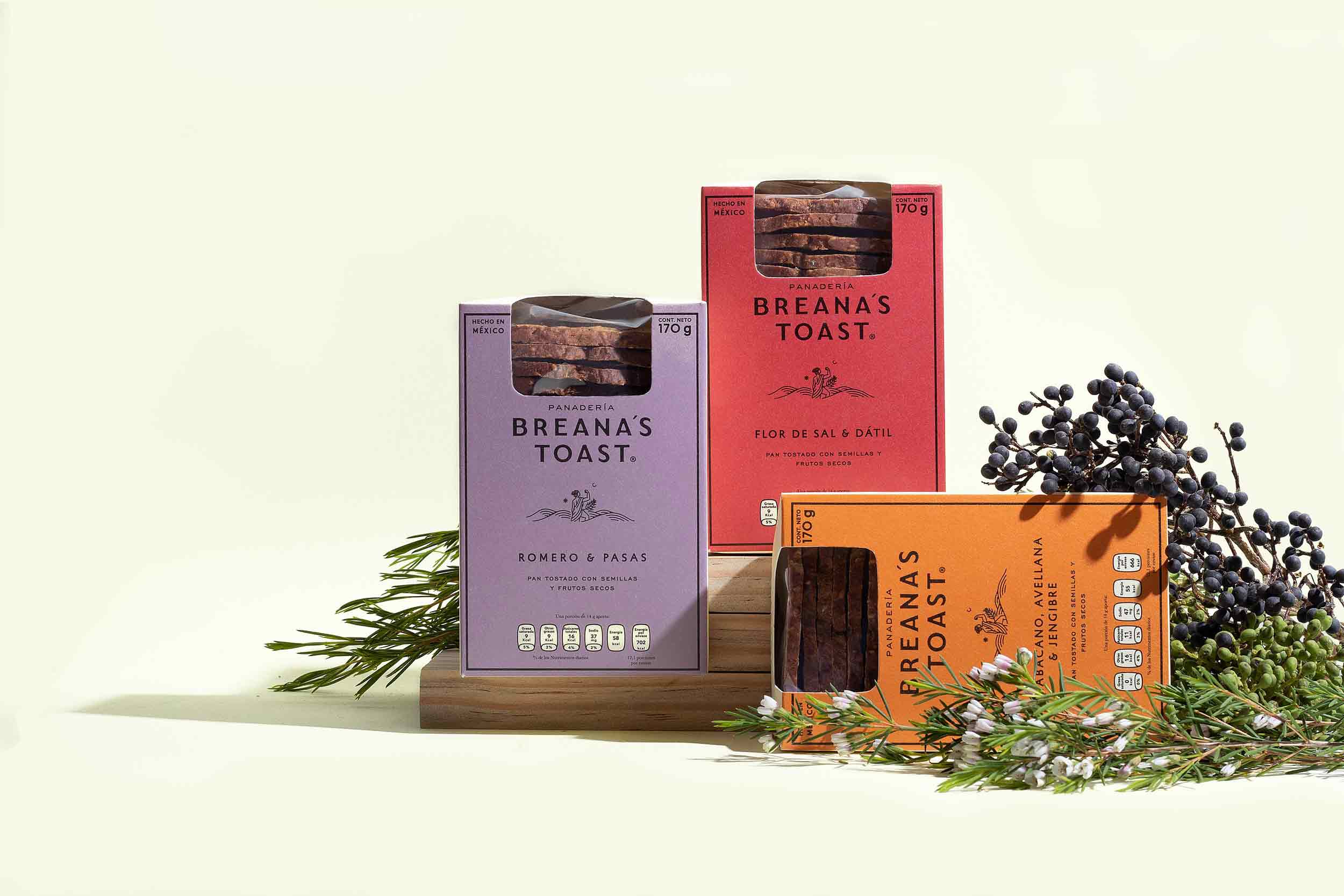
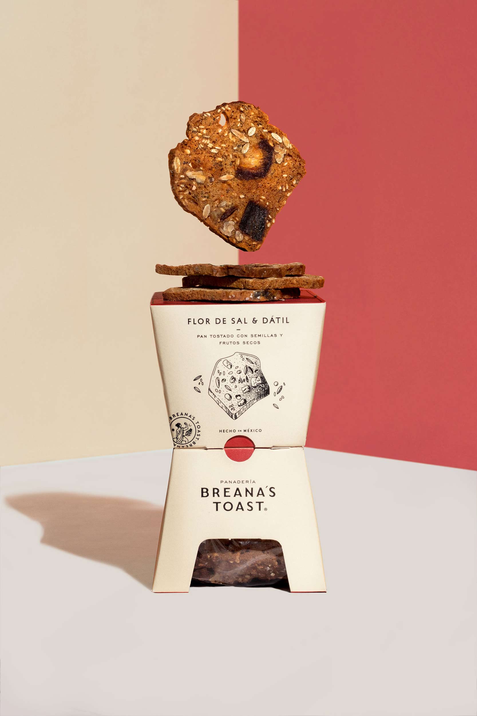
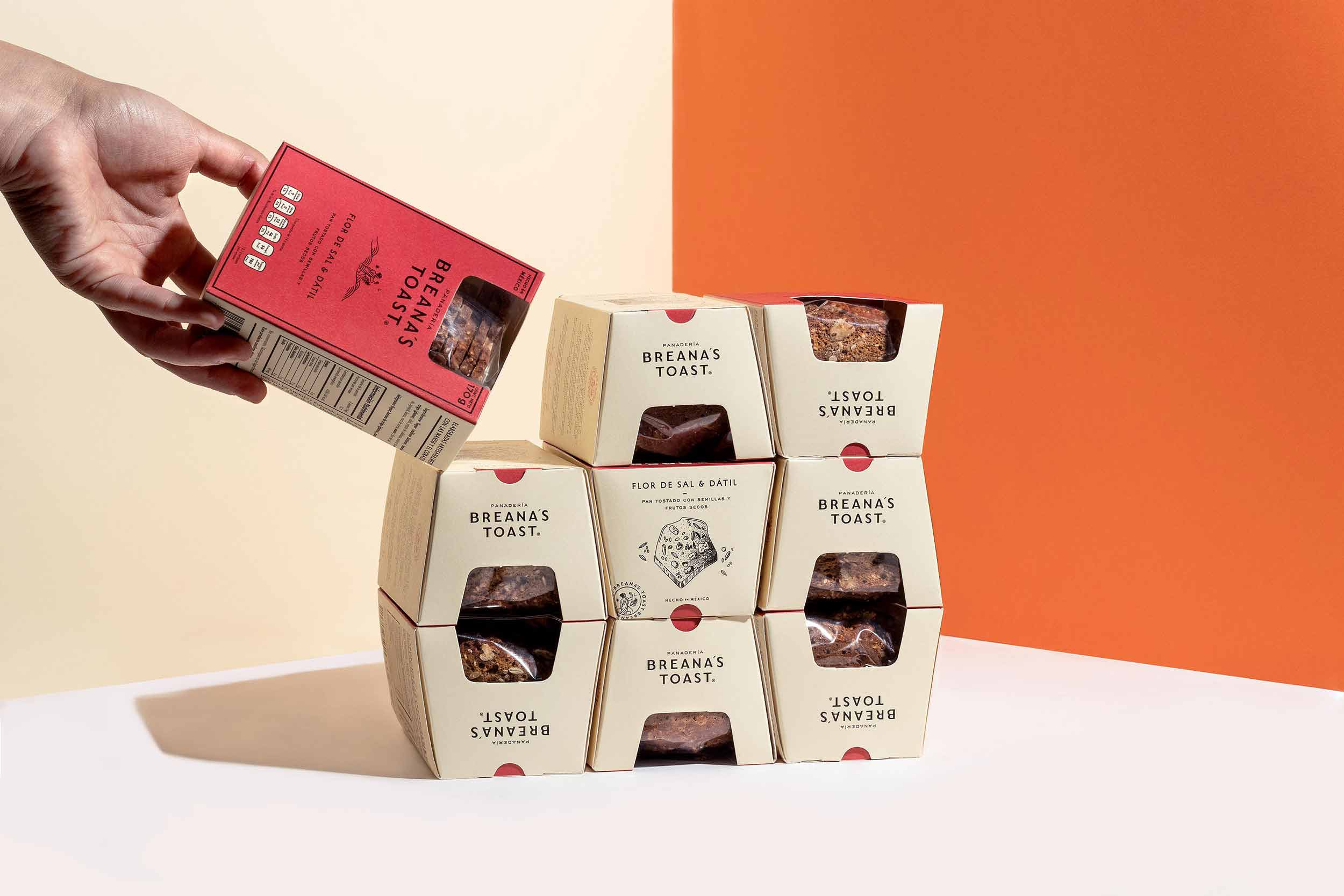
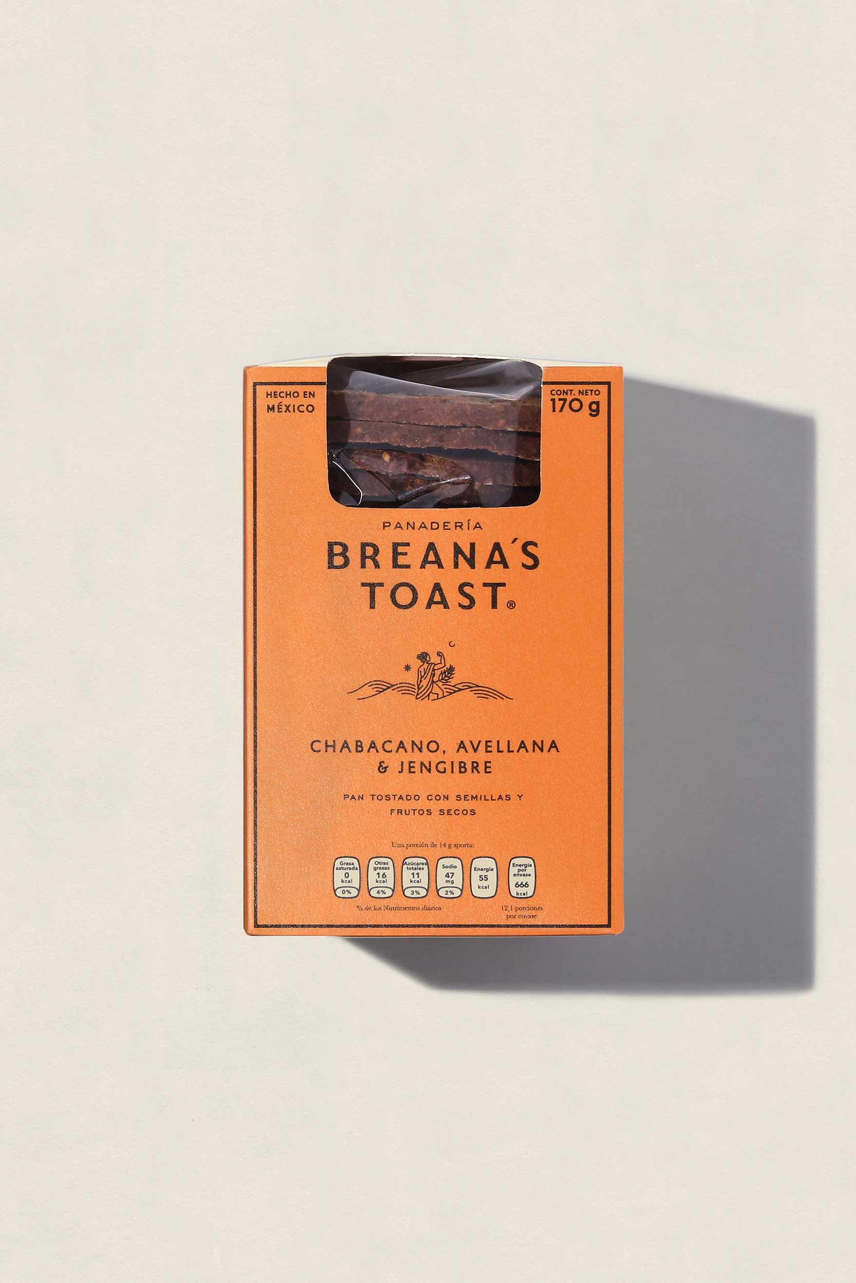
Breana´s Toast is a bread based brand with a family bond in the back end. Their products are for those who seek the quality of products made slowly in the convenience of their local shop.
—
CREDITS
ART DIRECTION: MARIO HGNO
COPYWRITING: OLGA VILLEGAS, KAREN VIZCARRA
DESIGN: MARIO HIGINIO BALLESTEROS, NUBIA FERNÁNDEZ
PHOTOGRAHY: FREDY “EL GATO” MORFÍN
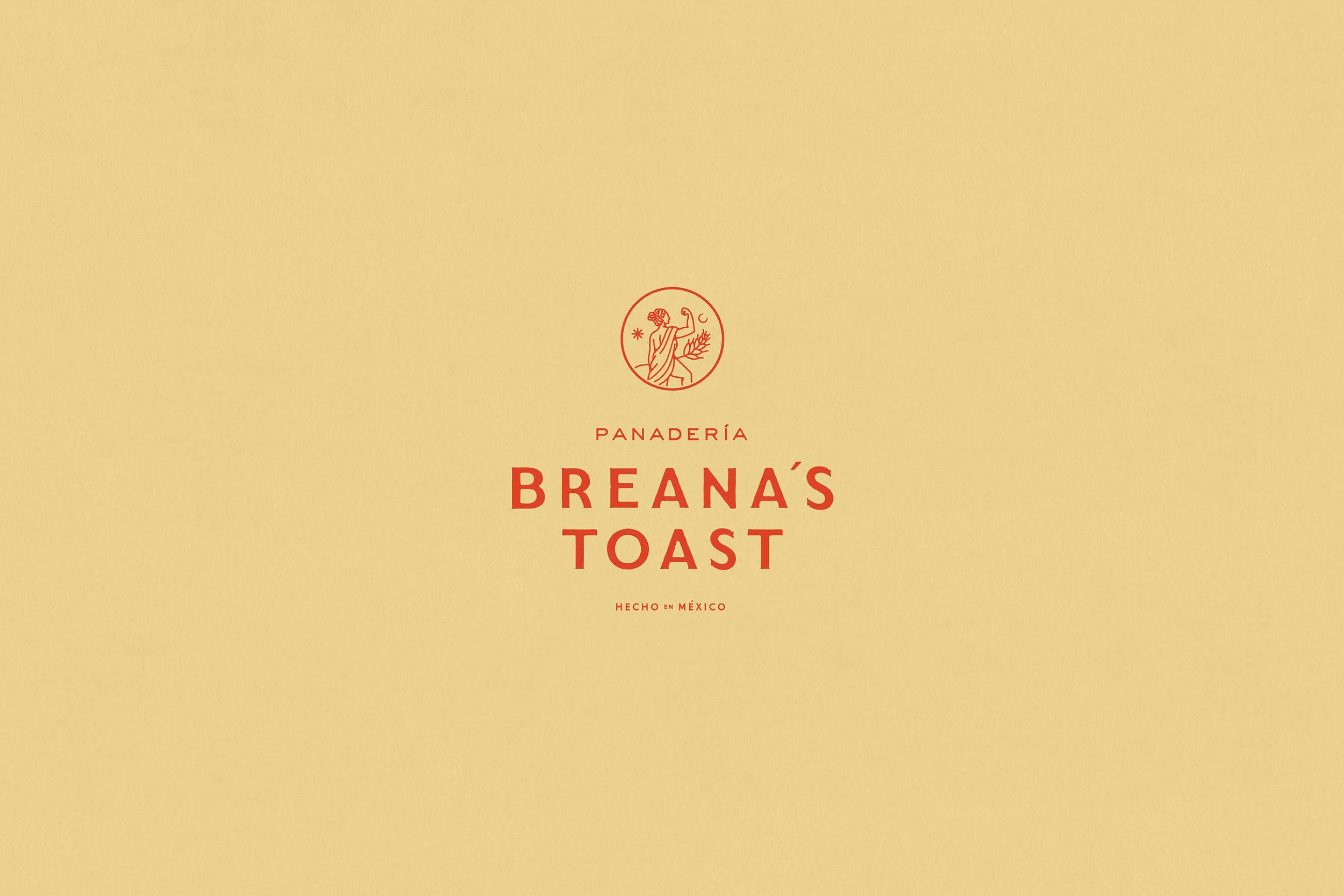
VISUAL UNIVERSE
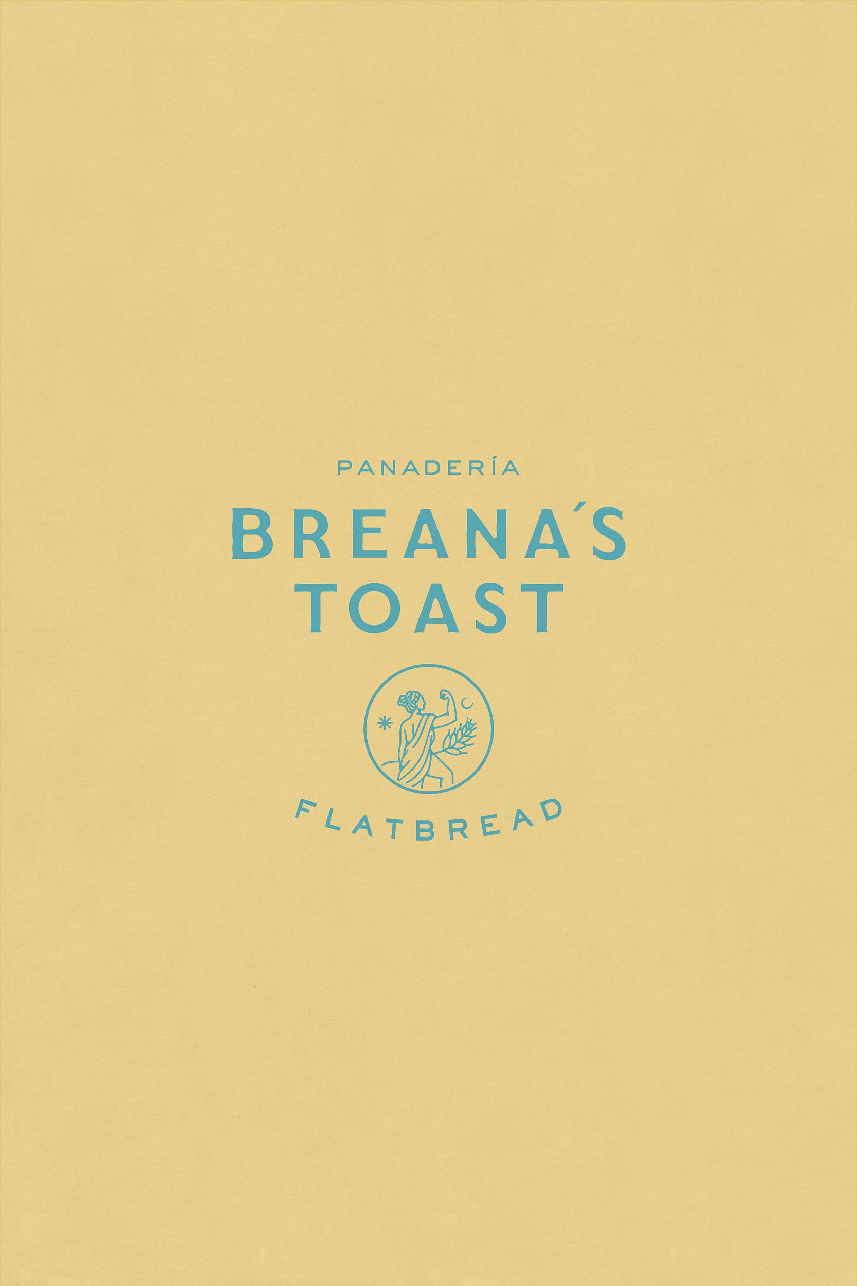
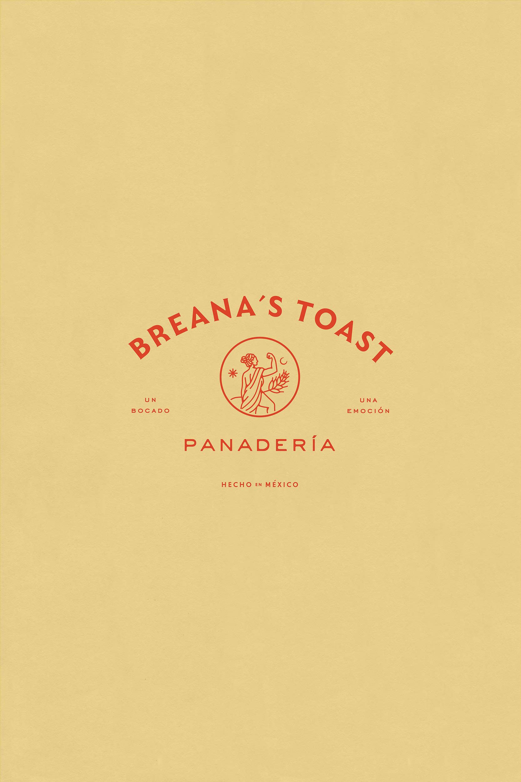
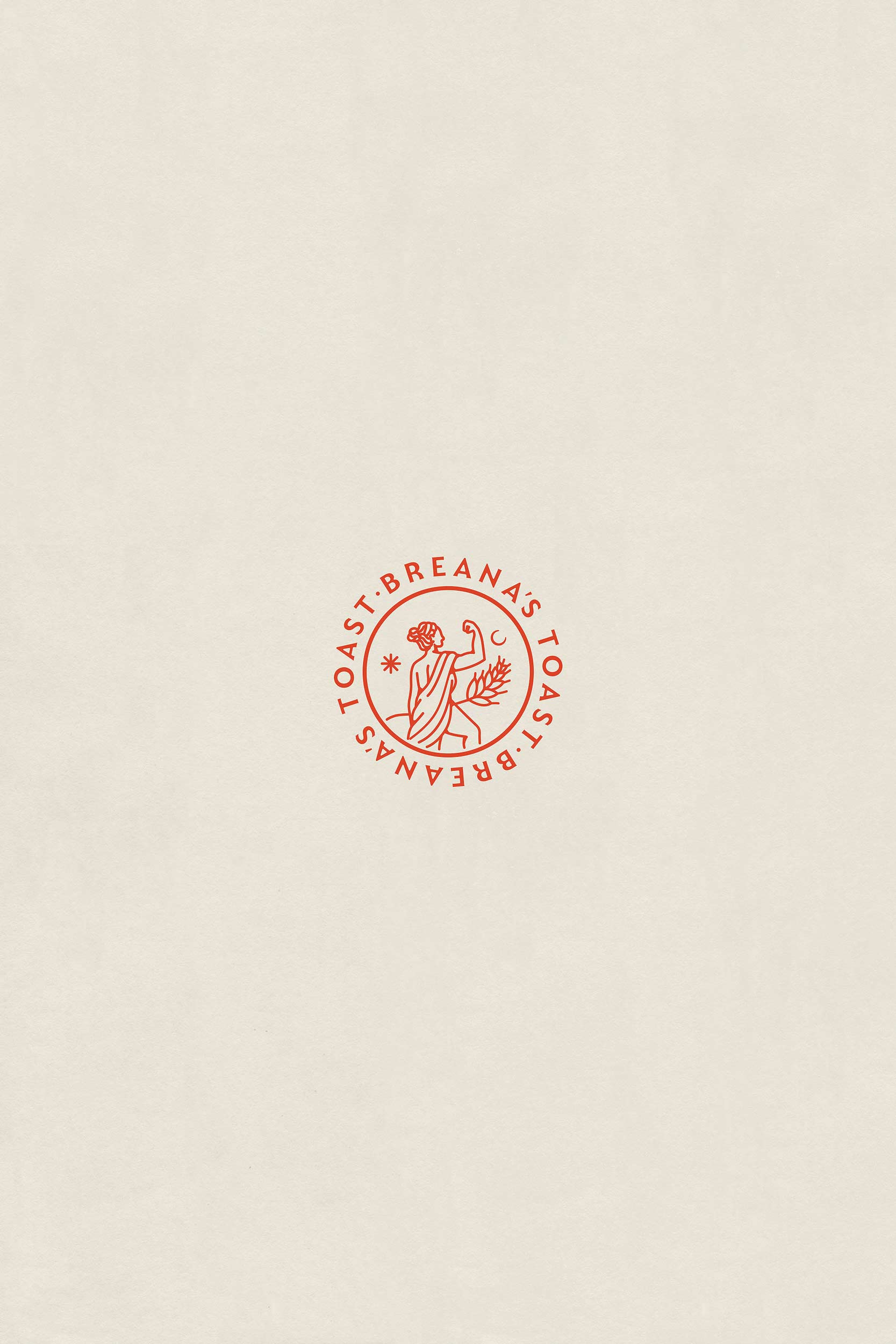
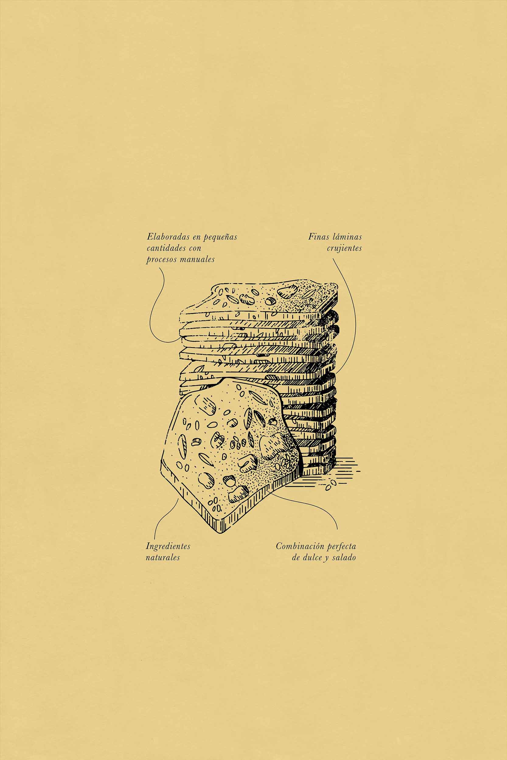
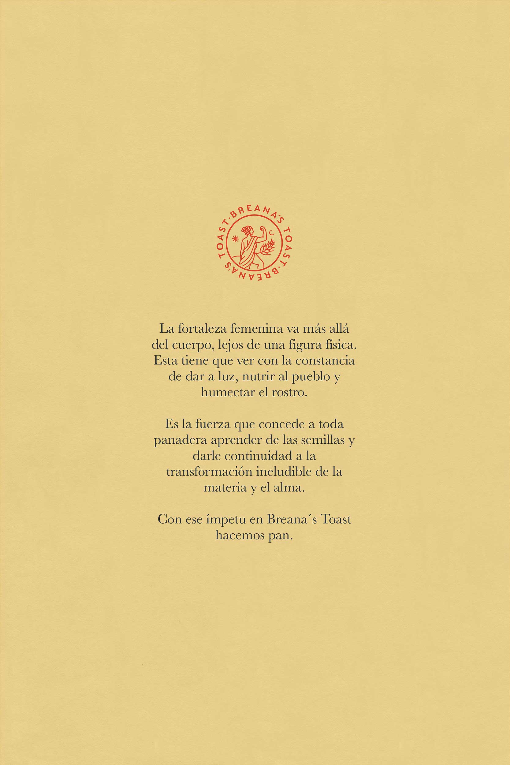
Through the brand system, we want to remind the consumer that there is a feminine force behind the project. We know that the future is female but so was the past when Breana´s Toast was founded. We opted for an ancient feminine symbol, a greek inspired goddess with a posture that signifies the importance of women in the work field. Breana´s strength surpasses the body, it stays away from the physical realm. It is the representation of continuous transformation, it is the stamina of being on your feet next to the heat of the fire.
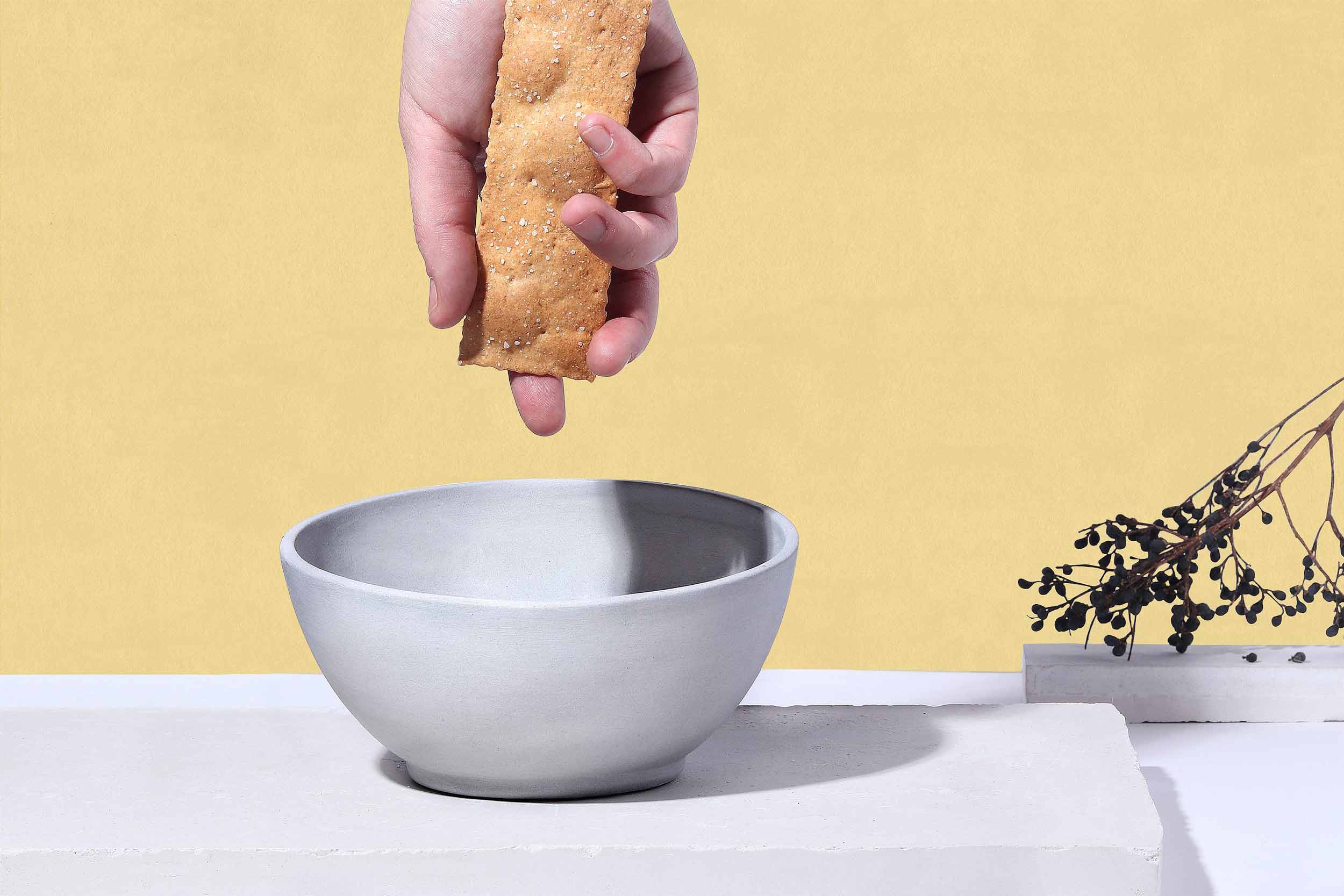
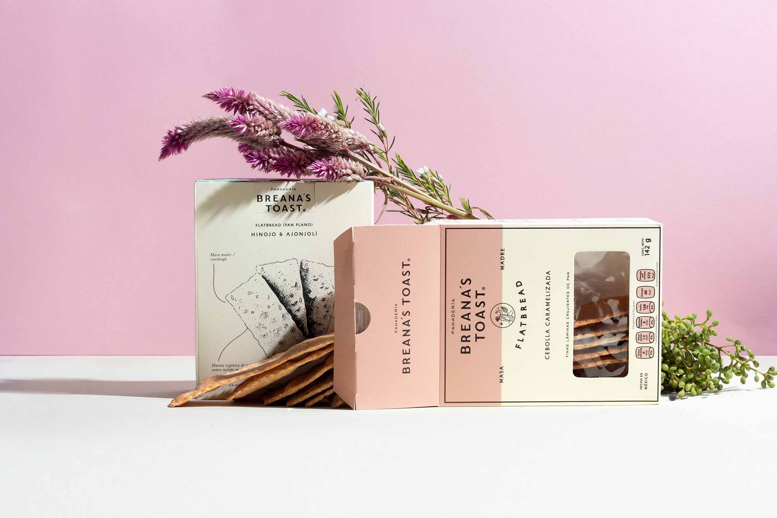
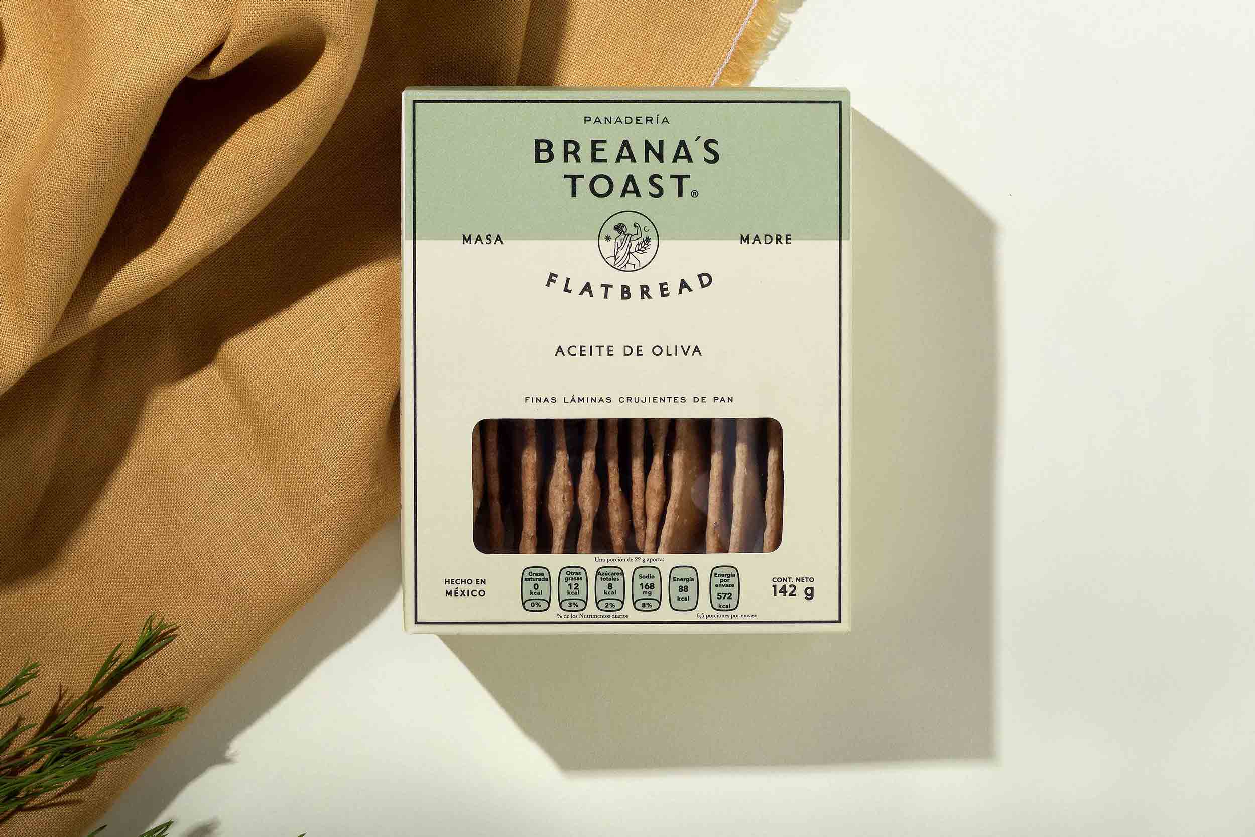

BRAND SOLUTION
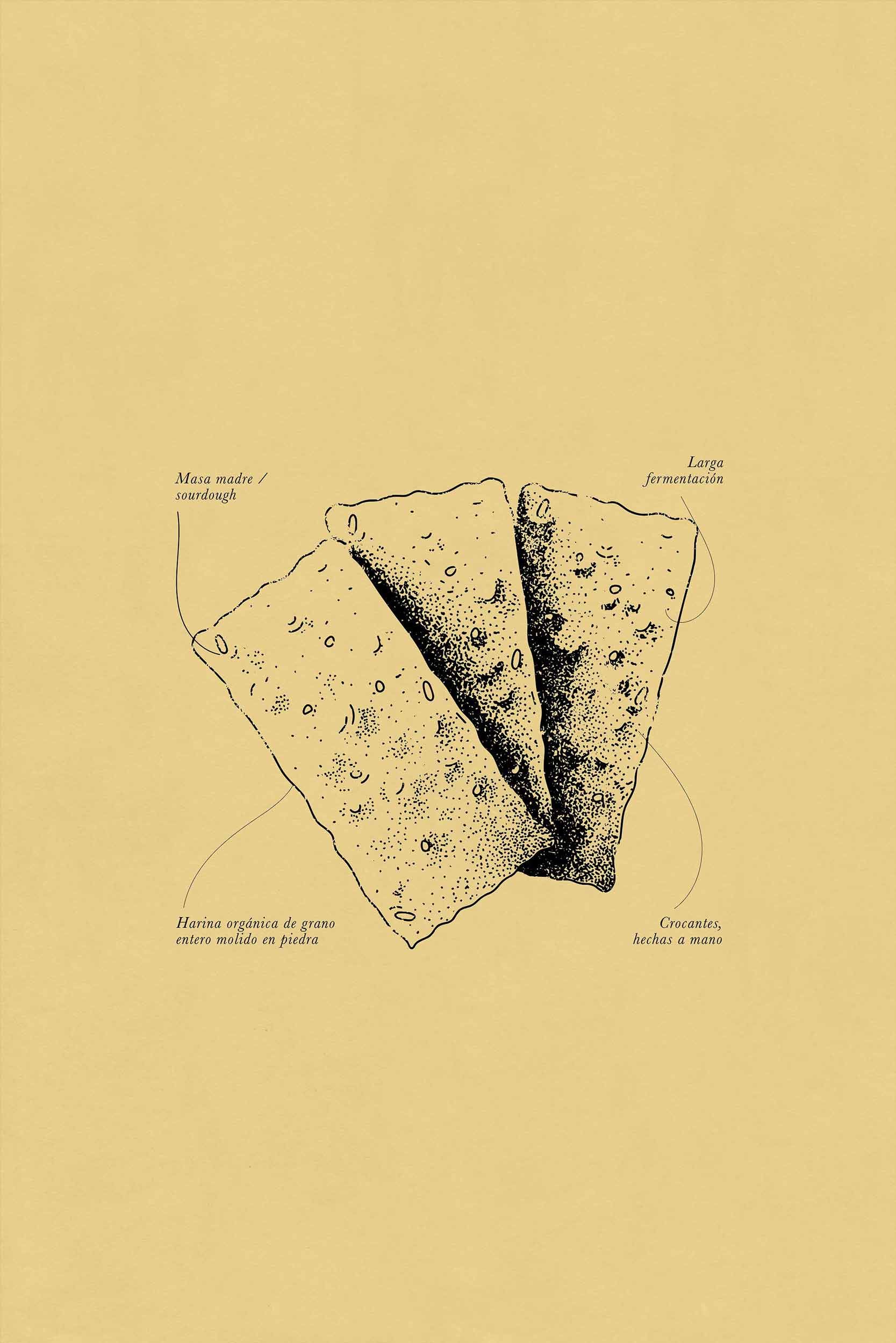
The overall concept revolves around the importance of quality ingredients, the strongest bond in humanity which is the one between a mother and her daughter and the strength behind a project ran by women. Breana´s Toast is a token for those who enjoy the pleasures of sharing a table.

SHARE THIS PROJECT