Flowerhead Tea
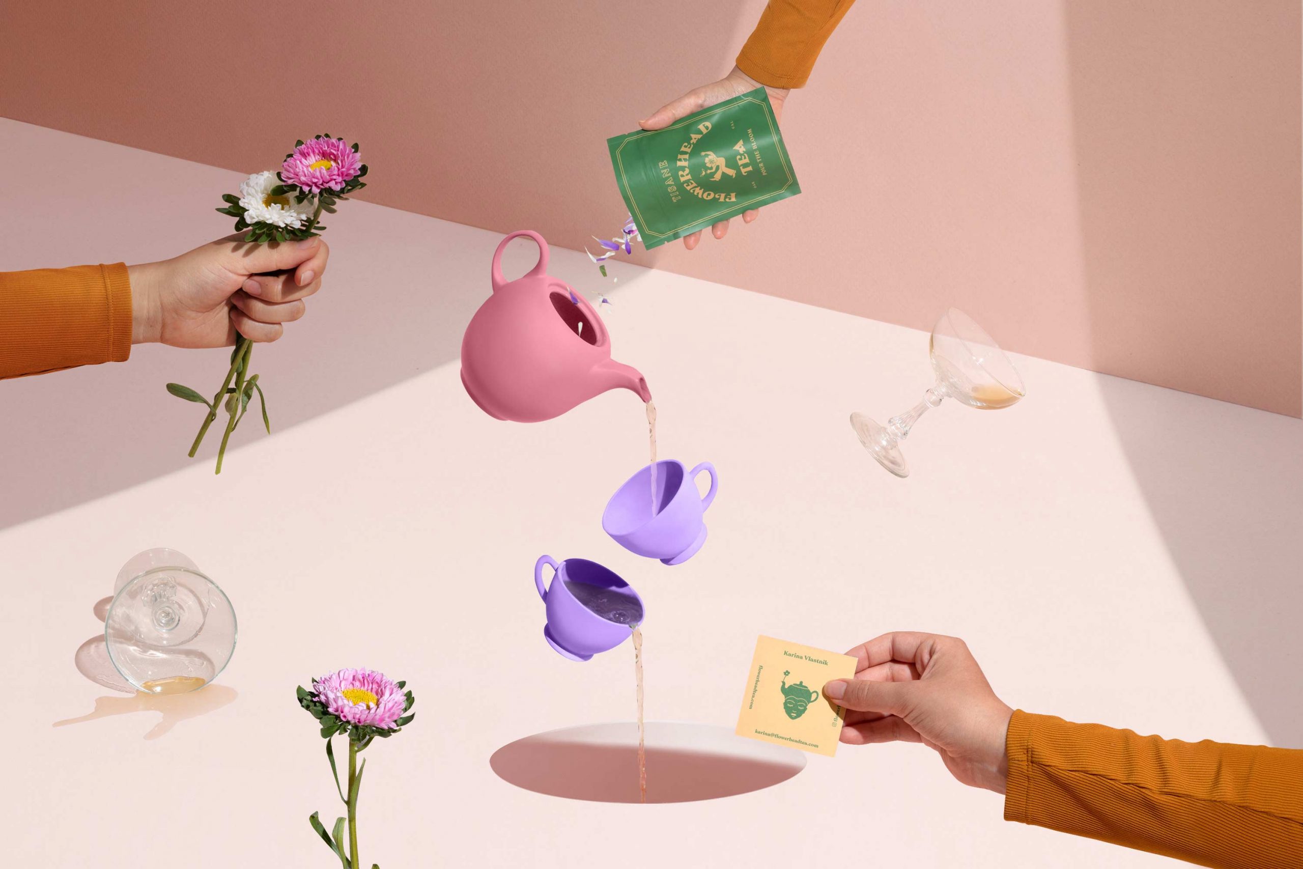
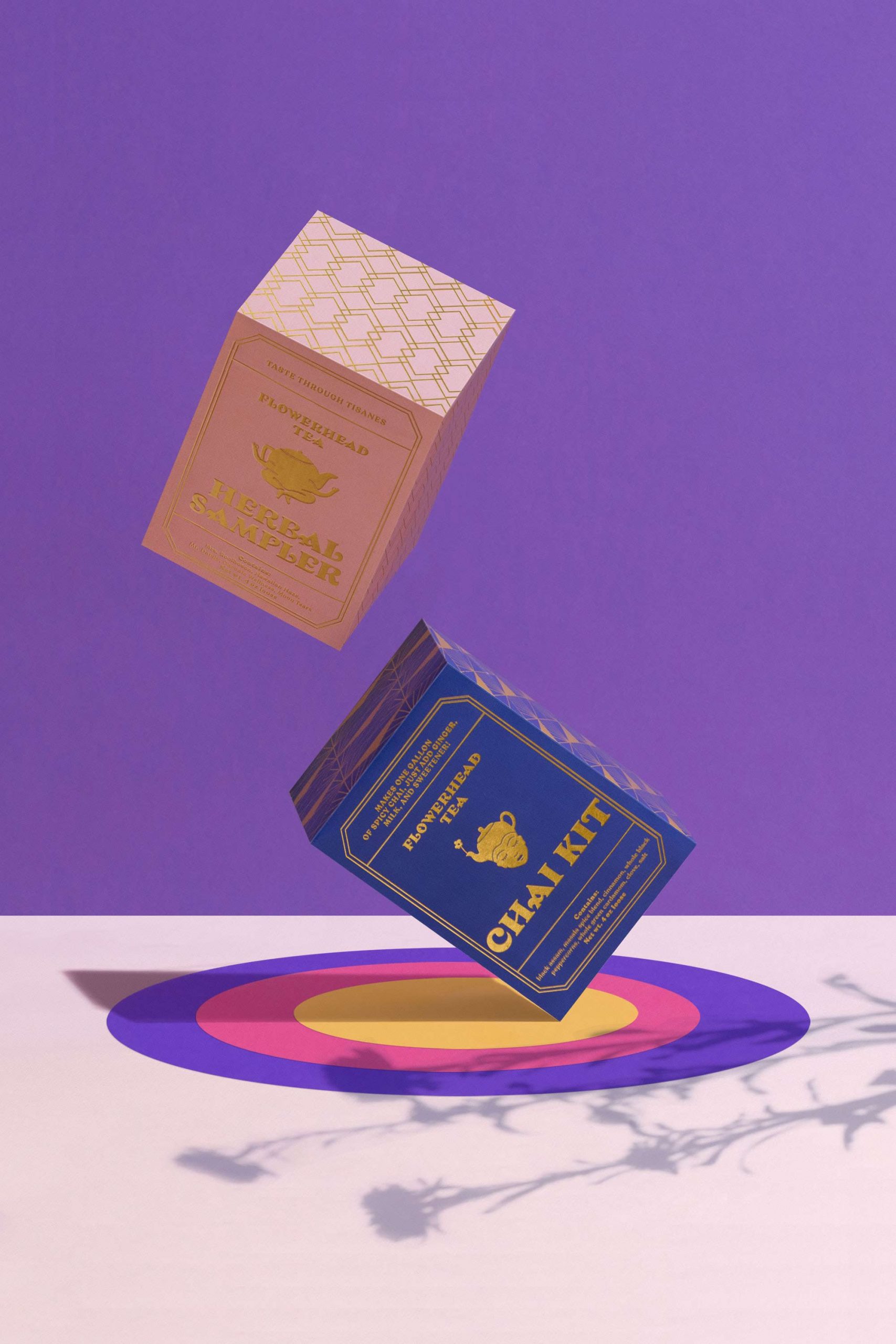
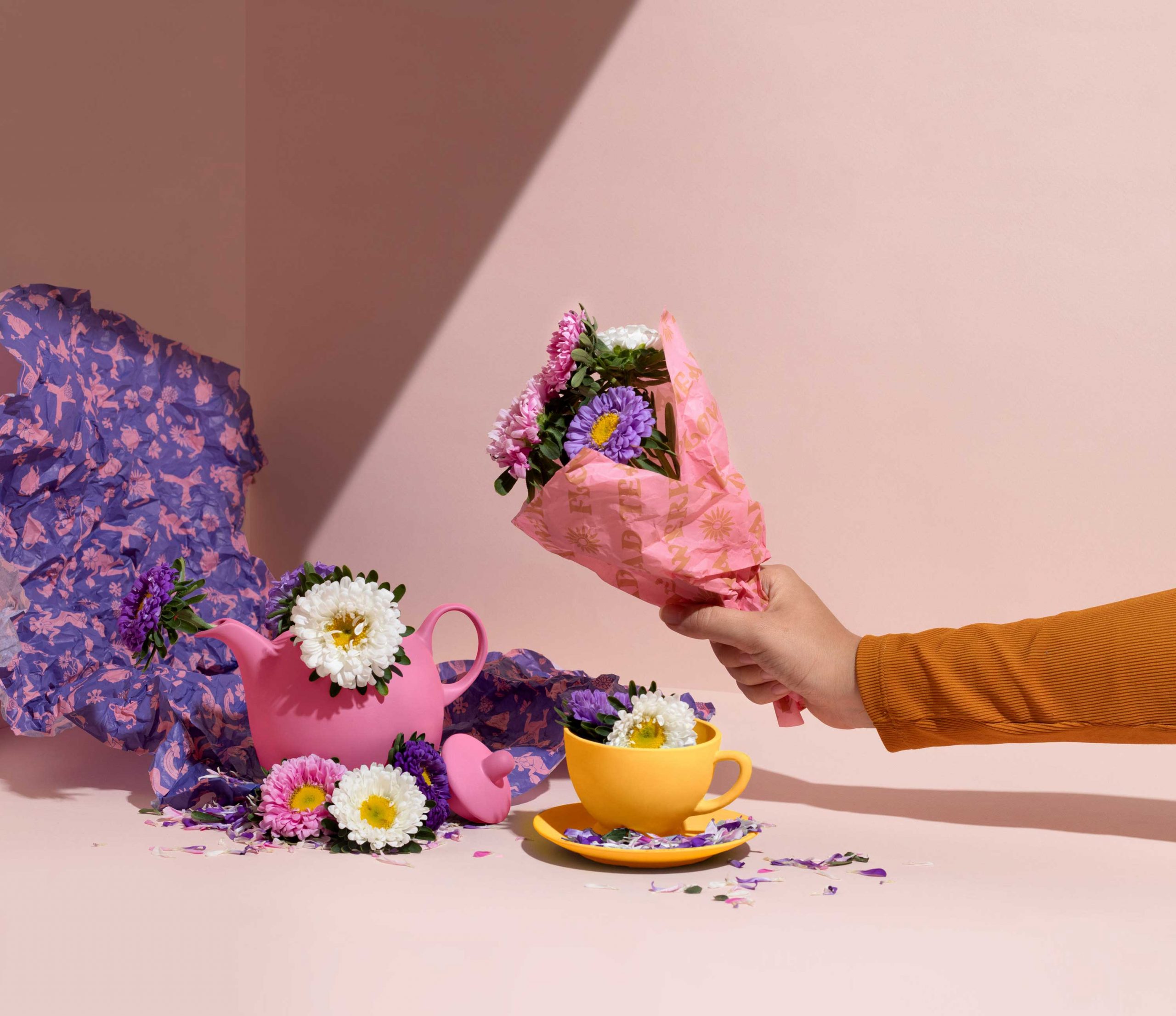
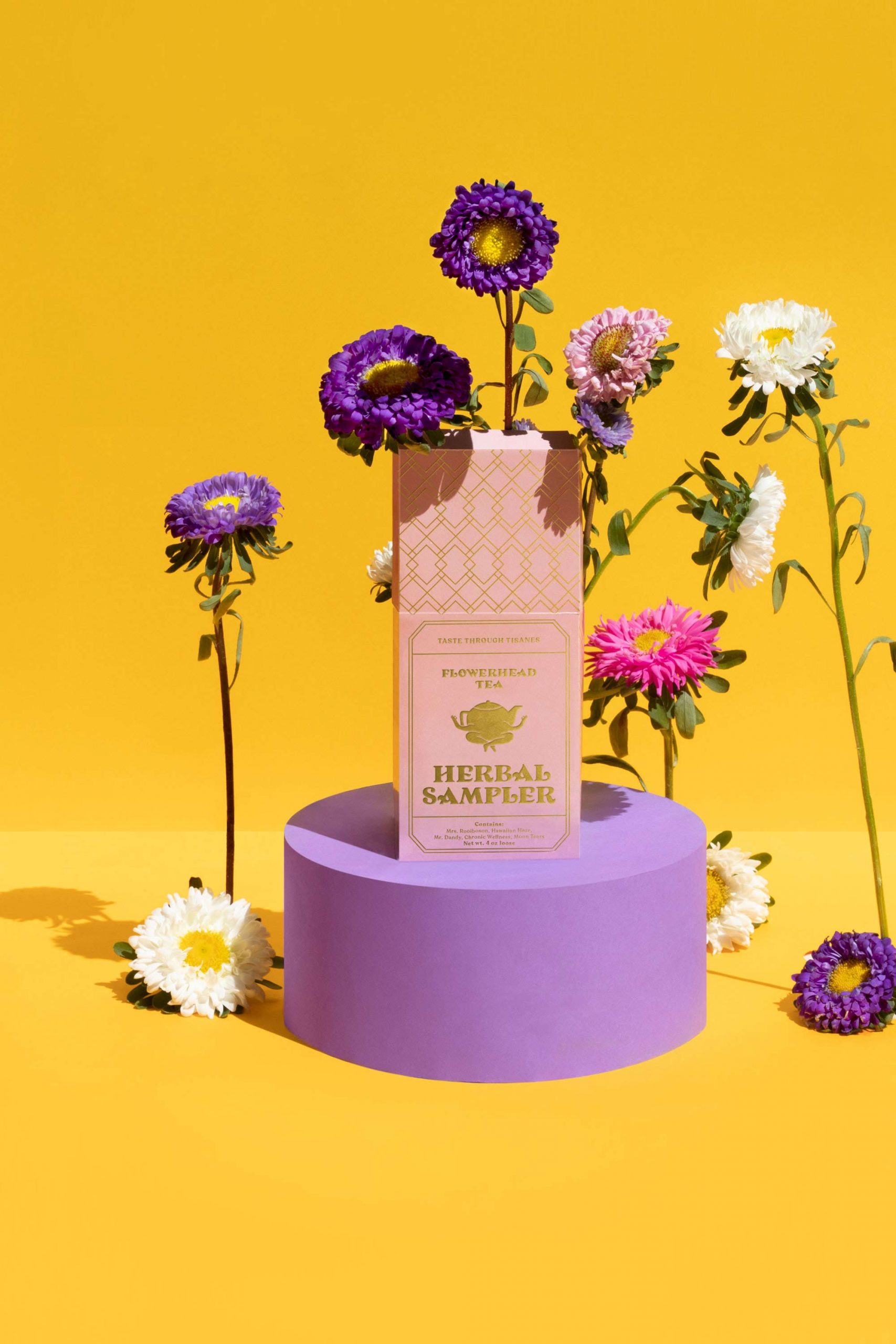
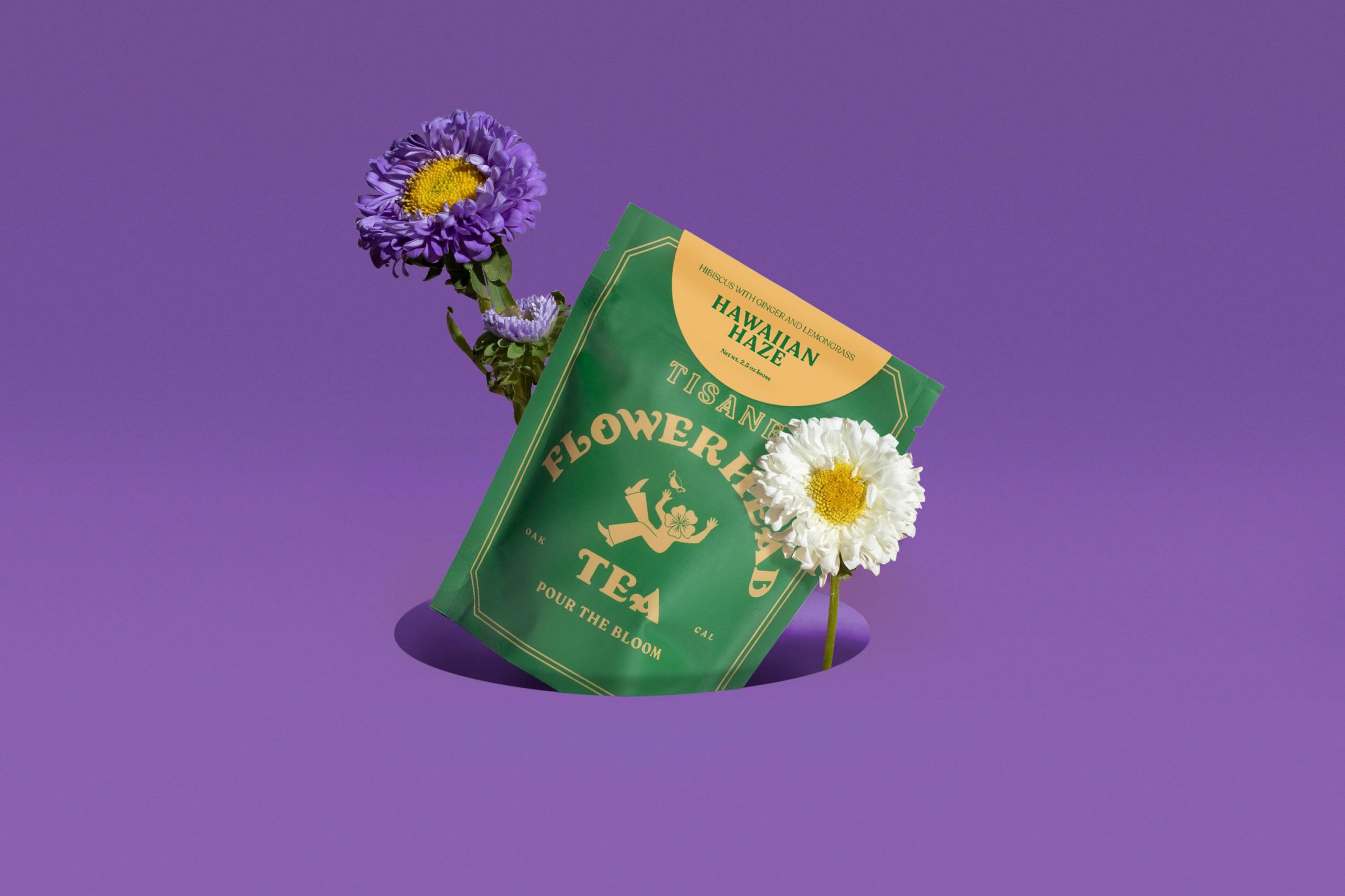
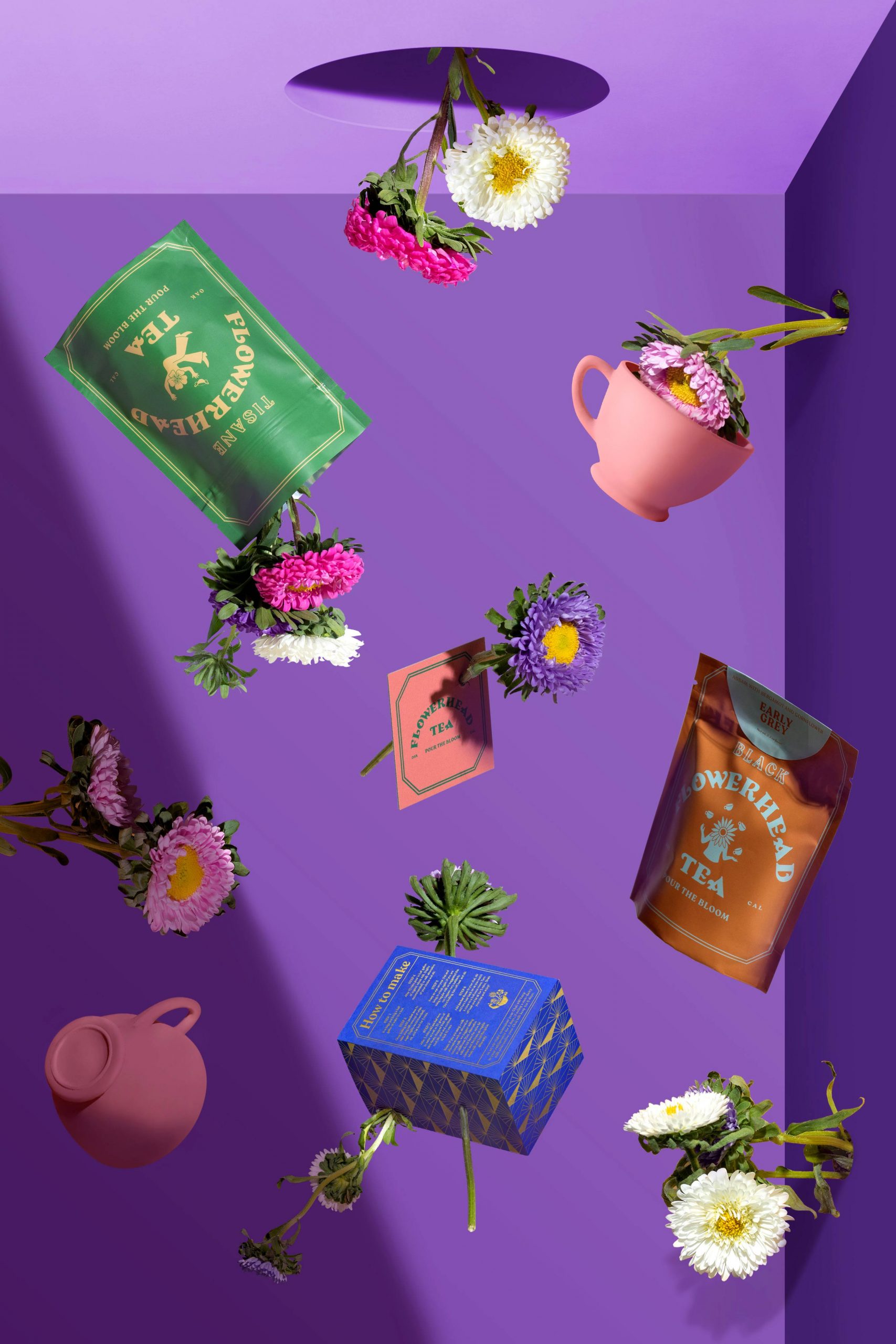
TEA COMPANY — BRANDING, PACKAGING. 2020Time expands, tea cups fall through a hole. The air is sticky. It contracts, it stretches until the cups fall to end up on a table where the tea is about to be served. Sometimes it’s a merry unbirthday, other times it’s just a sign of friendship. The beverage connects with the organism, makes eyes lock, and accentuates pleasant moments. This is Flowerhead, a tea brand. Its owner, a woman, drives a vintage van in which she offers her products. She sells tea blends in her four-wheeled shop as well as the possibility to drink tea on site. Her business is always with her. With her quirky vehicle she drives around different parts of California. Currently the brand is sold all over the United States, online. Hot or cold, the “flower head” is a visual proposal that refers to the 60s and 70s. It is influenced by psychedelia, fashion and aesthetics of the time. It is an opportunity for imagination, strong colours and carefree images. A reference to resistance and social revolution intertwined with a concept of hope and peace.
—
CREDITS
ART DIRECTION: MARIO HGNO BALLESTEROS
COPYWRITING: OLGA VILLEGAS, KAREN VIZCARRA
DESIGN: SANDRA GARCÍA, MARIO HIGINIO BALLESTEROS, NUBIA FERNÁNDEZ
PHOTOGRAHY: FREDY “EL GATO” MORFÍN
VISUAL UNIVERSE
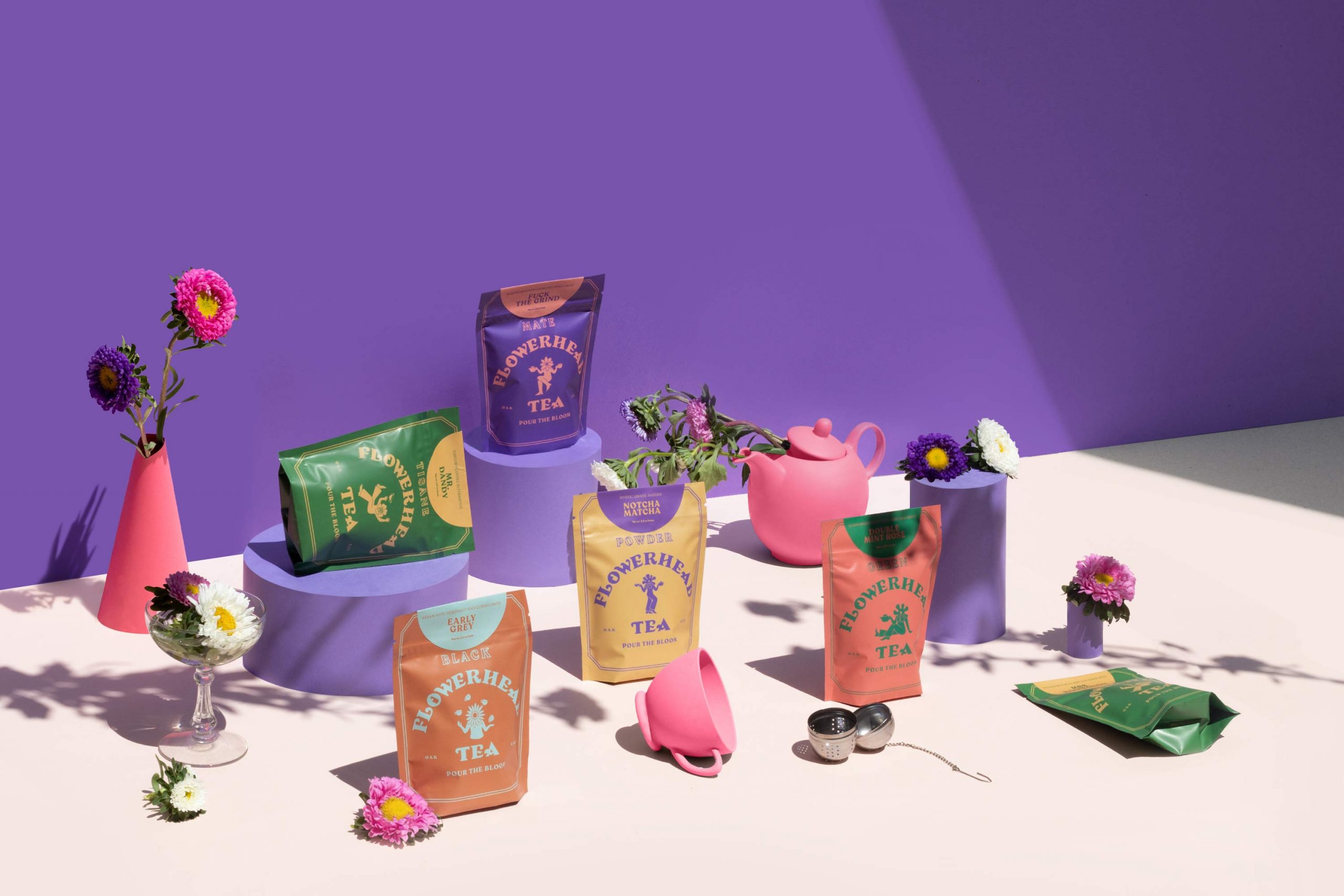
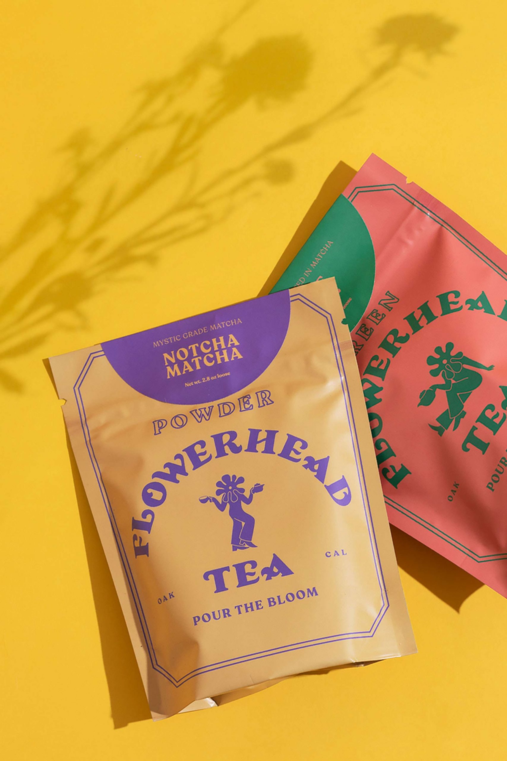
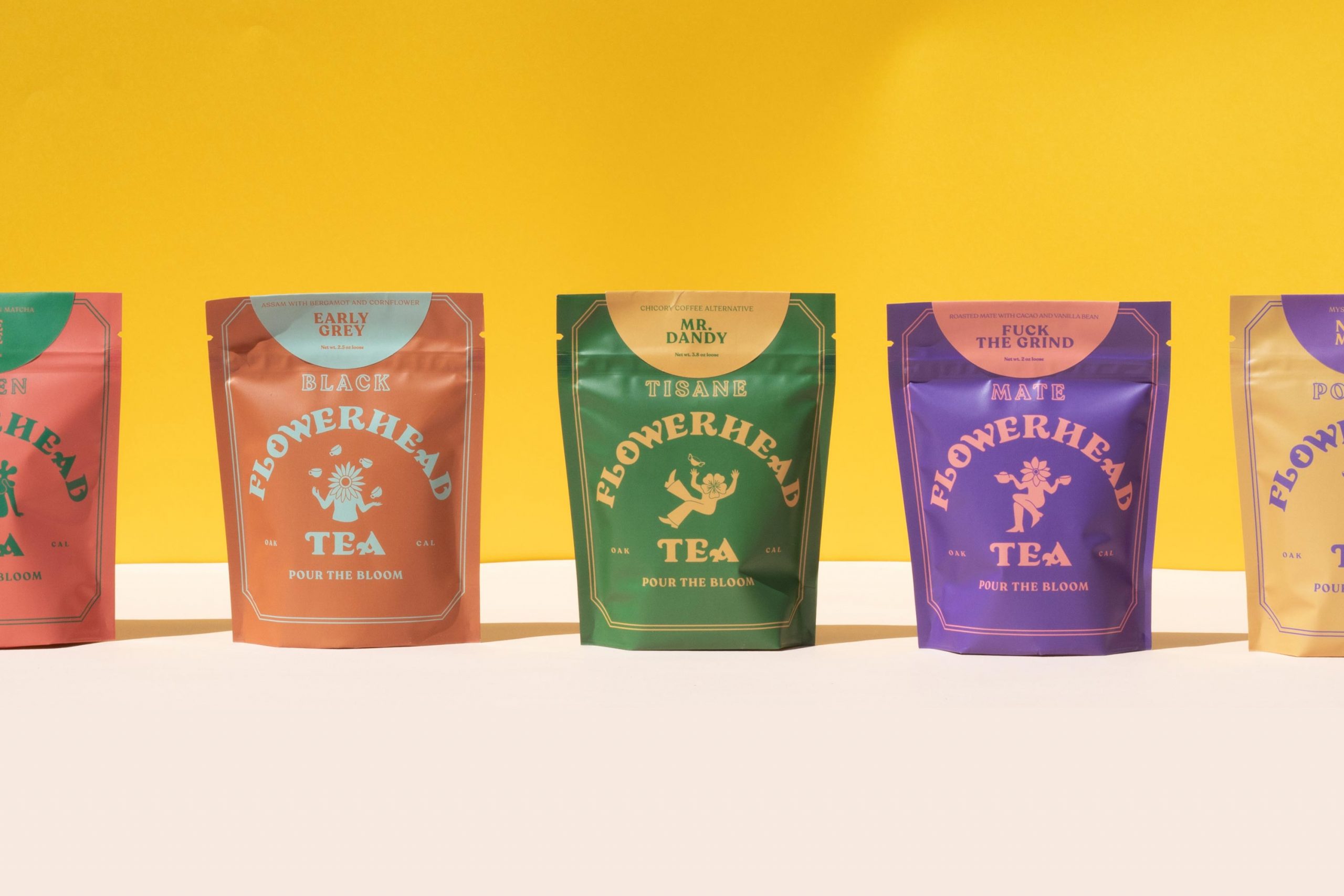
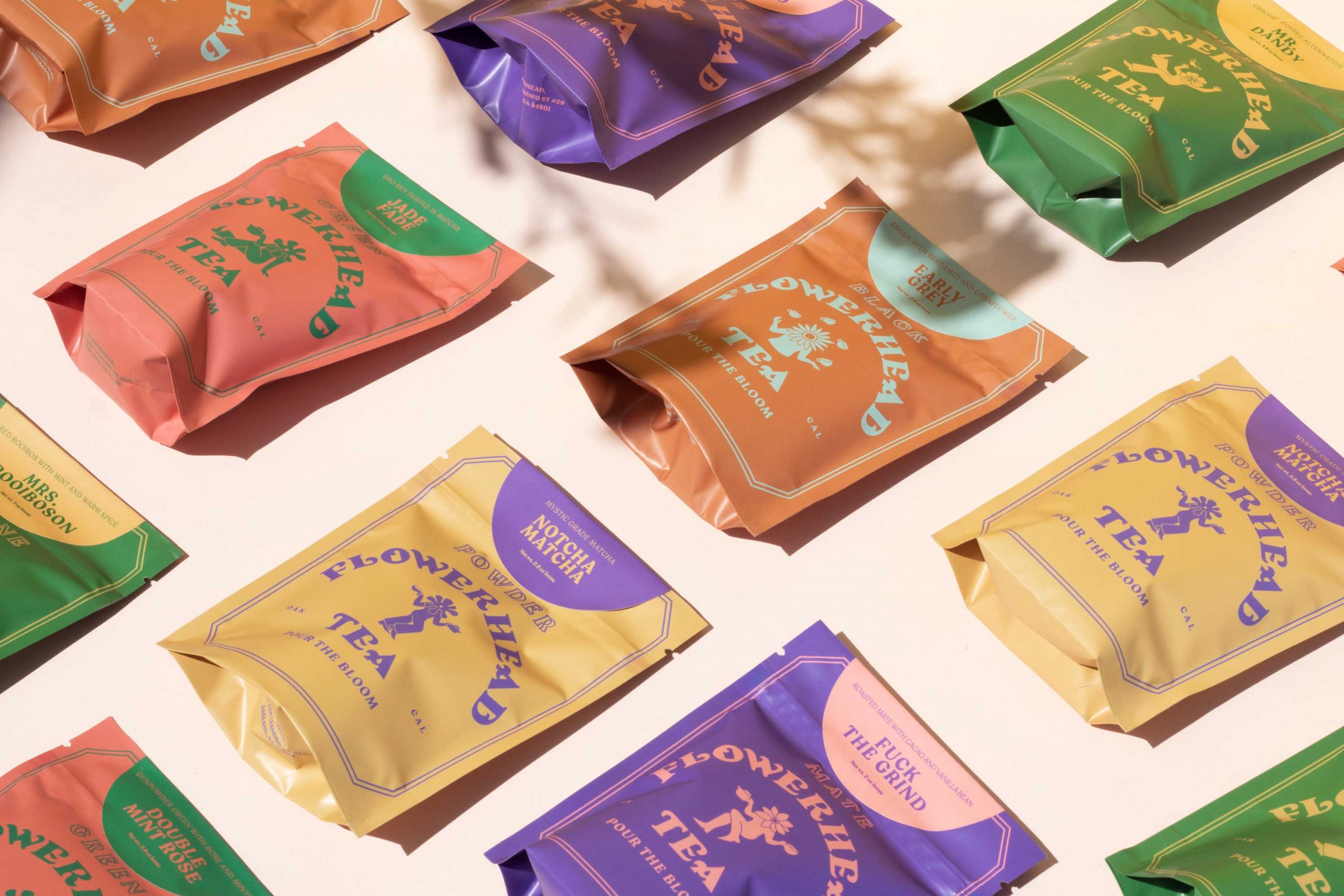
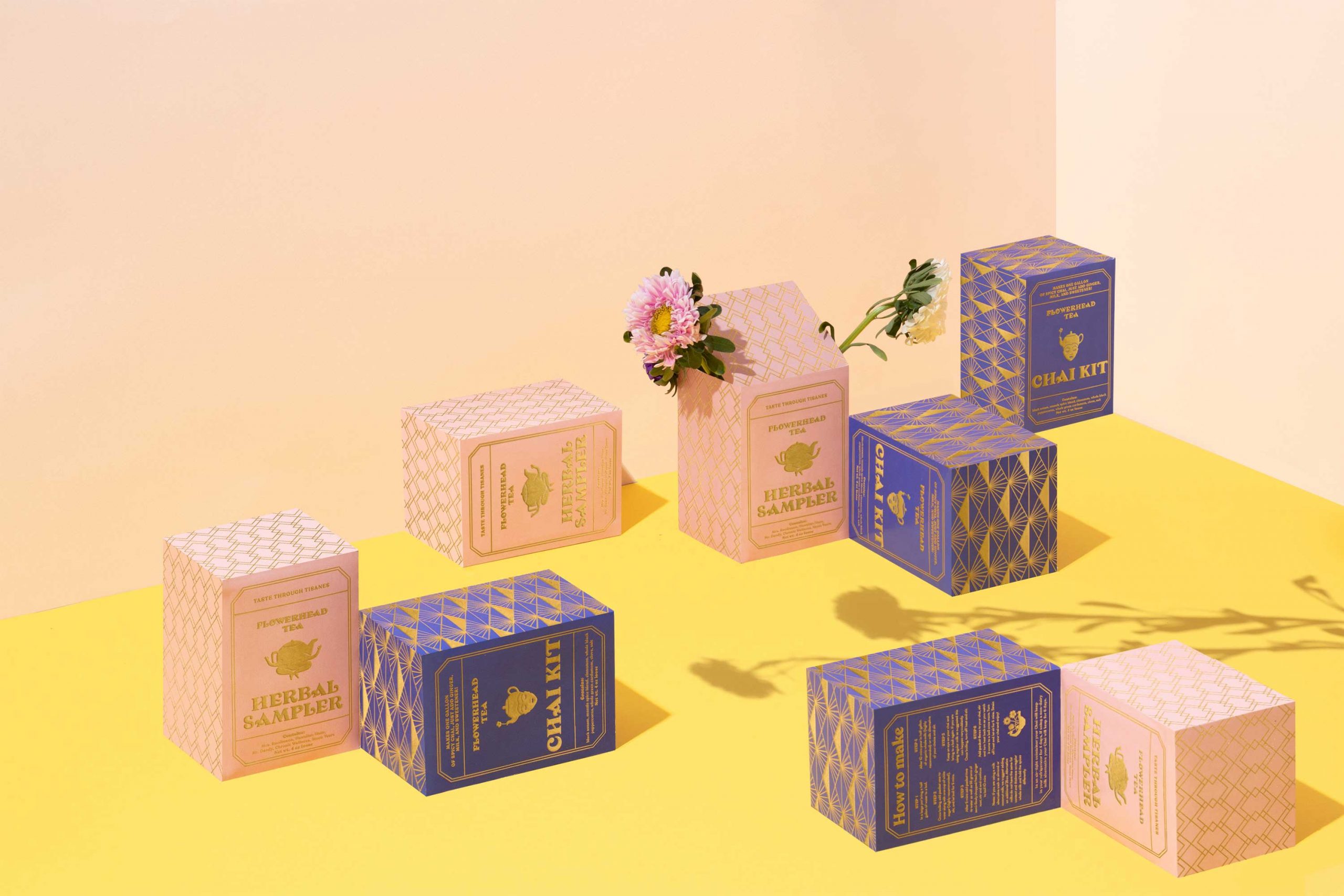
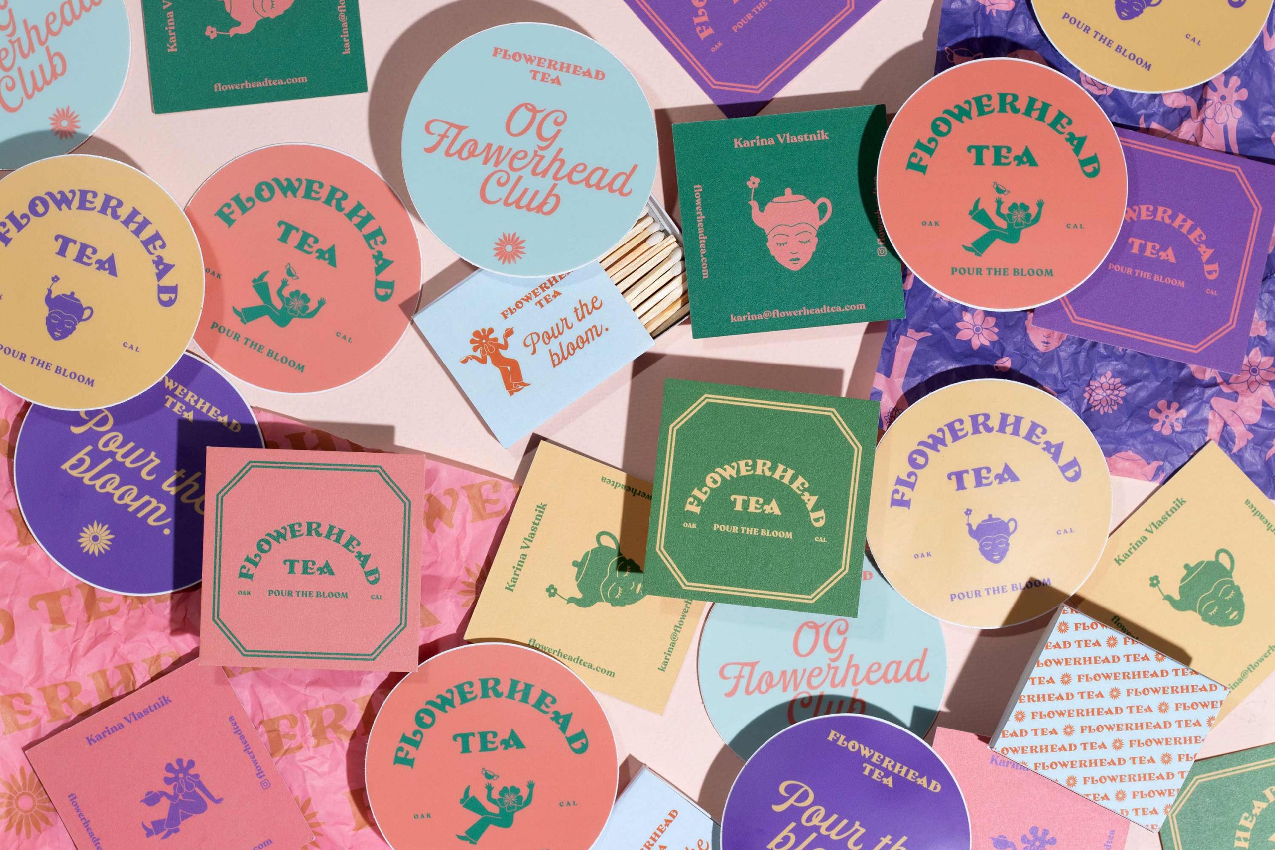
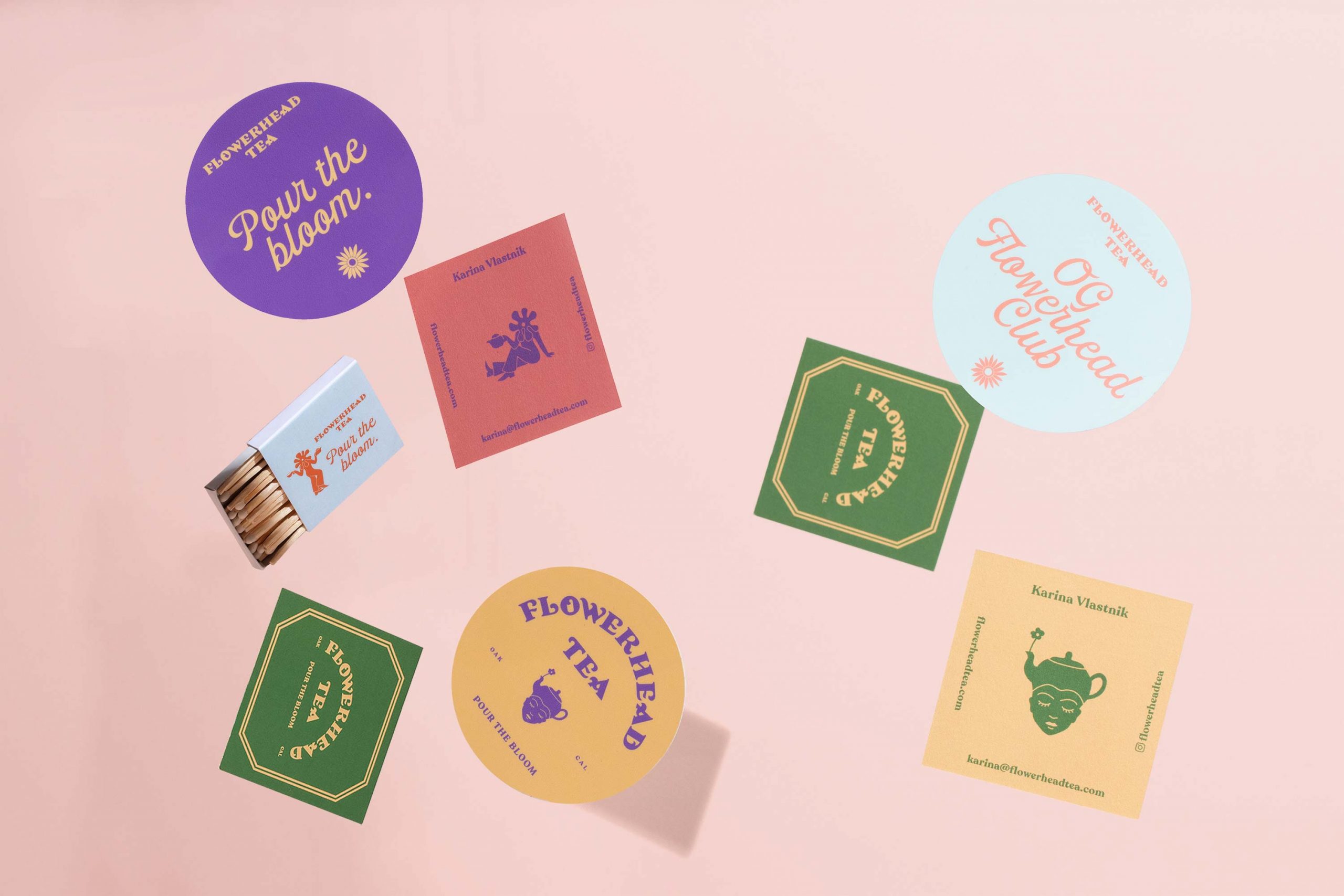
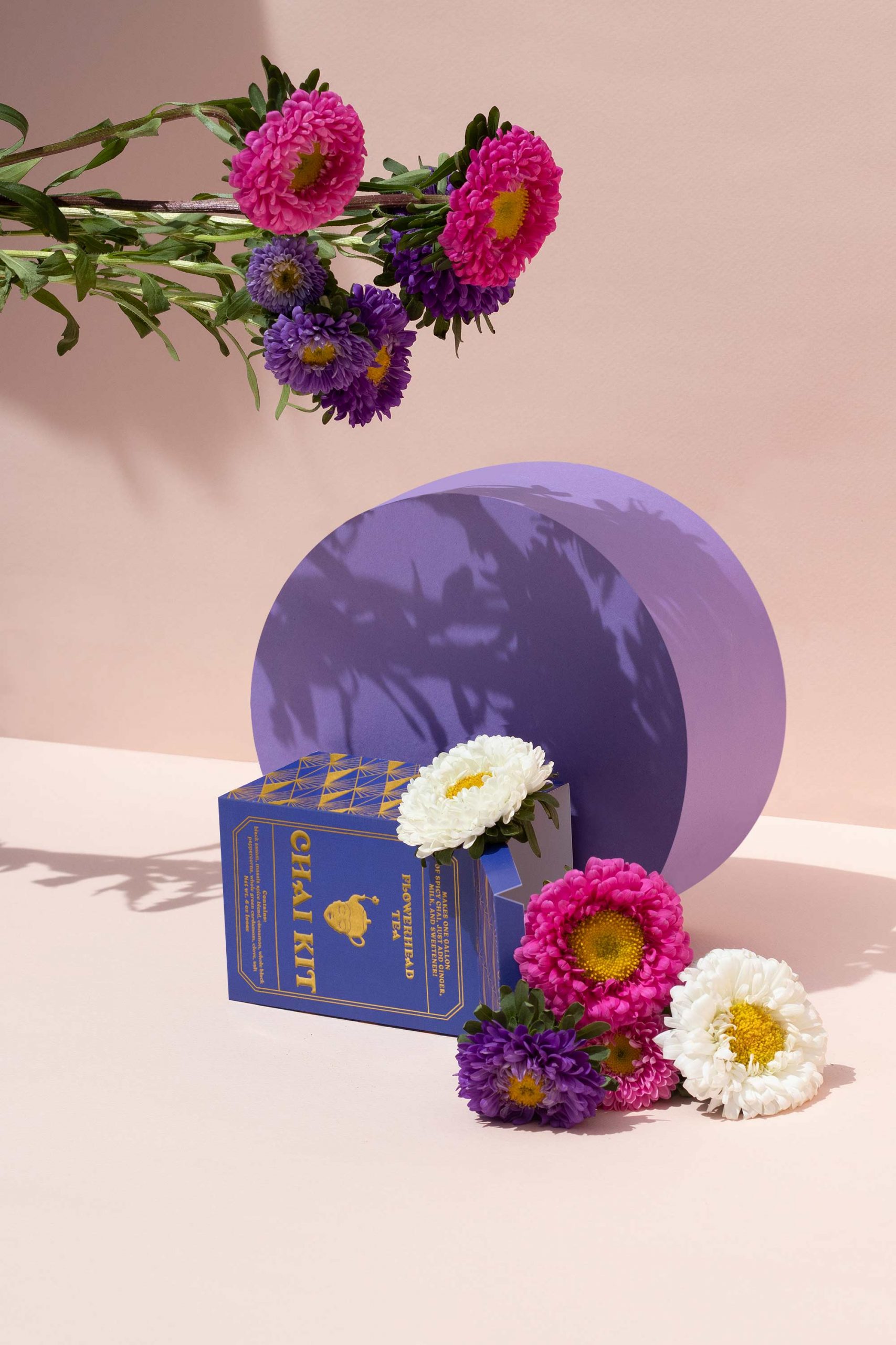
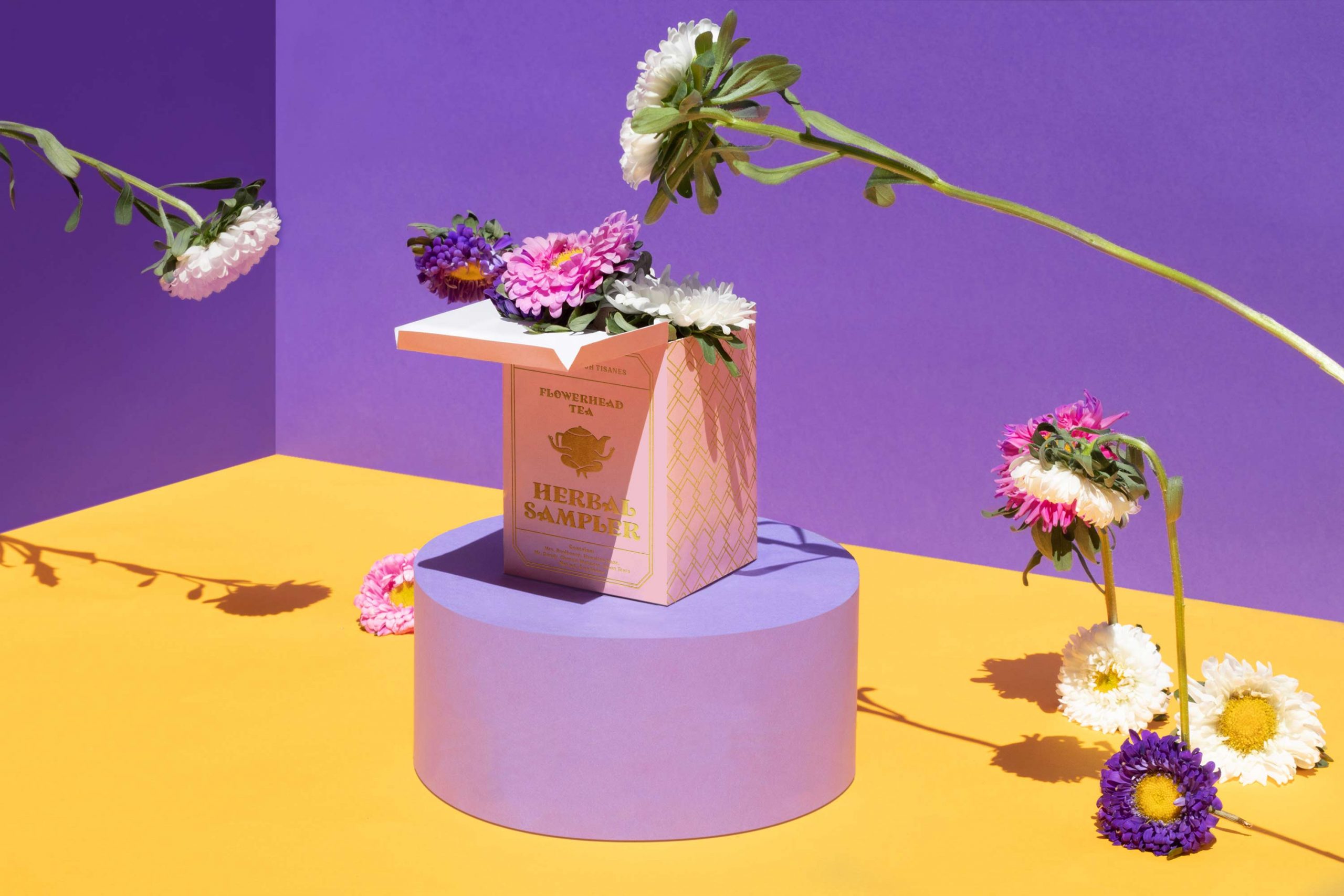
From Toro Pinto, we work on an identity system that moves away from minimalism. We brought to life a series of characters inspired by the archetypes of stories like those of Lewis Carrol in Alice in Wonderland. With oriental reminiscences, we give a wink to the origin of tea. We stretched the concept and added a touch of pop to make the product accessible. The challenge was to leave behind the idea that tea is high culture. We created an imagery of accessible and desirable fun references.

BRAND SOLUTION
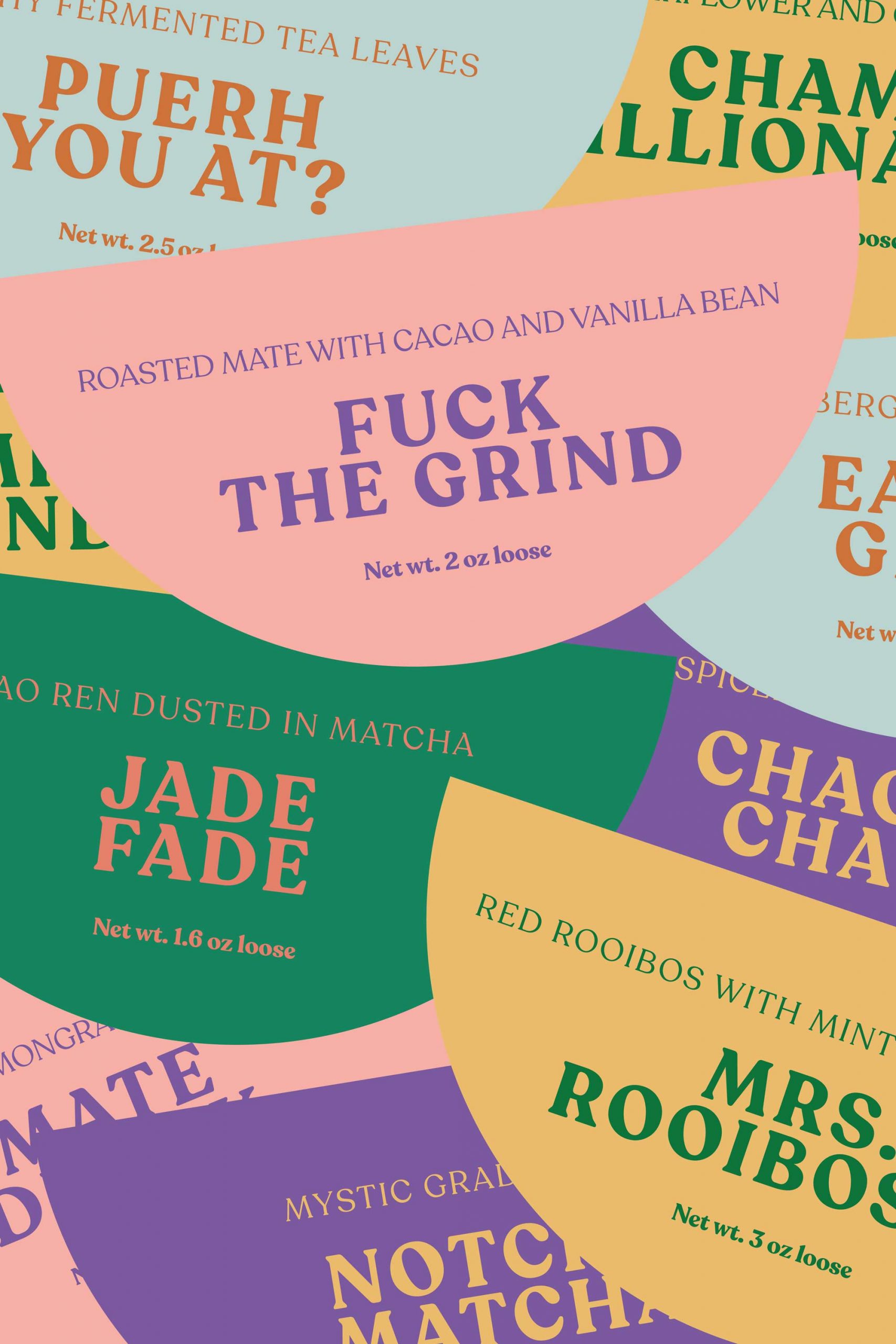
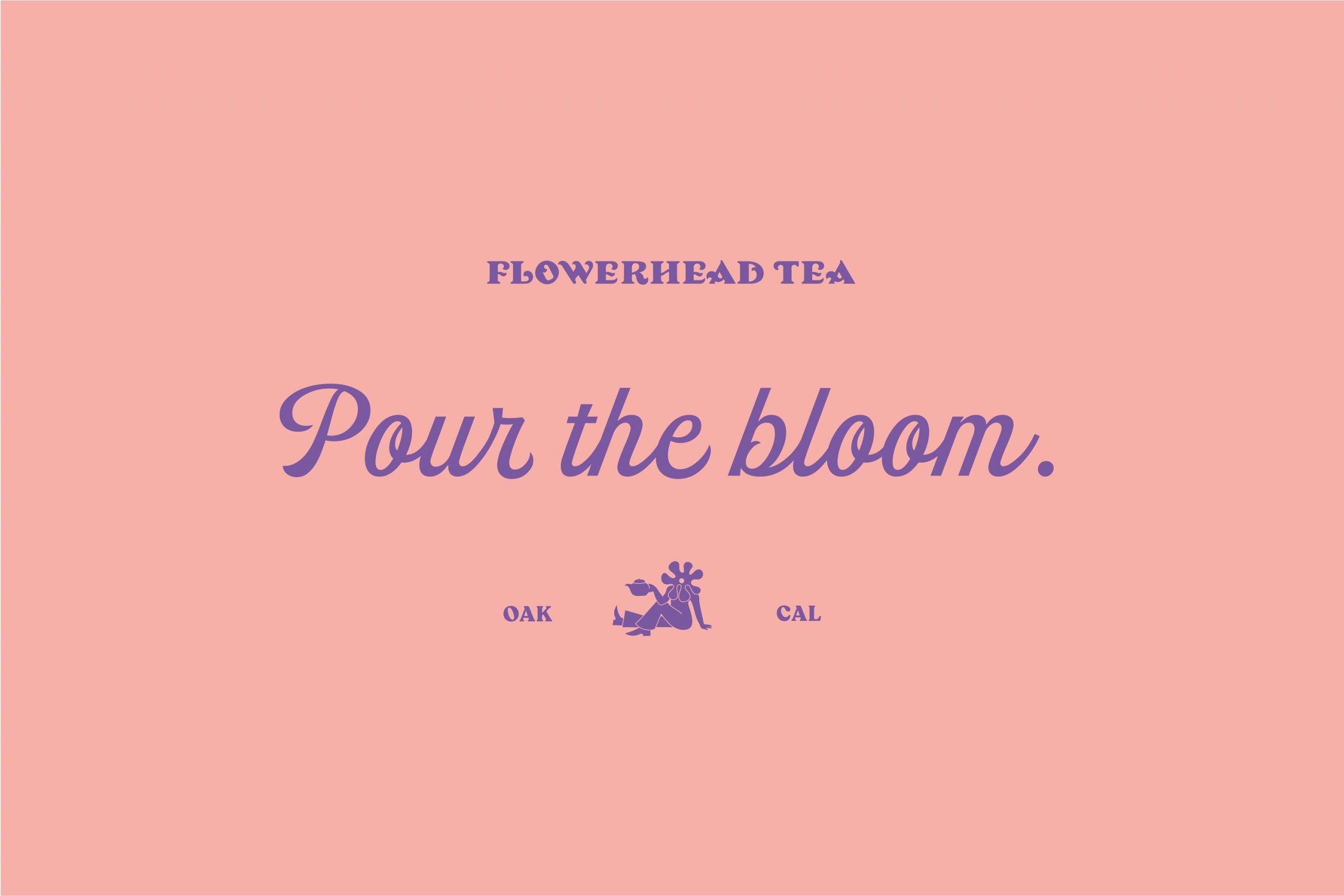
The graphic work reminds us of the era of visual experimentation that led to an emblematic aesthetic. The narrative and the tagline are part of the universe where this project lives now.


SHARE THIS PROJECT