PRINCIPIA
Craft Beer TASTING ROOM
—
BRANDING, PACKAGING. 2017
ABOUT THE PROJECT
Since the beginning, thousands of years ago, we have imagined worlds and exchanged thoughts for the sole purpose of finding meaning to our existence. This is why Principia Tasting Room was conceived as a space that provides an opportunity to explore, create and share. Celebrating the thousands of variables that allow us to be in the same spacetime.
—
CREDITS
ART DIRECTION: MARIO HGNO BALLESTEROS
COPYWRITING: OLGA VILLEGAS, KAREN VIZCARRA
DESIGN: MARIO HIGINIO BALLESTEROS, LILIAN NAVARRO
PHOTOGRAHY: MARIO HGNO / AMADEUS HERNANDEZ
BRAND SOLUTION
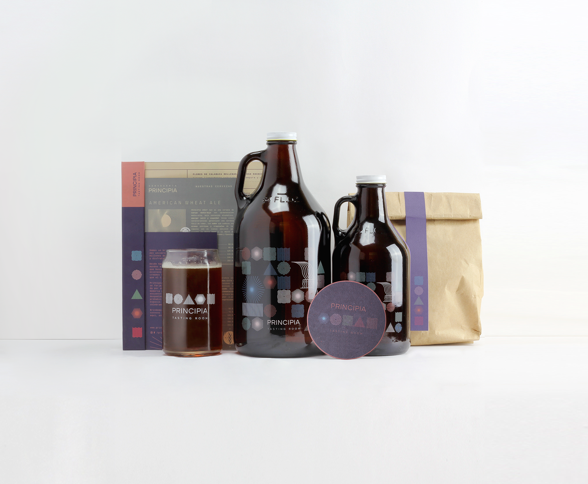
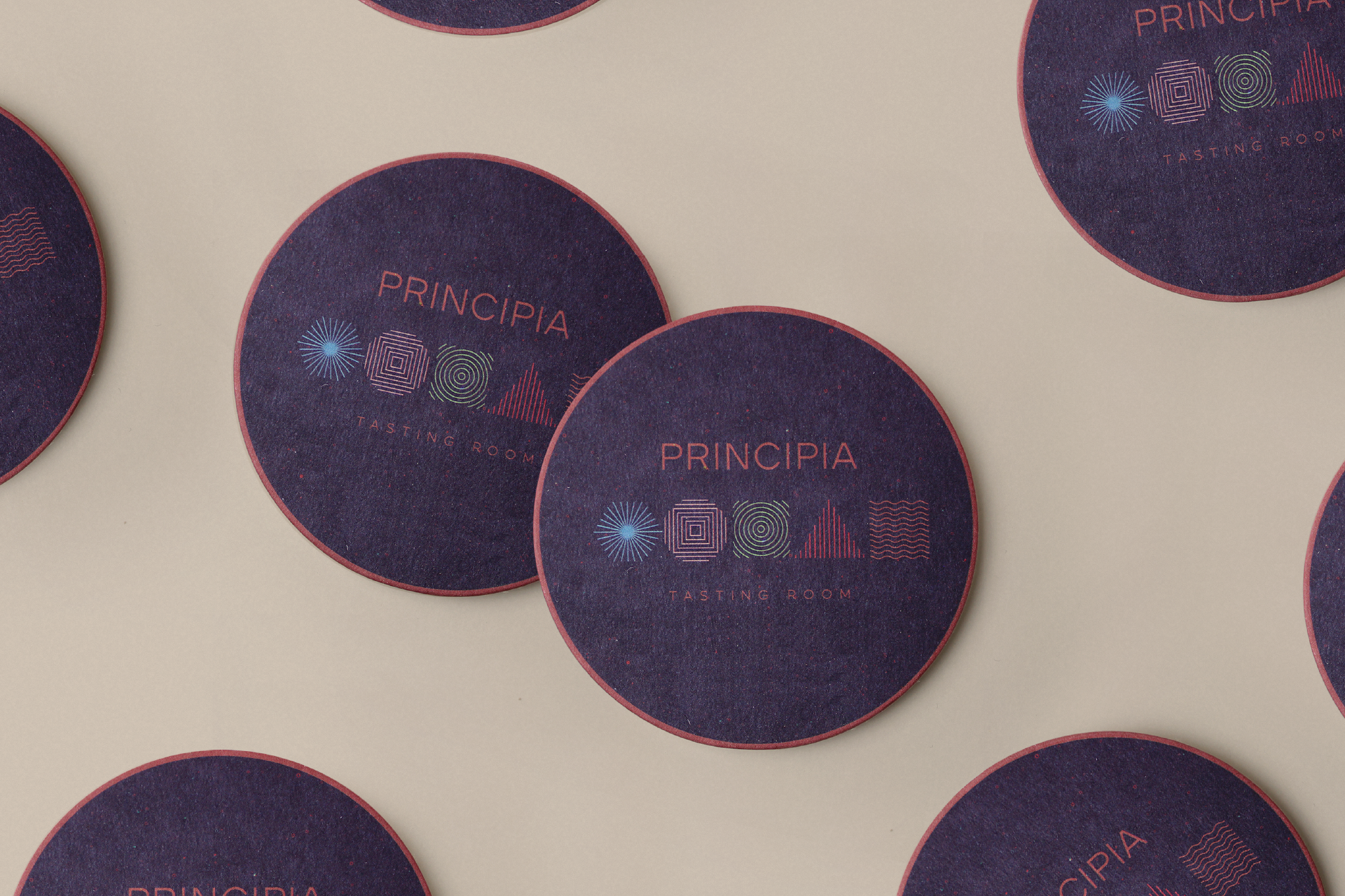
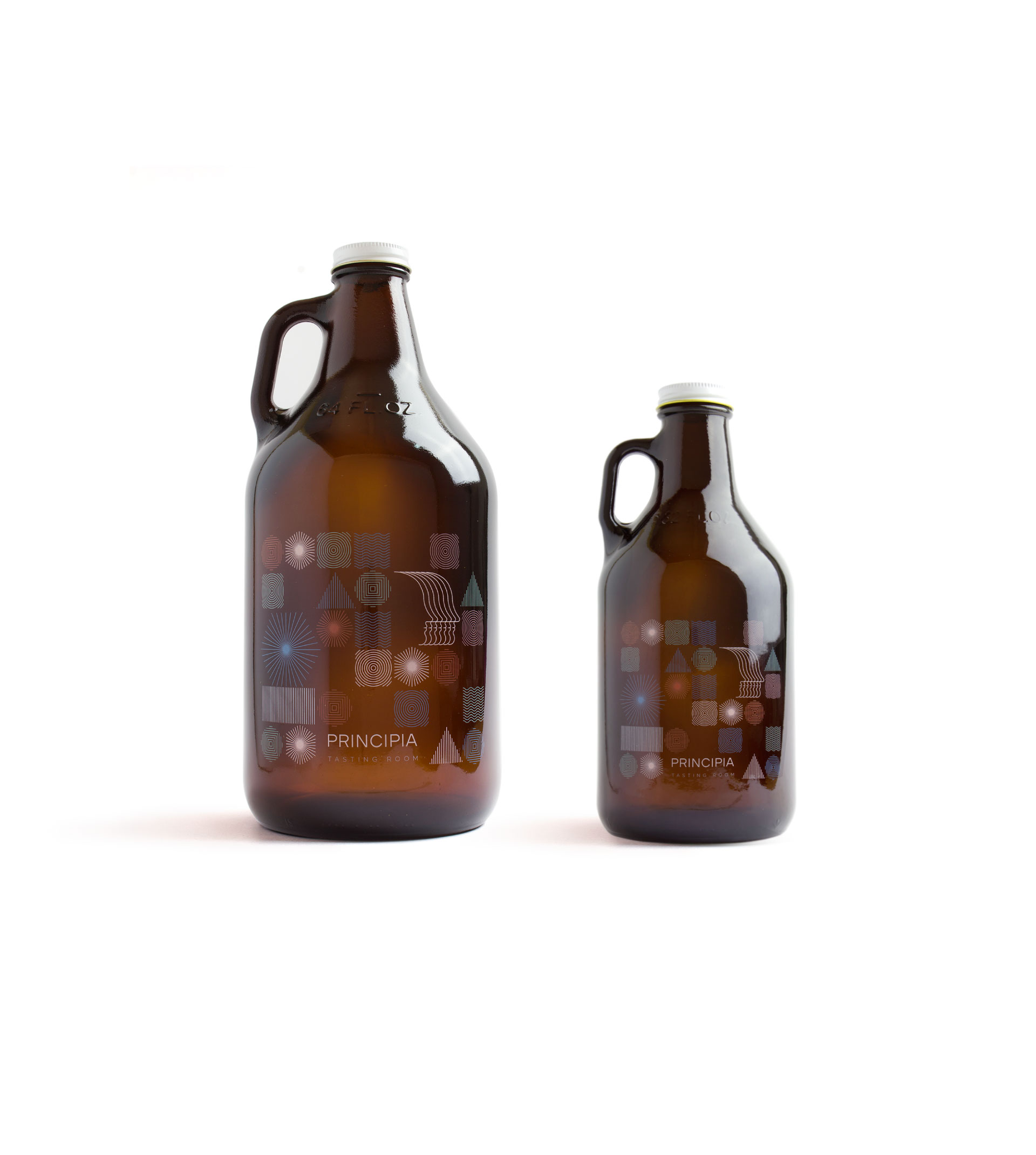
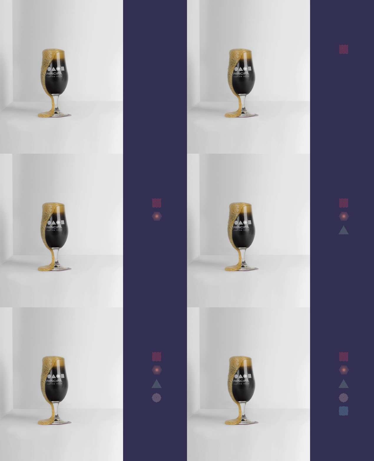
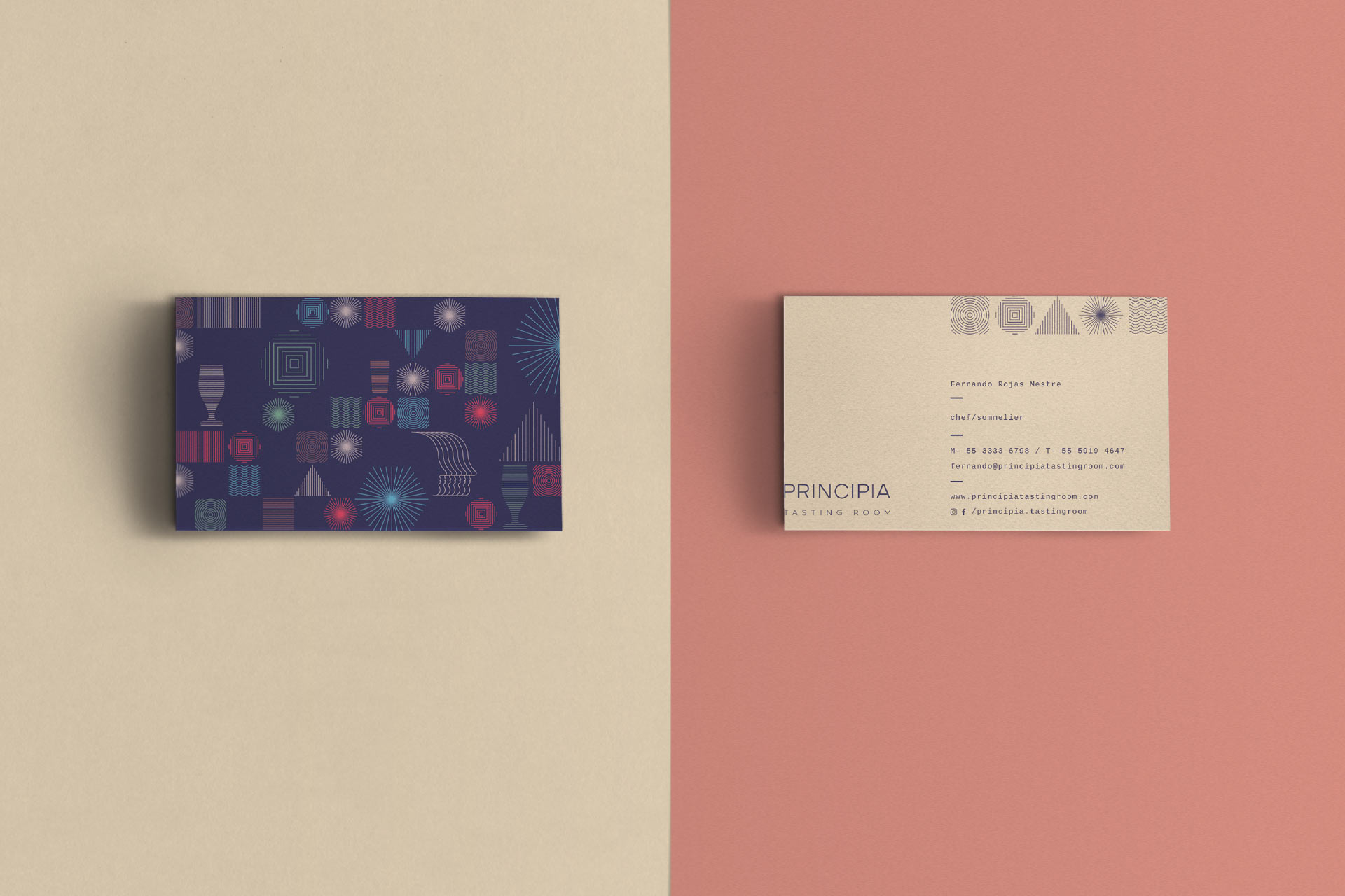
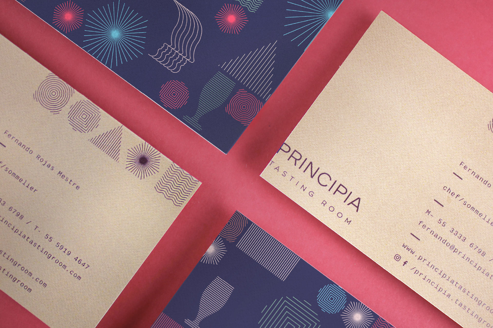
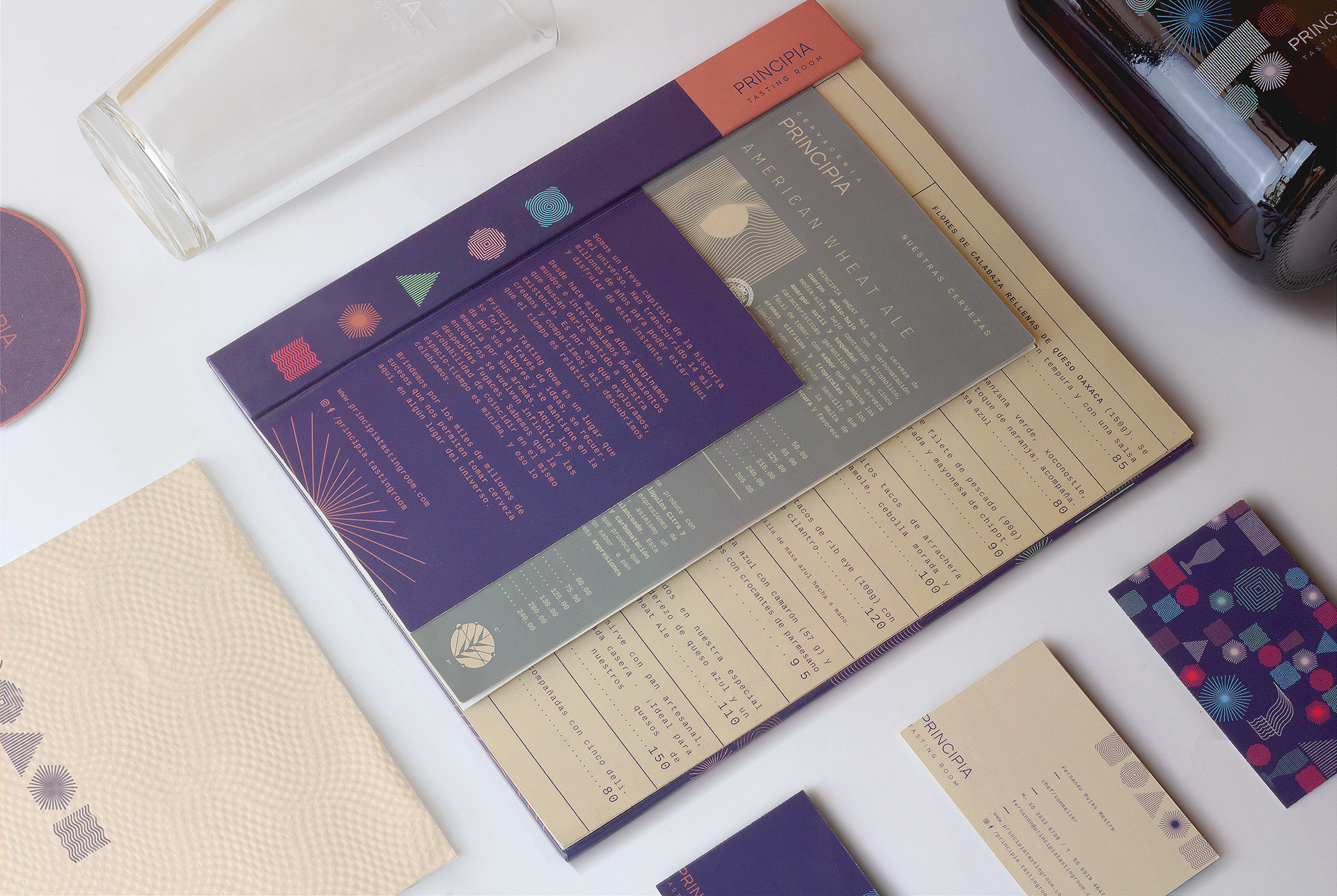
The five icons of the identity combine to create the metaphor of an experimental recipe.The blend of colors, graphics, sizes and textures were designed to give the consumer choices so that the outcomes could vary. Just like a recipe, science and pleasure are blended together. One of the main challenges was to find the balance between the scientific and mundane dimensions of eating and drinking. We aimed to transcend the current concept of handcrafted objects and chose to follow the path of intellectual sophistication. The color choices make a reference to space and provoke a vibrant nocturnal feeling.

VISUAL UNIVERSE
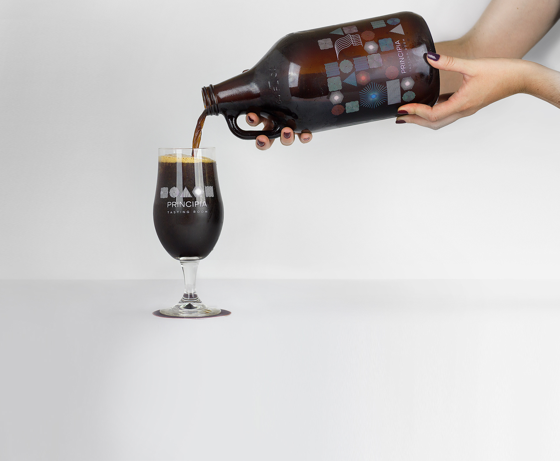
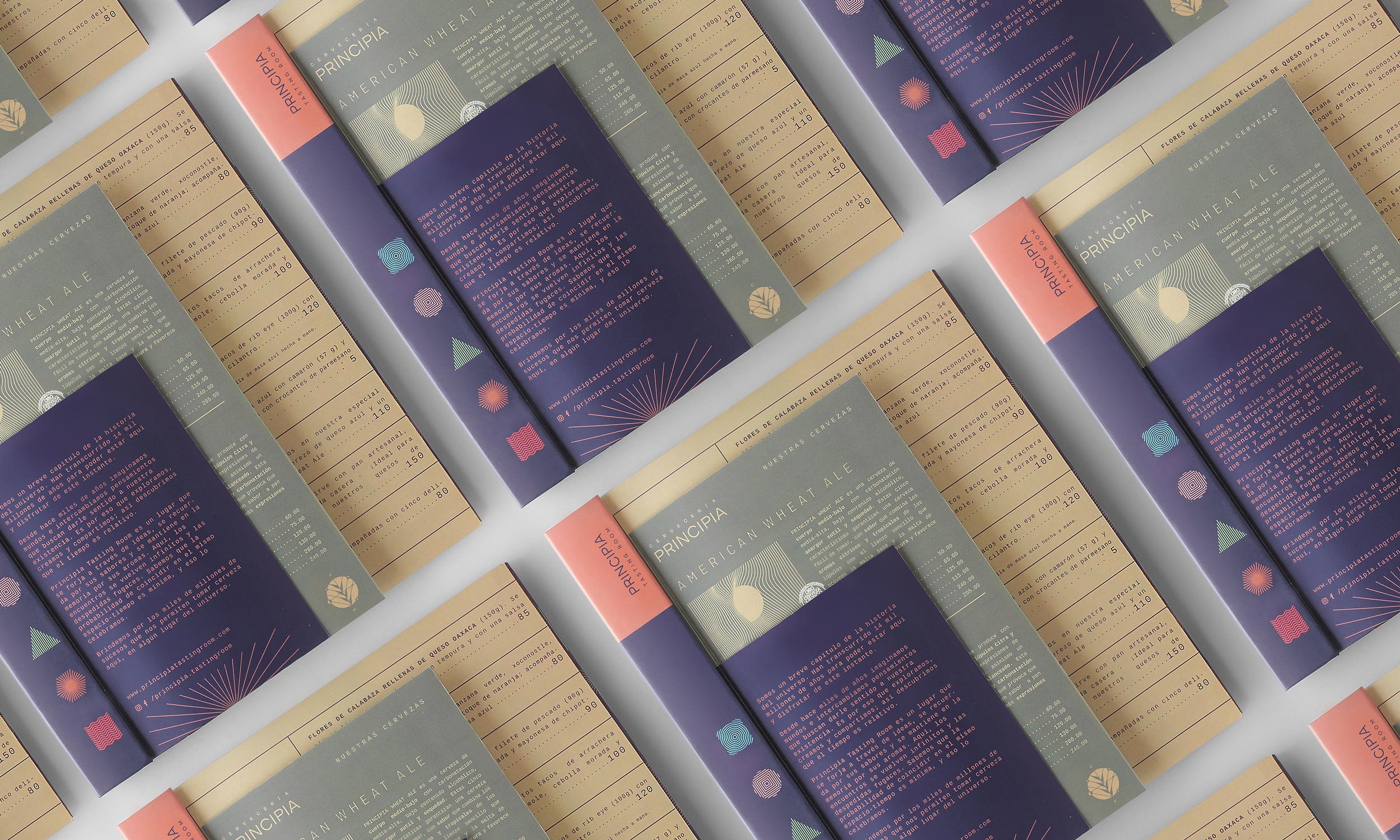
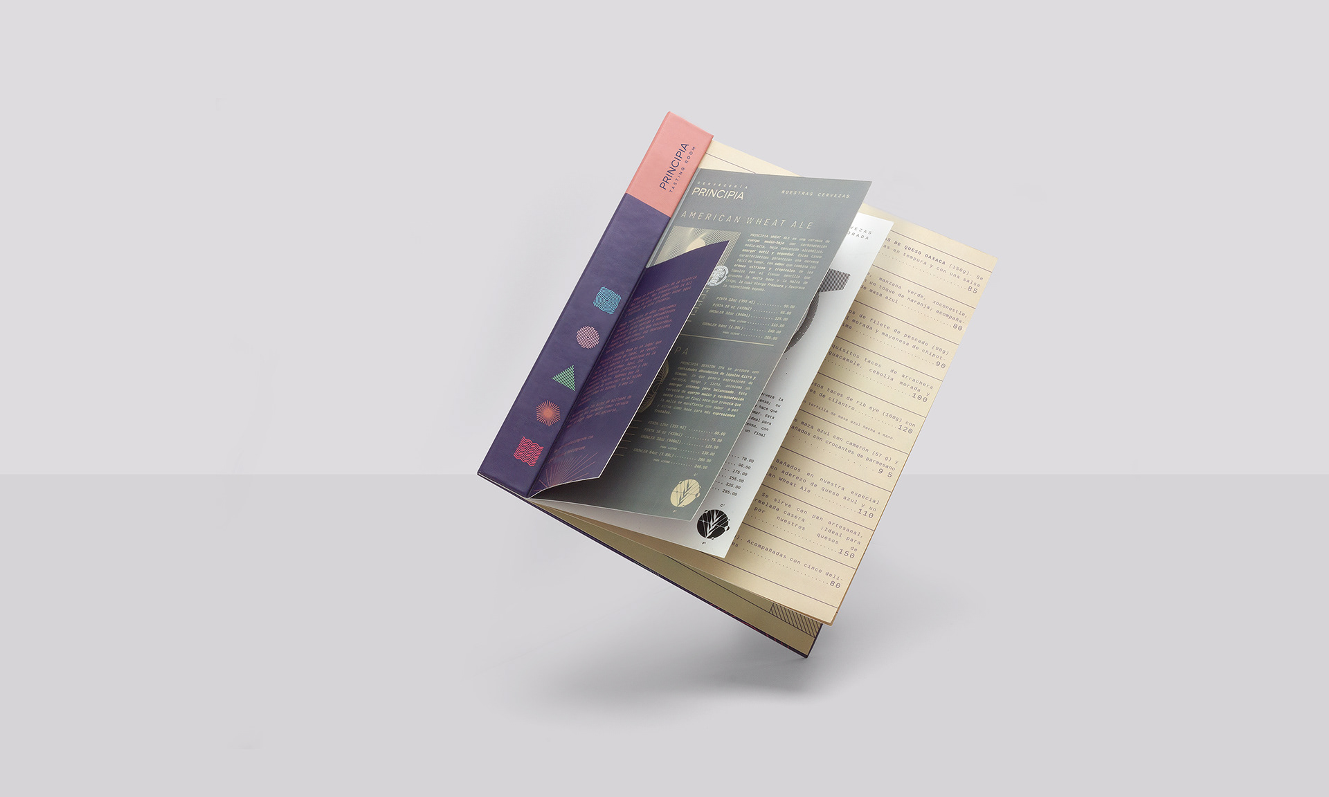
The tasting room (located in Mexico City) is an extension of Principia Brewery. We gave continuity to the main concepts: science and discovery tied to the five categories of flavors. Each icon is a universal expression of: acidity, sweetness, sourness, saltiness and umami. The line repetition sustains the idea of existence and everything that has yet been discovered.


SHARE THIS PROJECT