
NUESTROS NOMBRES – mezcal
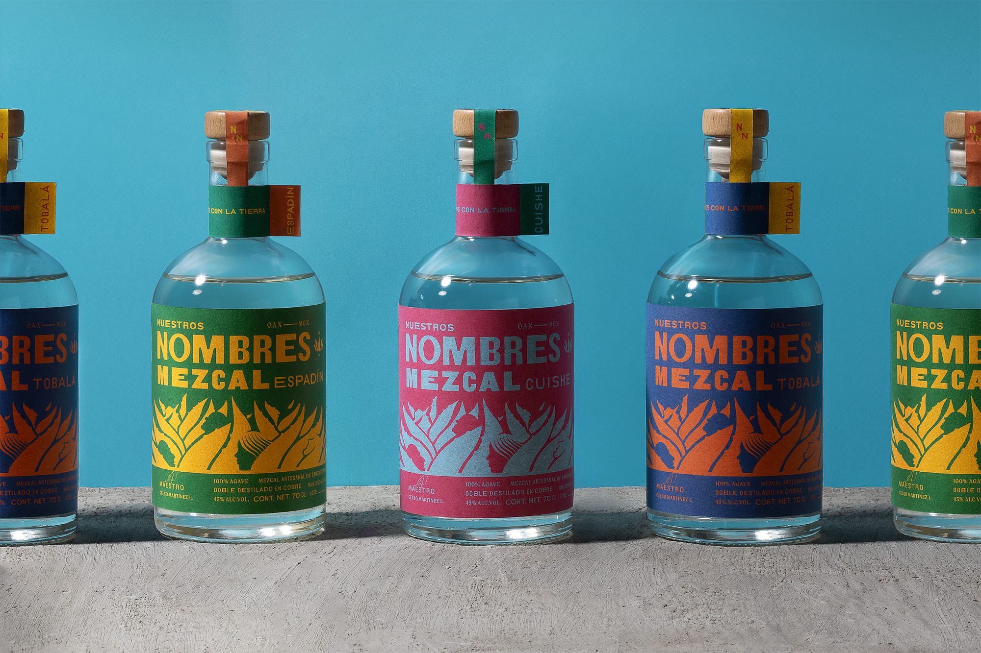
Nuestros Nombres Mezcal (“Our Names”)is a brand built on identity—both personal and collective. Inspired by the deep connection between the people, the land, and the craft, it embodies a visual system that speaks through bold typography, vibrant color contrasts, and elemental iconography.
The land spoke to us; it spoke our language.
We are, and always will be, a part of it.
It knows us all—it called us by Our Names.
The design system draws from Oaxaca’s cultural richness and the visual language of Latin American collective graphic art, where bold compositions, strong typographic statements, and vibrant colors serve as tools of storytelling and communal expression. Each label balances simplicity and depth, featuring agave as a symbol of heritage while integrating contemporary graphic elements that highlight the diversity of mezcal.
Beyond a visual aesthetic, Nuestros Nombres is a reflection of voices—those who shape the land, the process, and the narrative behind every bottle. A brand that acknowledges the past while looking forward, rooted in community and expression.
Hablamos con la tierra.
CREDITS:
Art Direction: Mario Higinio HGNO Ballesteros
Design: Toro Pinto
Copywriting: Olga Villegas, Karen Vizcarra
Photography: Caro Ballesteros
OMETEO – Gin Mexicano
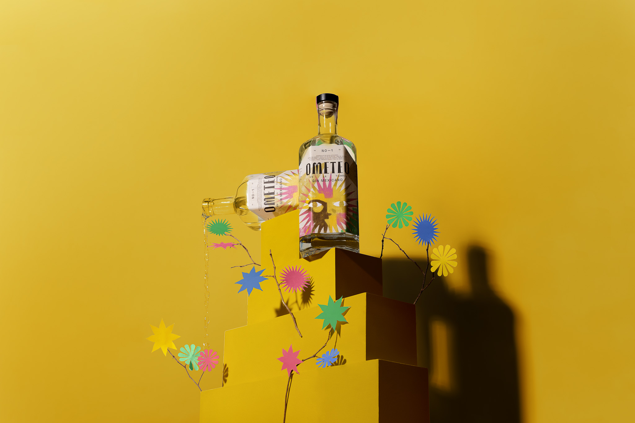
El Rayo (translated as thunderbolt) is a brand that aims to change tequila ́s perception in Europe. To dissolve the idea that the drink serves the sole purpose of inebriation. To promote the exuberance of the beverage ́s flavor from its origin to a globalized market. A twist in a classic product.
The base narrative is a fictional story about the ancient popular legend of the origin of tequila. In it a farmer crosses a field where he witnesses a lightning striking the core of an agave plant from where the drink, known today as tequila, flowed out of. We took the explorer archetype for the brand’s essence and it became the label ́s protagonist.
The identity was developed under a Mexican folk tale tone. Landscapes filled with Mexican fields walked by farmers that became the centerpiece of the brand ́s artwork. The big picture reminds us of the stories told in small towns, legends about enlightenment brought by the sky. Both the branding and packaging are filled with hints of pop art and a modern contemporary aesthetic, a substantial universe that was applied to the brand ́s collaterals.
CREDITS
Art Direction: Mario Hgno
Copywriting: Olga Villegas / Karen Vizcarra
Design: Nubia Fernández, Mario Hgno
Design: Photography: Fredy “el gato” Morfín
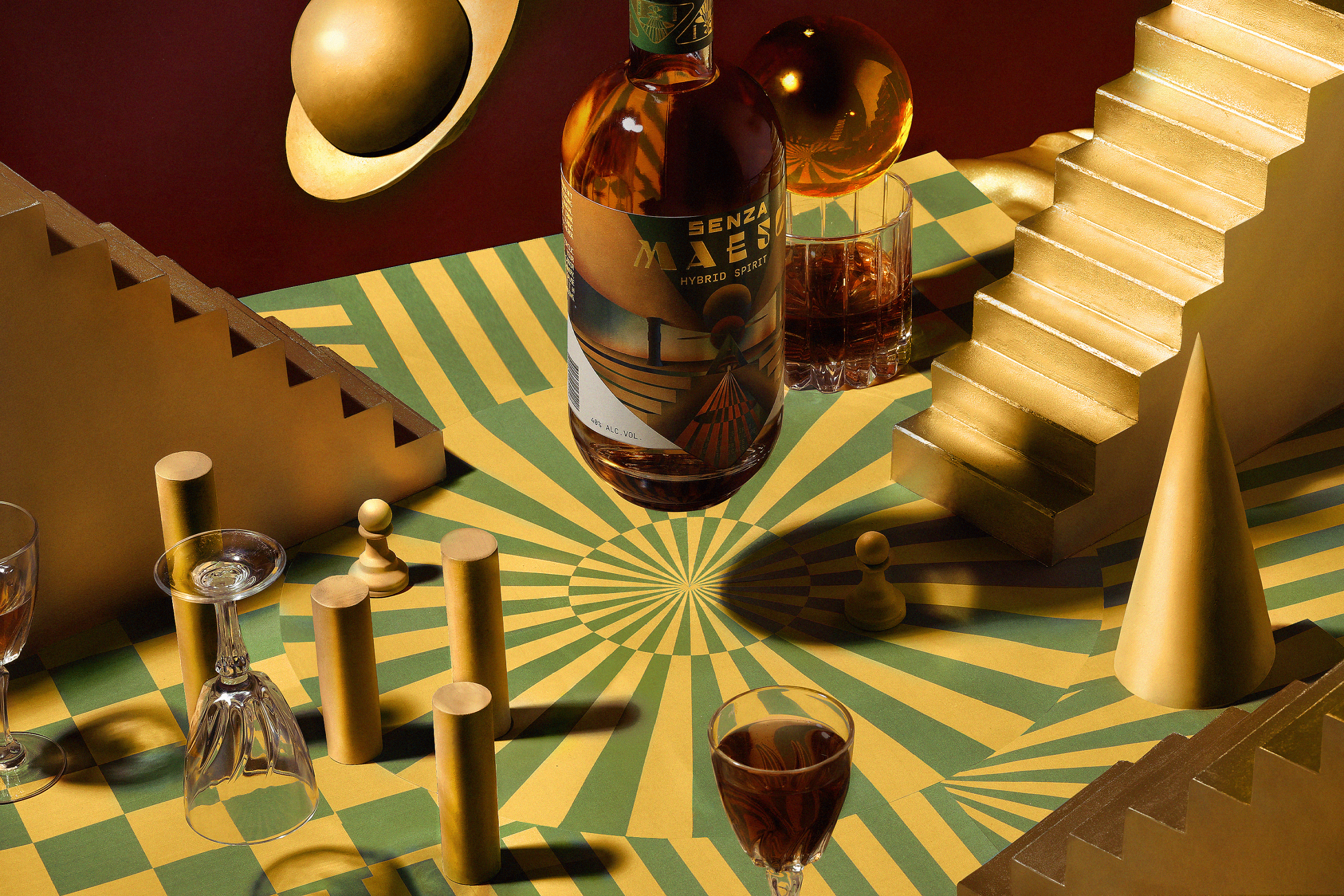
SENZA MAESO hybrid spirit
El Rayo (translated as thunderbolt) is a brand that aims to change tequila ́s perception in Europe. To dissolve the idea that the drink serves the sole purpose of inebriation. To promote the exuberance of the beverage ́s flavor from its origin to a globalized market. A twist in a classic product.
The base narrative is a fictional story about the ancient popular legend of the origin of tequila. In it a farmer crosses a field where he witnesses a lightning striking the core of an agave plant from where the drink, known today as tequila, flowed out of. We took the explorer archetype for the brand’s essence and it became the label ́s protagonist.
The identity was developed under a Mexican folk tale tone. Landscapes filled with Mexican fields walked by farmers that became the centerpiece of the brand ́s artwork. The big picture reminds us of the stories told in small towns, legends about enlightenment brought by the sky. Both the branding and packaging are filled with hints of pop art and a modern contemporary aesthetic, a substantial universe that was applied to the brand ́s collaterals.
CREDITS
Art Direction: Mario Hgno
Copywriting: Olga Villegas / Karen Vizcarra
Design: Nubia Fernández, Mario Hgno
Design: Photography: Fredy “el gato” Morfín
PRINCIPIA BREWERY
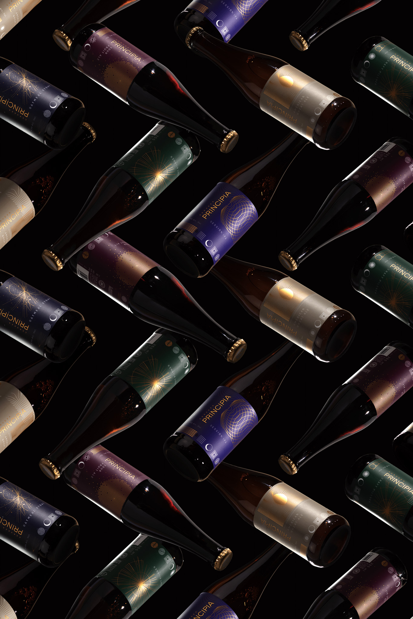
Cielito Lindo [Barrel aged beer collection]
![Cielito Lindo [Barrel aged beer collection]](https://toro-pinto.com/wp-content/uploads/2022/06/12.jpg)
Eight Row [pan american restaurant]
![Eight Row [pan american restaurant]](https://toro-pinto.com/wp-content/uploads/2022/06/26.jpg)
AQAVE spirits distilled from agave [mezcal]
![AQAVE spirits distilled from agave [mezcal]](https://toro-pinto.com/wp-content/uploads/2020/12/01_CENITAL_ISO-scaled.jpg)
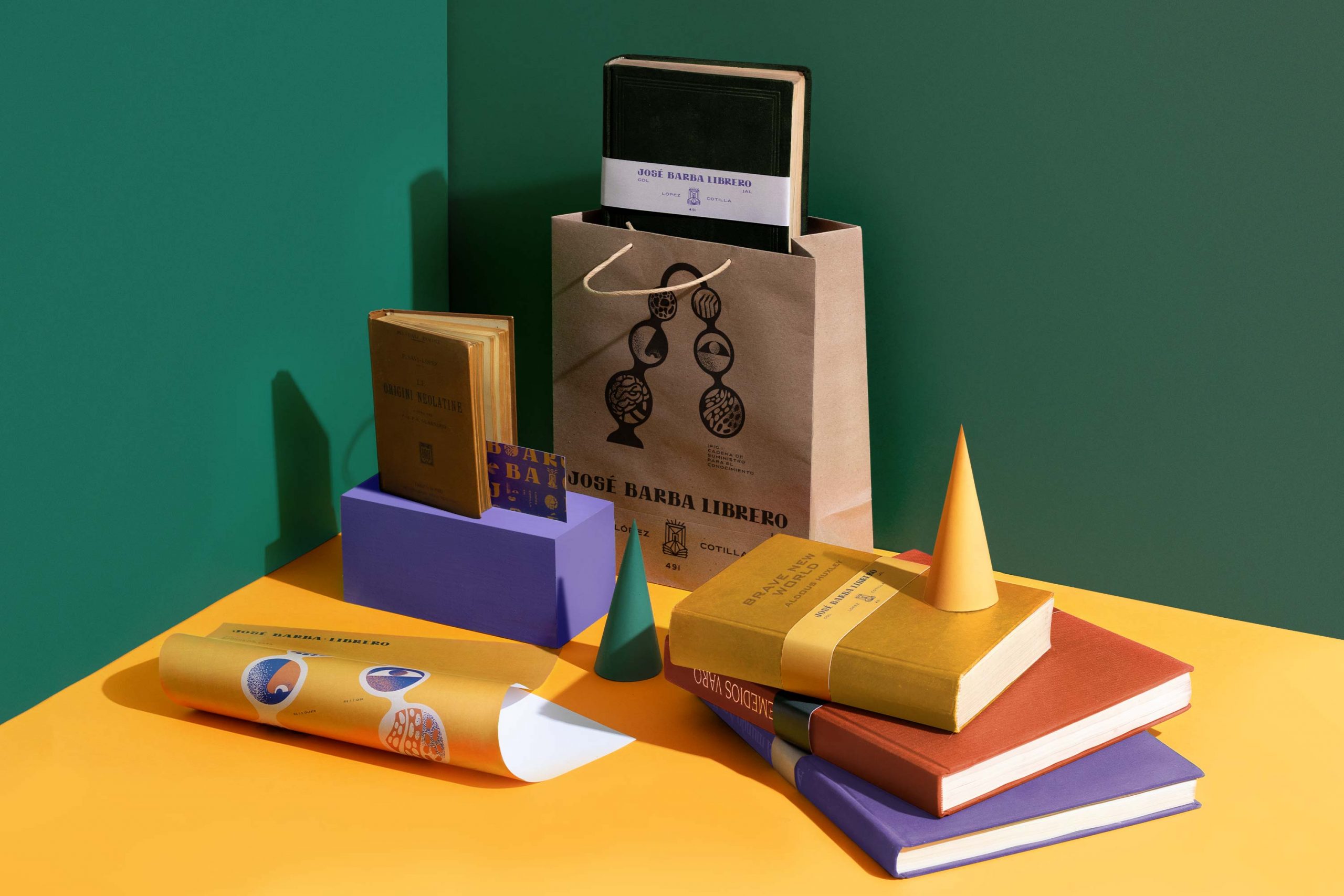
JOSÉ BARBA LIBRERO bookstore
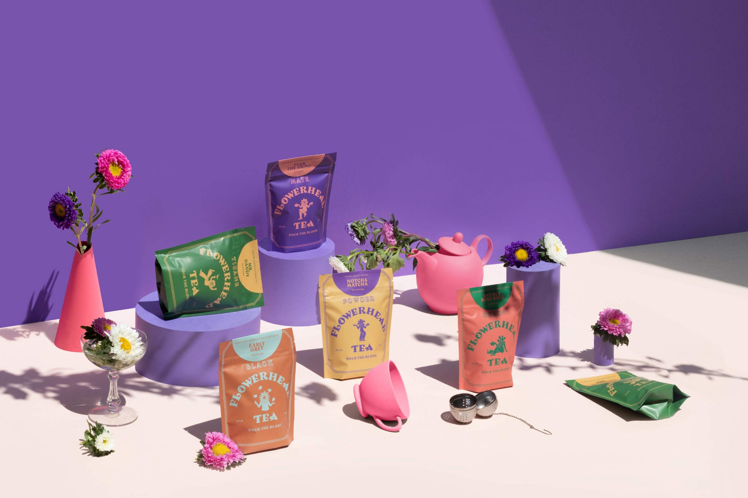
Flowerhead Tea
Cajeta de la Lira
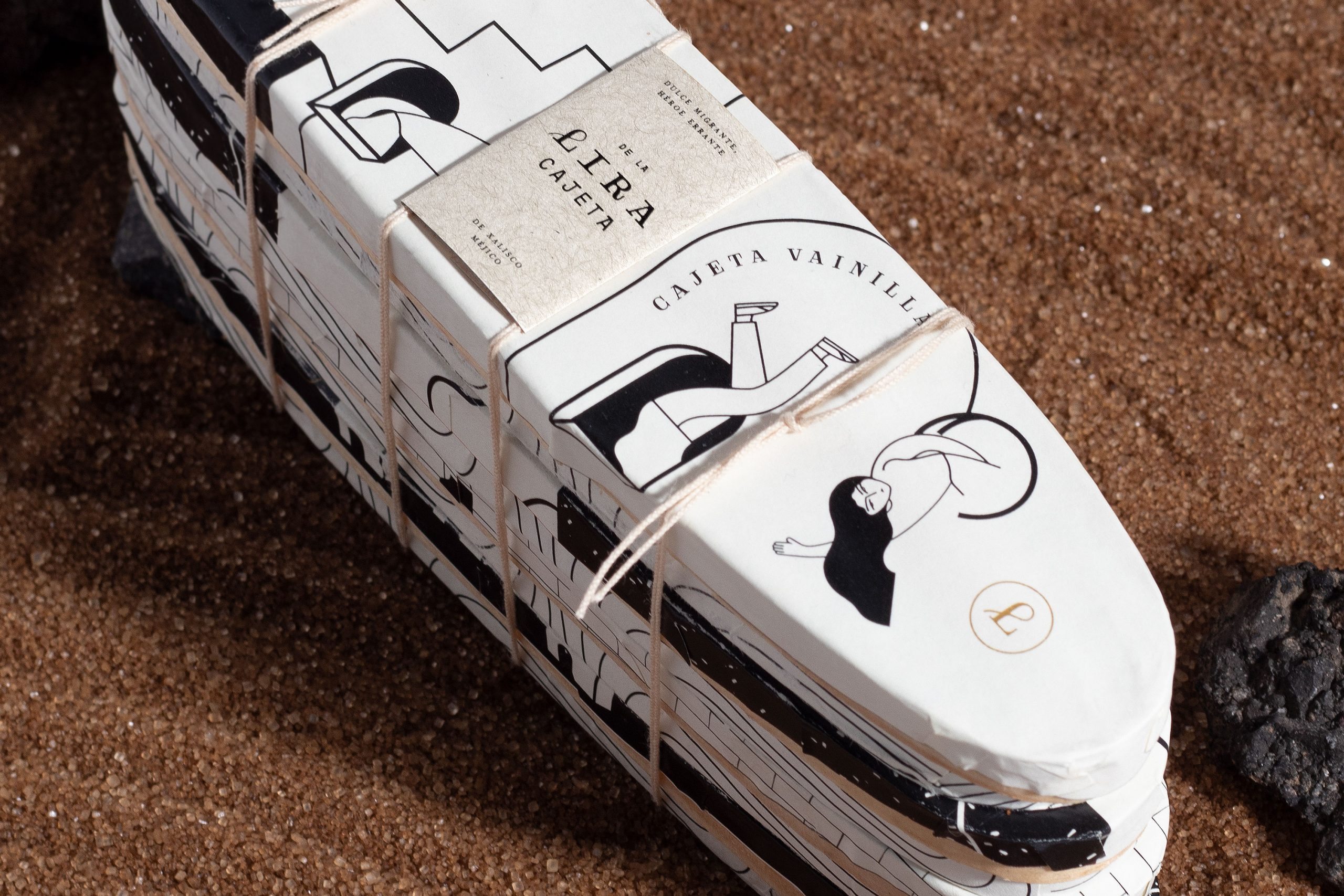
DE LA LIRA
CAJETA (SMOKED MILK CANDY)
De la Lira is a tribute made project for all the immigrants in the world, especially Mexican people going into the U.S.
Cajeta is a classic Mexican candy made with smoked milk and sugar. Even though it is known throughout Mexico it is essential to the states of Guanajuato and Jalisco. Although now sold in plastic and glass jars, the artisan way of packaging it is in bent wood containers that give the cajeta a special flavour.